Open Infrastructure Foundation Branding

Summary
The OpenStack Foundation changed its name to the Open Infrastructure Foundation as it began supporting new open source projects.
Problem
The foundation needed a new visual identity to represent their position as the home for open source infrastructure.
Role
- Logo design
- Brand guide development
- Website refresh
Introduction
The OpenStack Foundation was started in 2010 but didn’t have an official brand until 2018. I created the first iteration of the logo, which featured the OSF initials encapsulated in a simple badge shape. It was a deliberately understated design intended to reinforce the Foundation’s position as an entity which exists in service to the projects it supports, not simply to promote itself.
However, the OSF outgrew the ‘OpenStack’ part of the name as it took on a variety of projects beyond OpenStack and underwent a rebrand only 2 years later. In 2020, the OSF became the ‘Open Infrastructure Foundation’ and needed a new look to rally behind.
The idea of an Open Infrastructure Foundation was a complex thing to encapsulate in an icon. There isn’t a singular thing that comes to mind when thinking of “infrastructure”, much less “open infrastructure” from a technical, software perspective. The foundation had previously used arrow logos in various forms for its event branding, so I sought inspiration from different types of arrow designs to continue that legacy.
Rationale
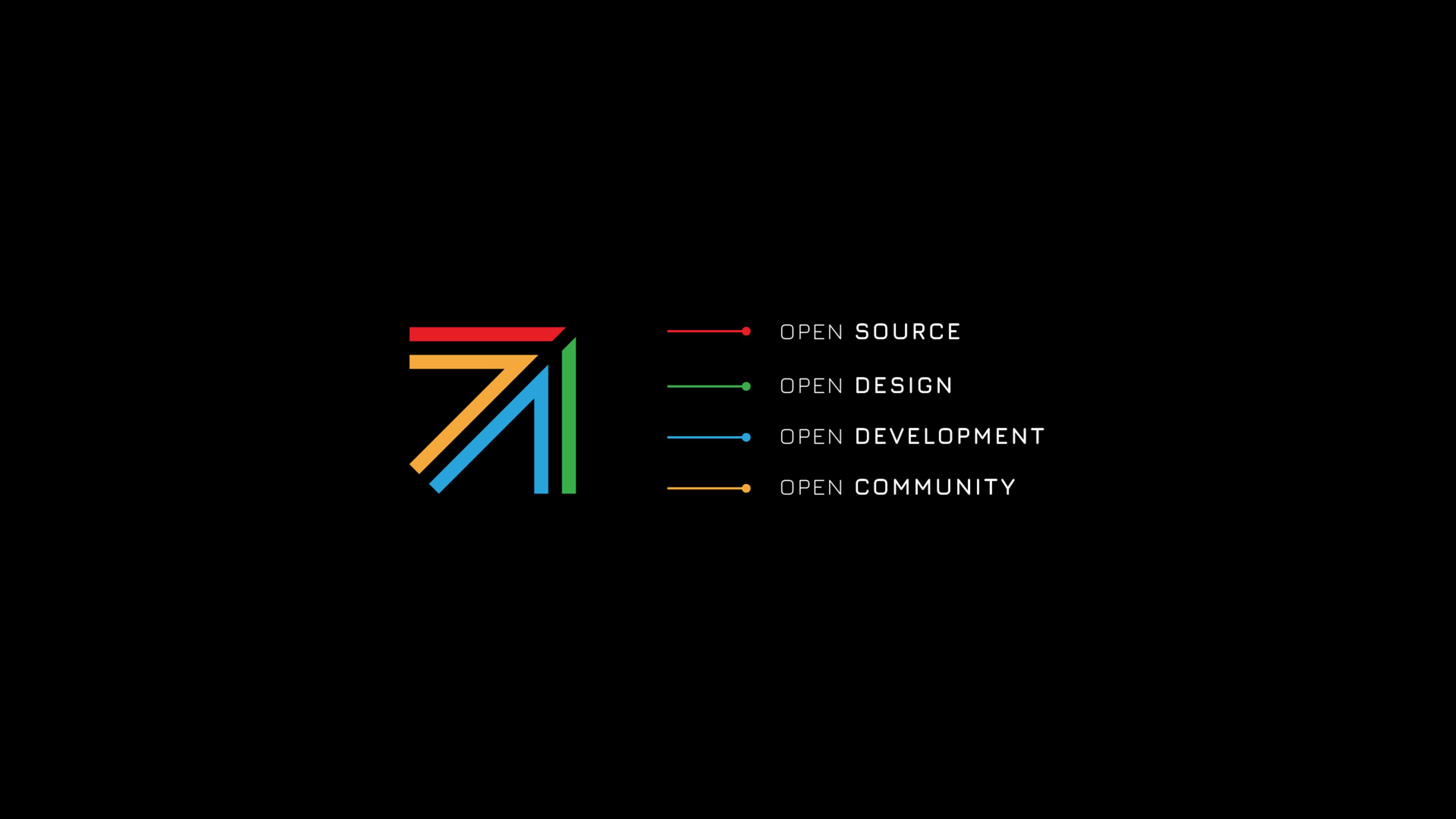
Borrowing from the visual language of civic infrastructure, like road and transit signage or industrial imagery, I created a stylized arrow inspired by the multi-colored lines found on transit maps. The arrow is composed of 4 lines to represent the Four Opens, the principles guiding the foundation: Open Source, Open Design, Open Development, and Open Community.
The theme alludes to the global nature of the community, the use of project code in literal civic infrastructure, and the idea that the foundation exists to help projects along their journey.


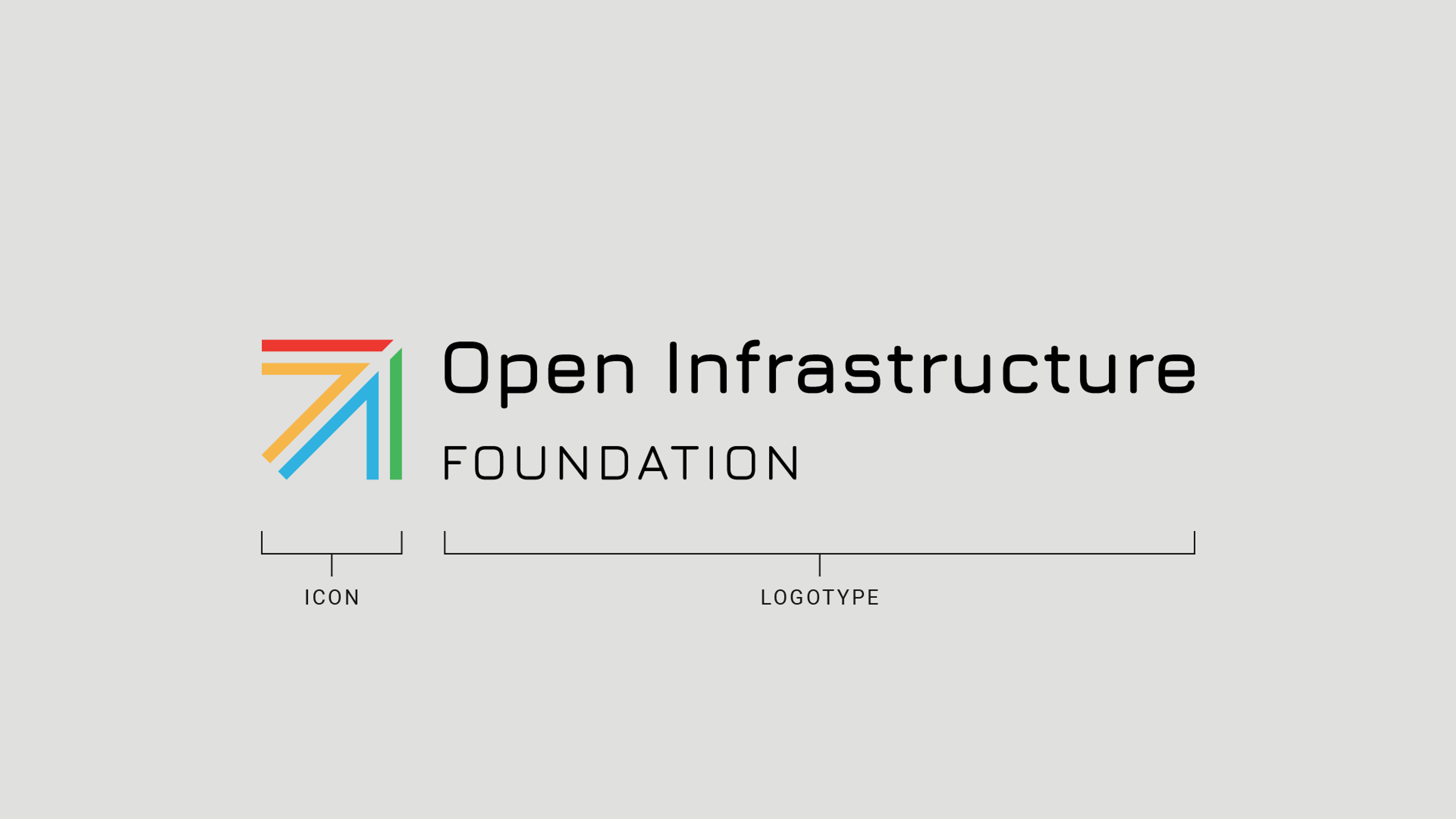
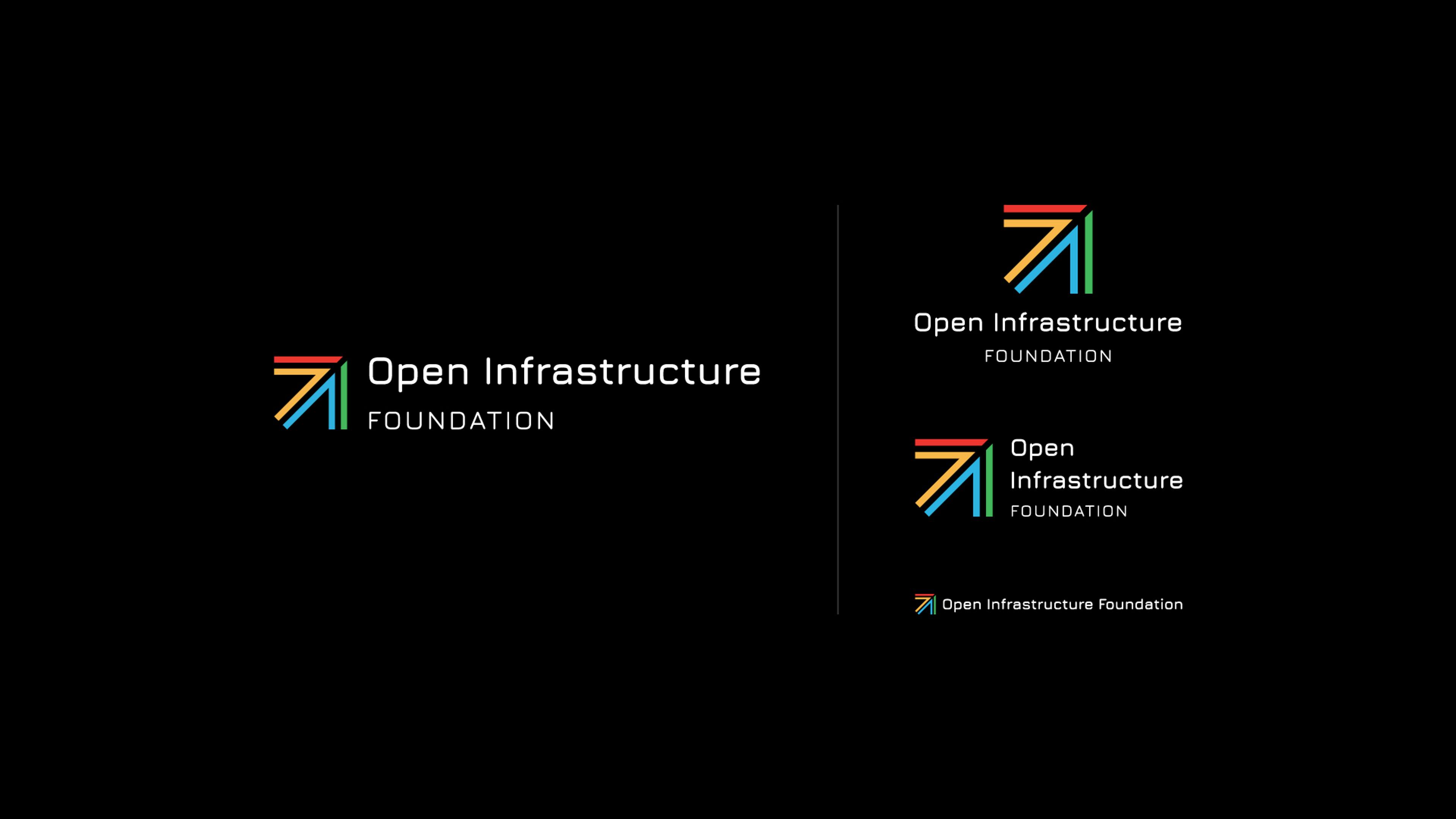
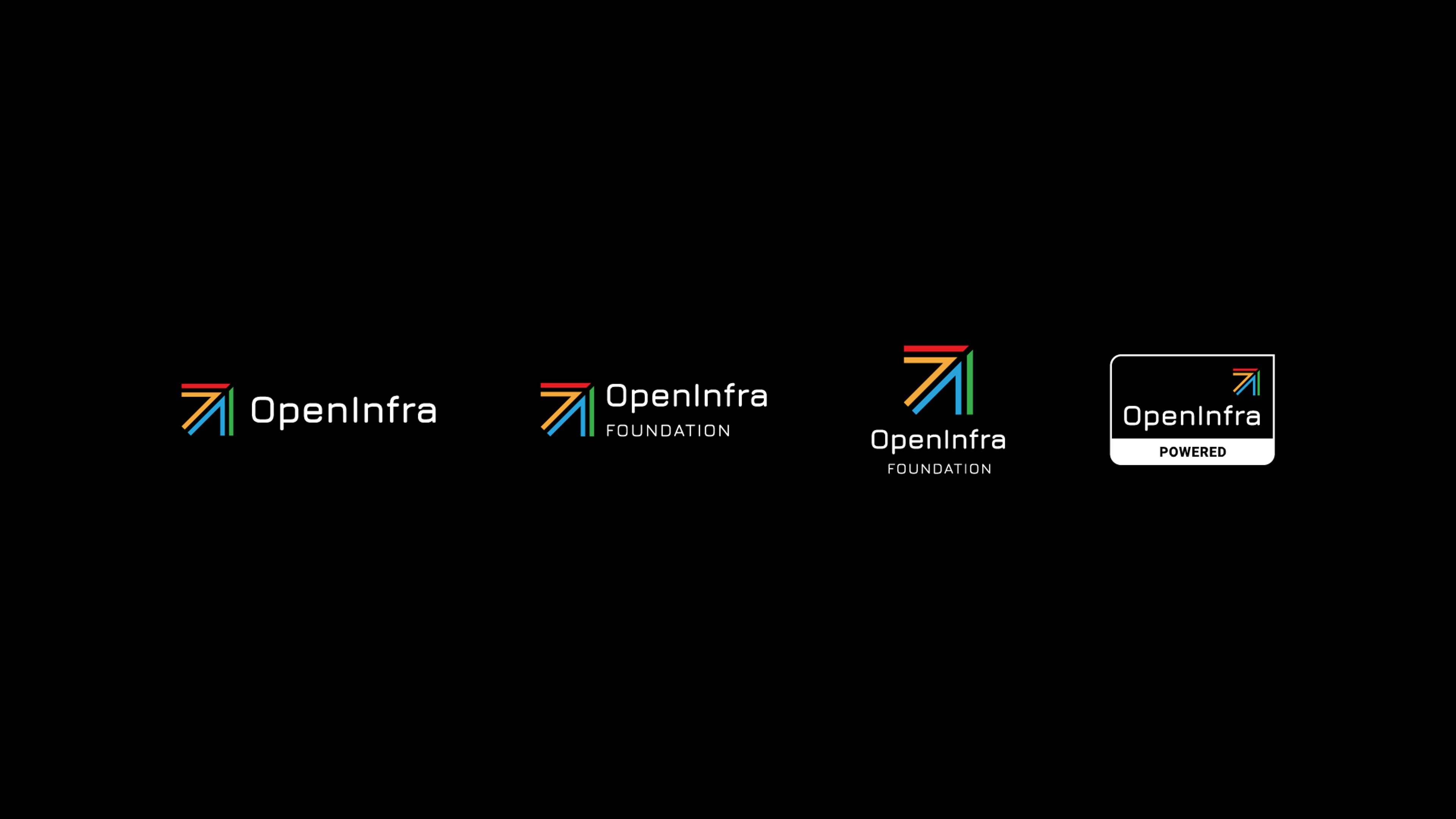
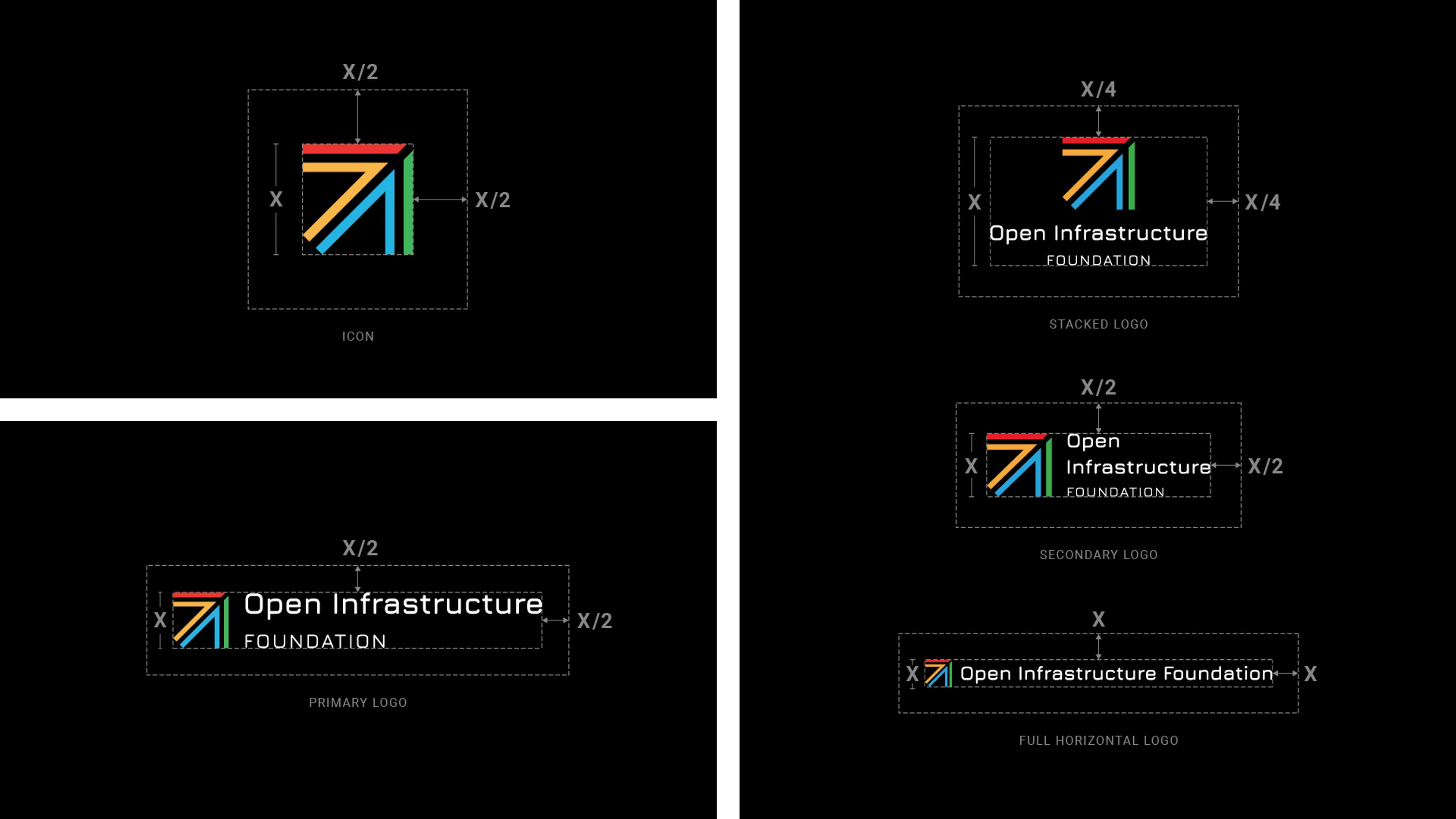
OpenInfra logos
Beyond the standard logo variations, the rebrand required a number of additional strategic assets intended to create associations between ‘Open Infrastructure’ and the term “OpenInfra’, a contraction the foundation hoped to own.
OpenInfra Live
One of the earliest use cases of the OpenInfra brand was the newly-created ‘OpenInfra Live’ series, which is a weekly live stream featuring discussions on all things open infrastructure. Beyond the logo, I created a number of assets to be used in the broadcast, including video overlays and some simple animations promoting the foundation.


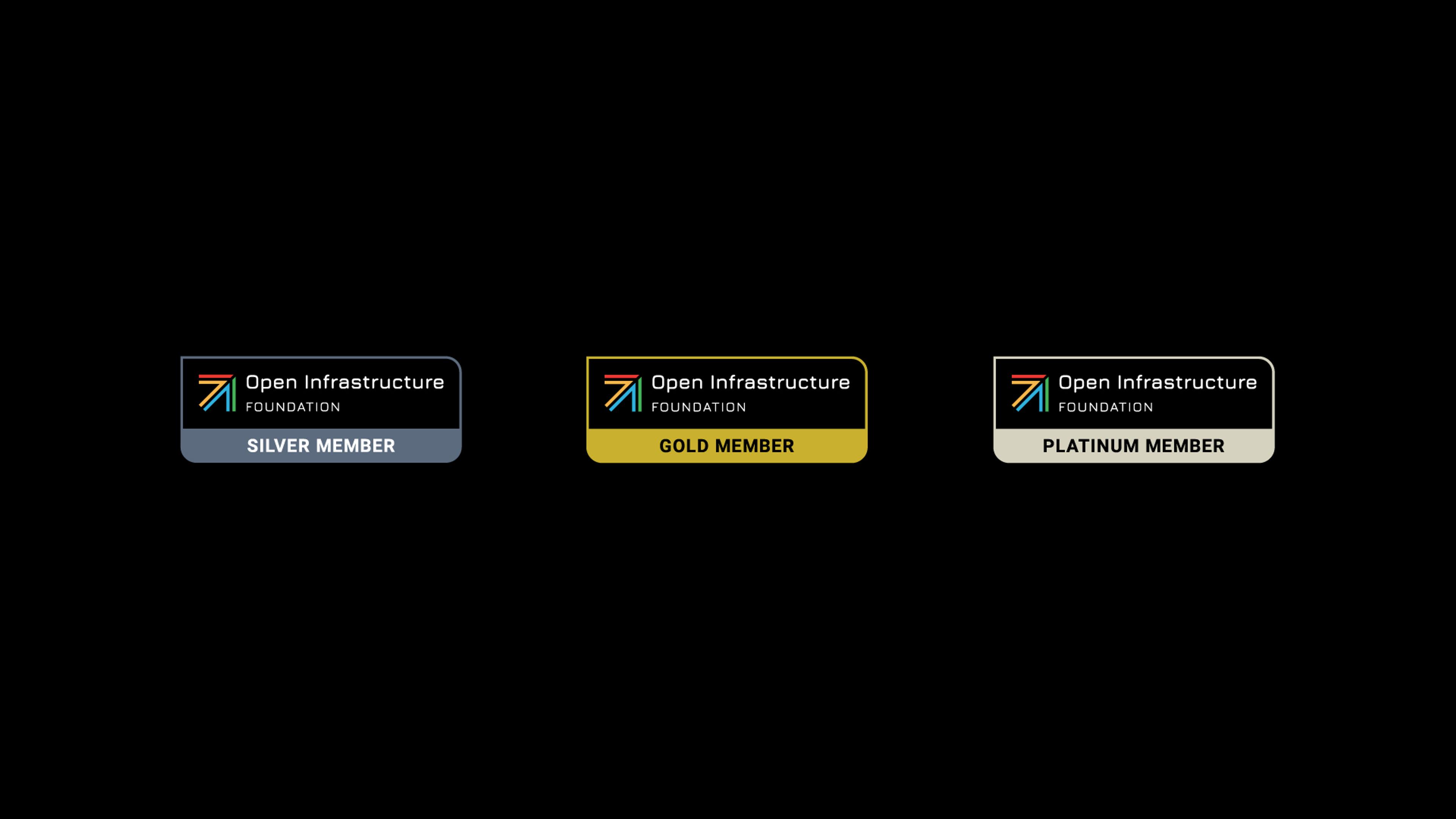
Foundation member badges
Three new foundation member badges were also created to share with supporting companies and feature on the foundation’s job board.

Supporting Assets
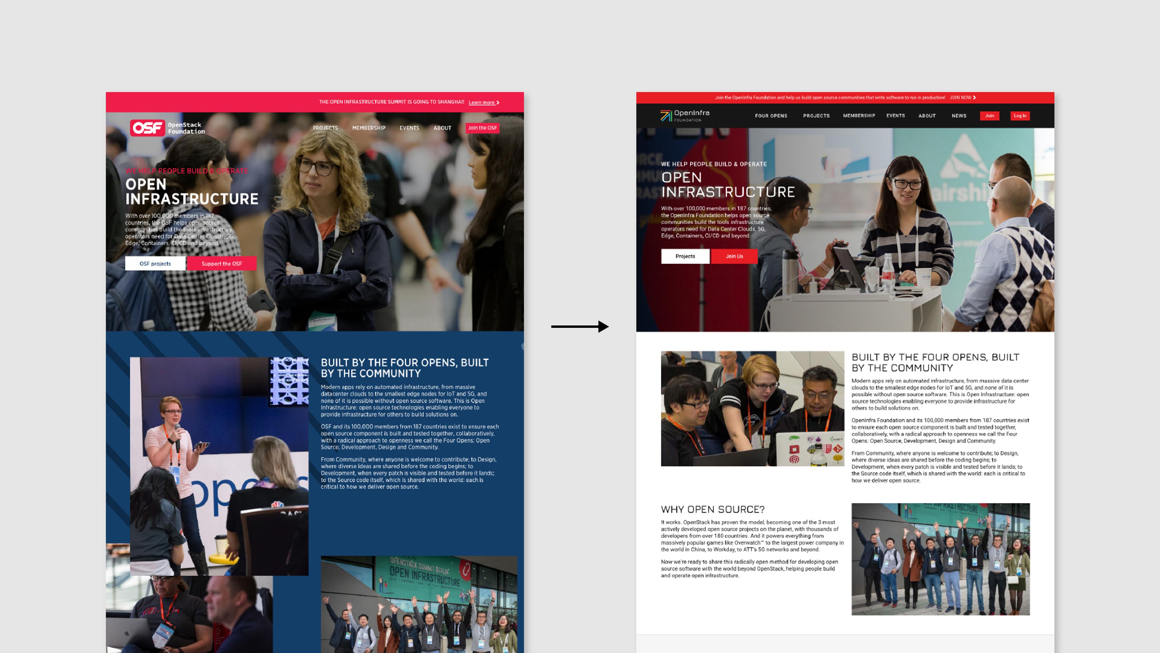
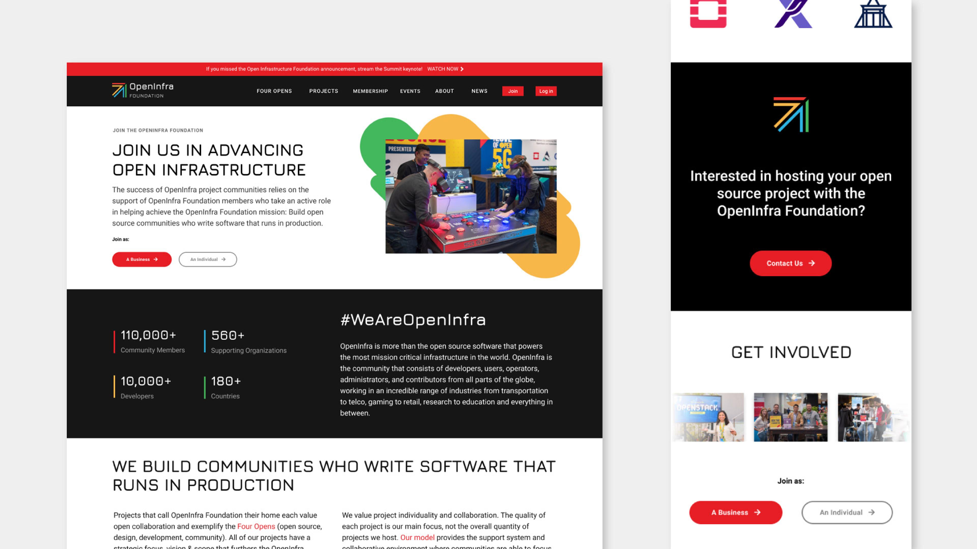
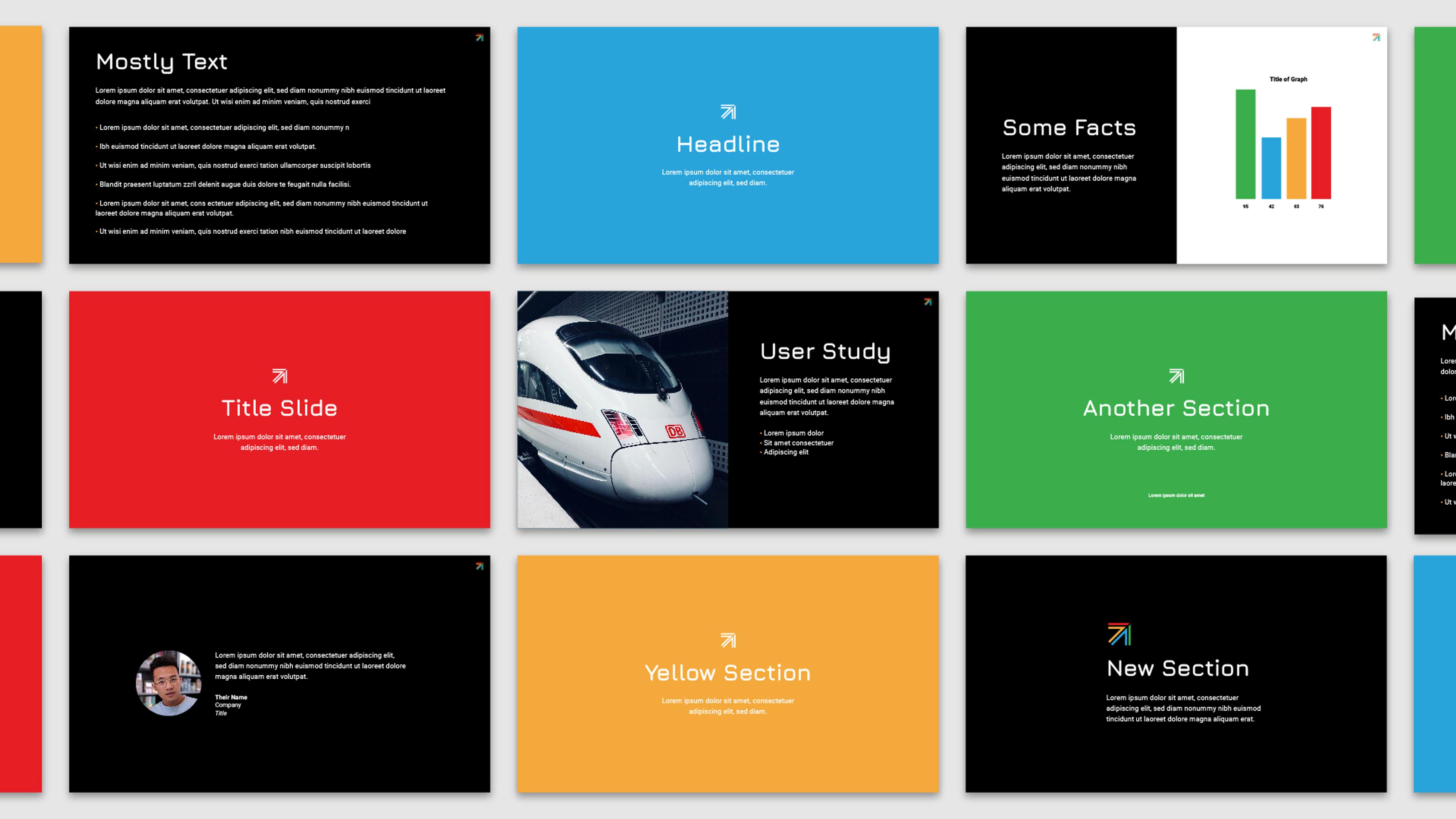
After the ‘badging’ phase of the rebrand, I was also responsible for creating supporting assets to be used on foundation web properties, as well as updating the style of the foundation's website.
Brand guide
The rebrand happened gradually, so I created a one-page brand guide to help with the rollout while the brand guide website was being built.
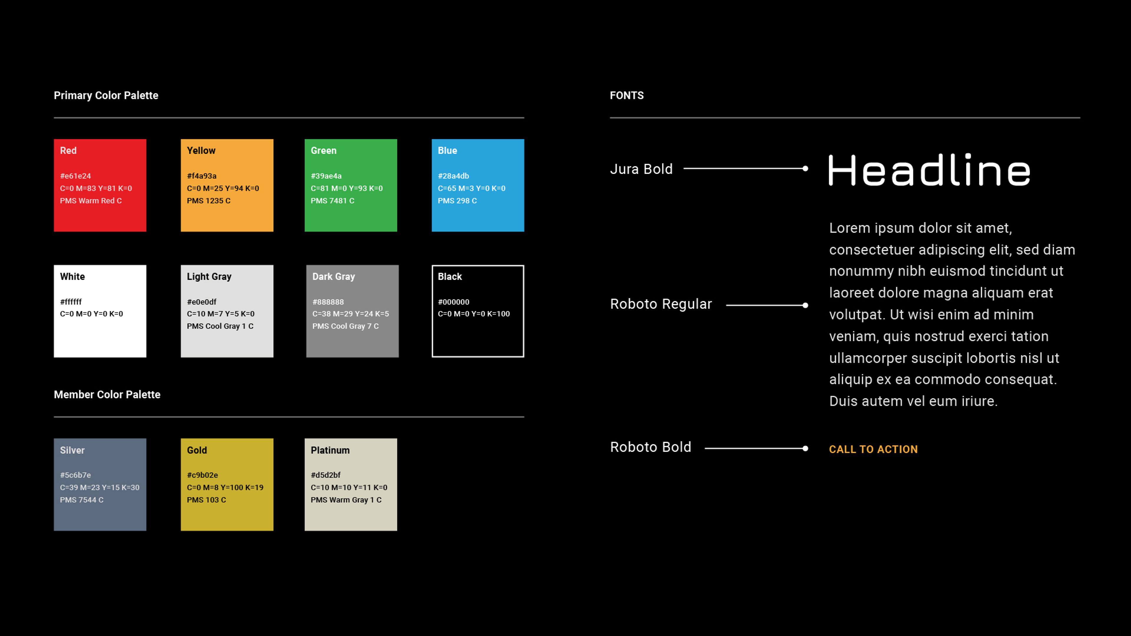
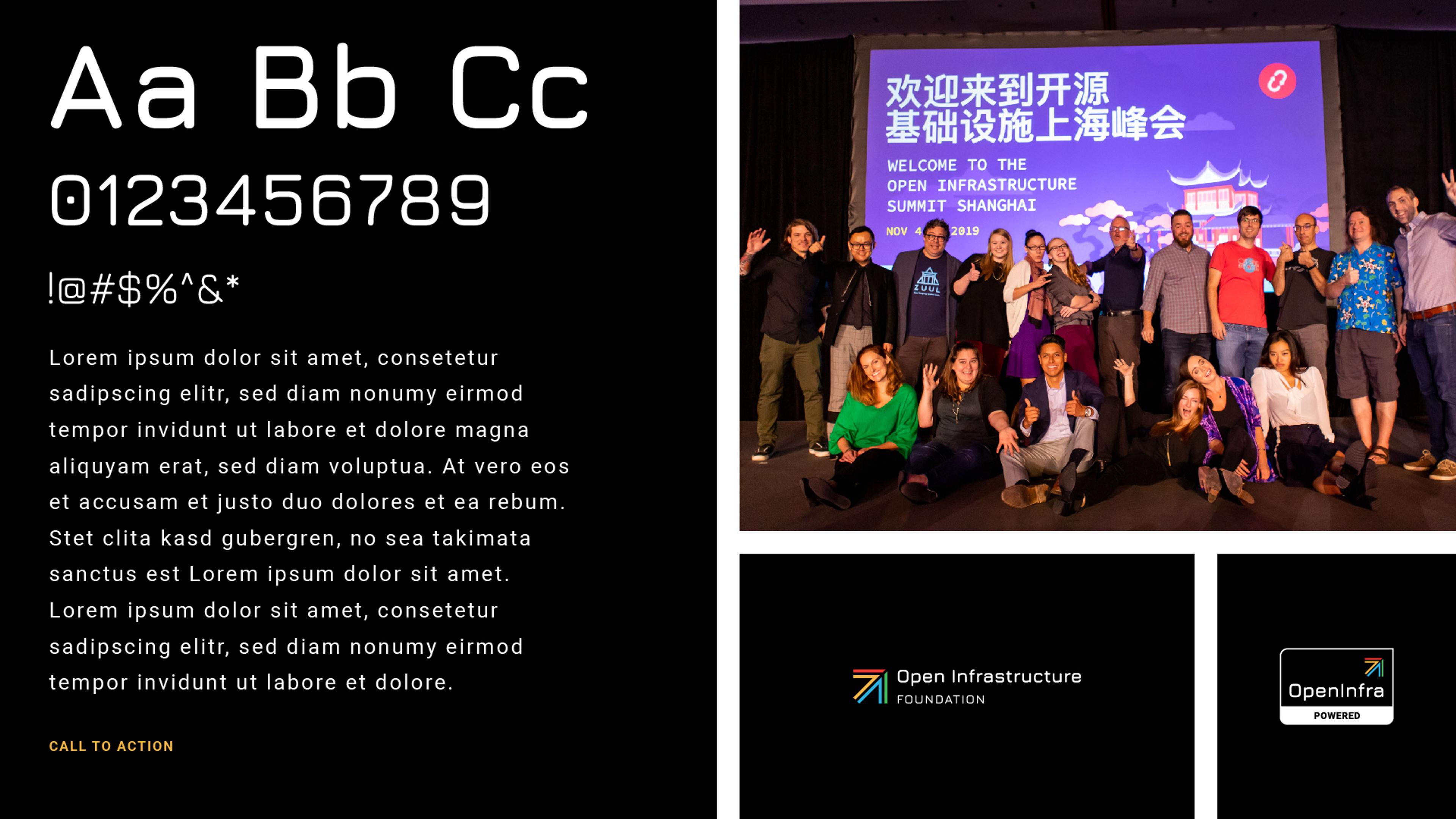
I created the online brand guide using Catalog and launched the first iteration in July 2021. The guide is a living document, to build upon as needed. The live site can be viewed at brand.openinfra.dev.
Elements from online brand guide

Conclusion
This rebrand project was a massive undertaking and came at a time where the foundation was planning the next decade of open infrastructure. In true open source form, it was a collaborative effort with input from all areas of the organization. I was privileged to have been able to develop the visual identity and hope it continues well into the future.
You can read more about the rebrand on TechCrunch.

