MoneyBinder Concept

Summary
This was a semester-long team project for the Human-Centered Interaction Design 1 course at the University of North Texas.
Our project focused on reducing debt by improving student financial literacy using a mobile application.
My role in this project involved discovering user needs, assisting with and conducting user interviews, designing the user interface, and assisting with and conducting usability tests.
Problem
College students lack financial literacy and incur student debt burdens that can derail their lives.
Role
- Ideation / Problem definition / Personas
- Wireframes / UI design / Design system creation
- Prototyping / Usability testing
Introduction
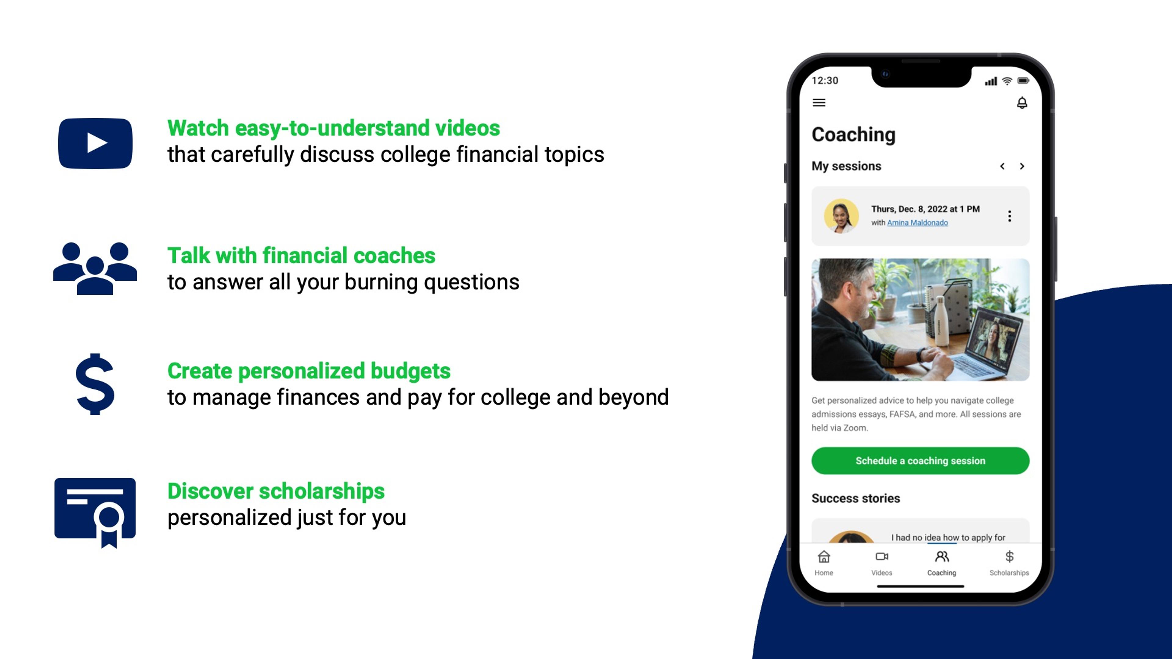
The federal student loan debt was $1.6 trillion dollars and rising for 45 million people as of 2022. This is larger than the annual GDP of Australia. The process of applying to schools and securing financial aid is overwhelming for many students, and there is no single source of truth they can refer to. Our project attempted to address this issue by creating a mobile application to help students pay for college without student loans.
Our Process
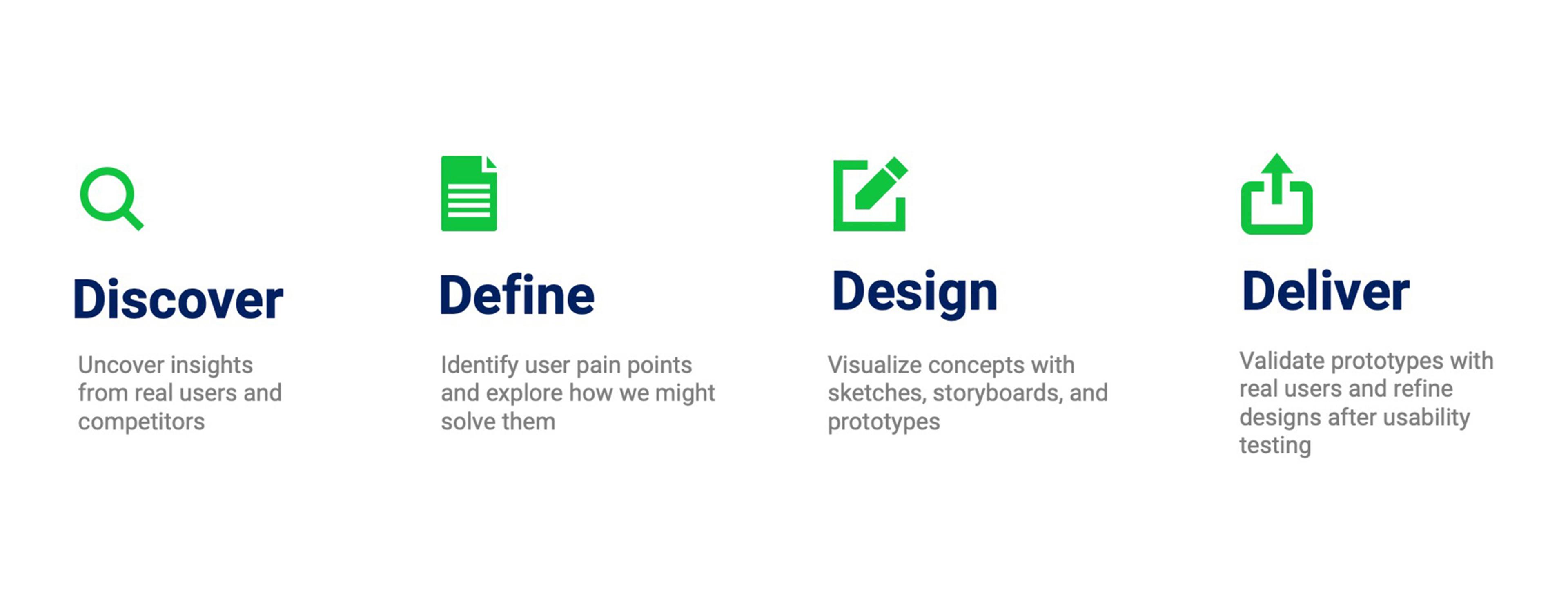
Since we wanted to address the needs of current and incoming college students, we began our process by identifying the problem, ideation high-level solutions, and exploring how our concept might be positioned in a marketplace of similar financial products.
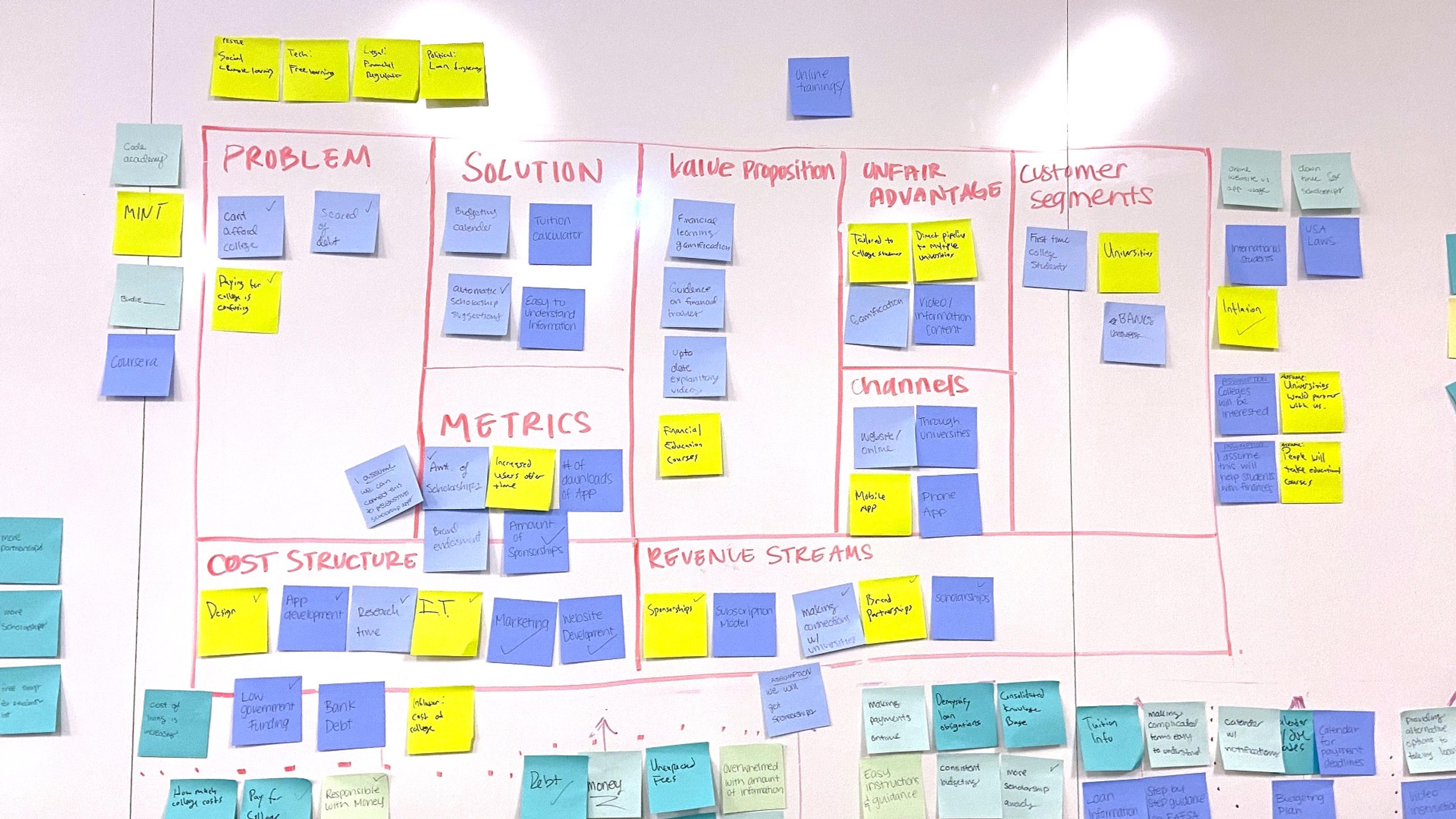
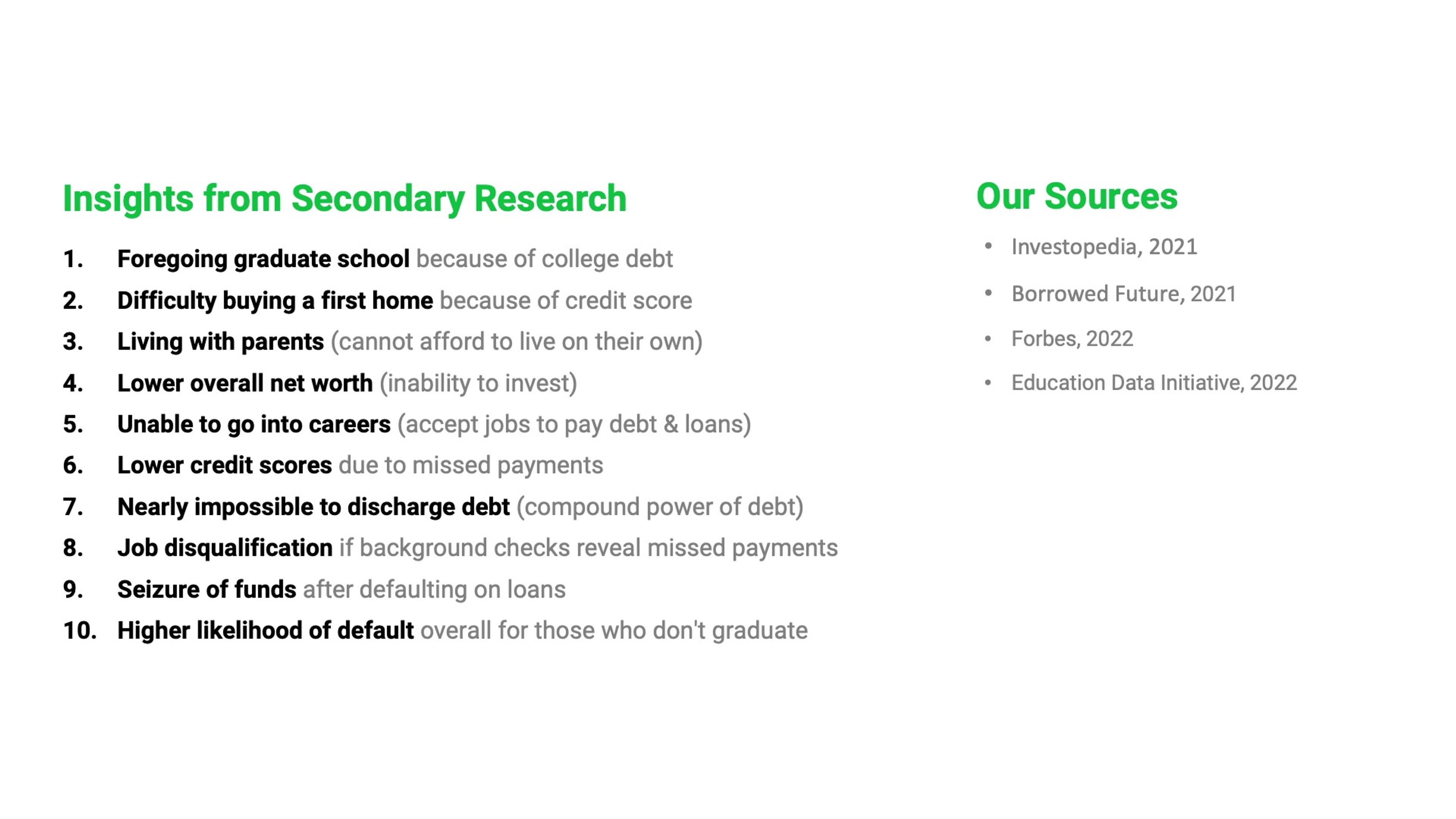
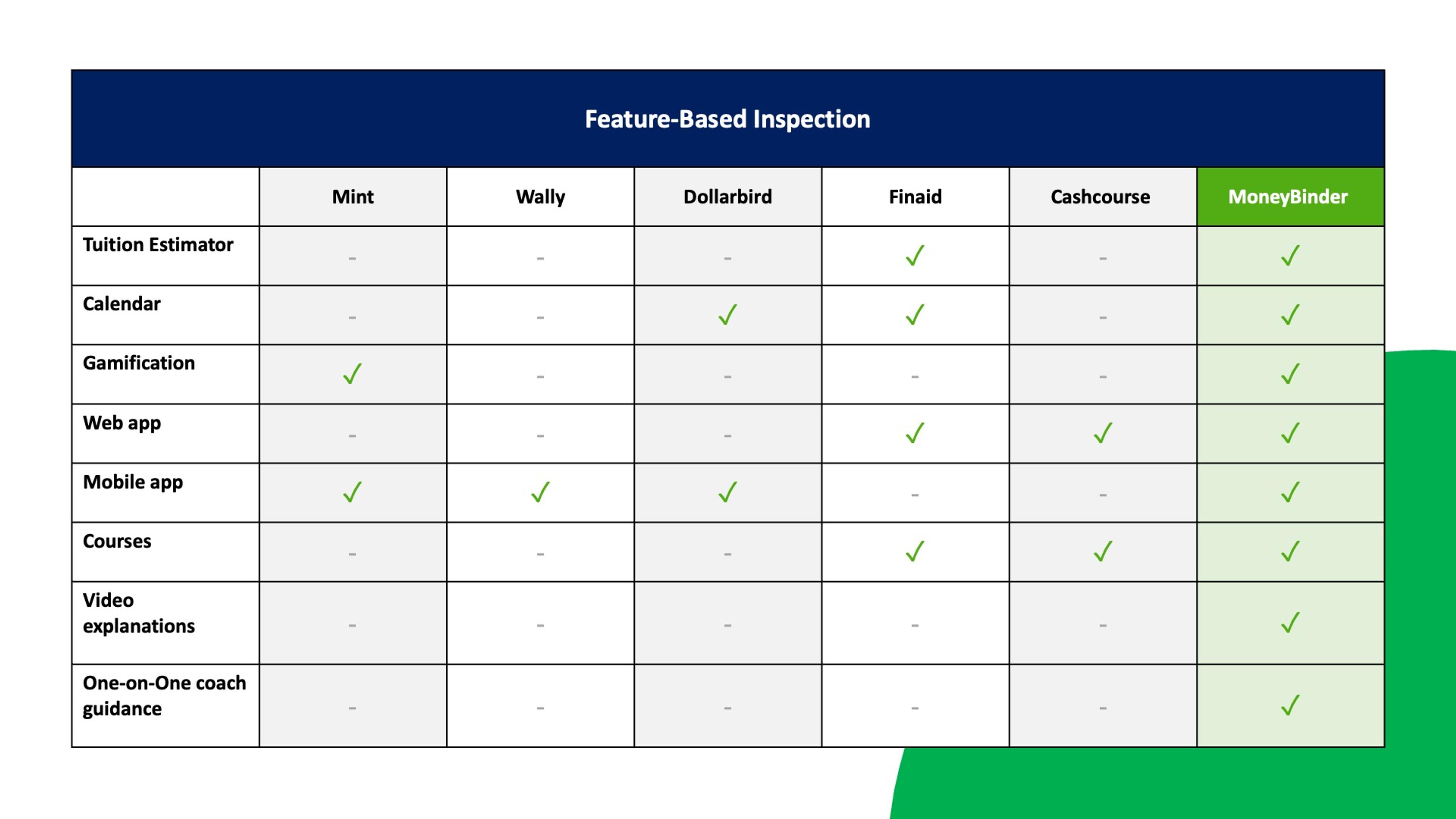
We conducted secondary research and a competitive analysis to identify common elements of similar products and opportunities for our concept to fill gaps in the existing product landscape.
Personas
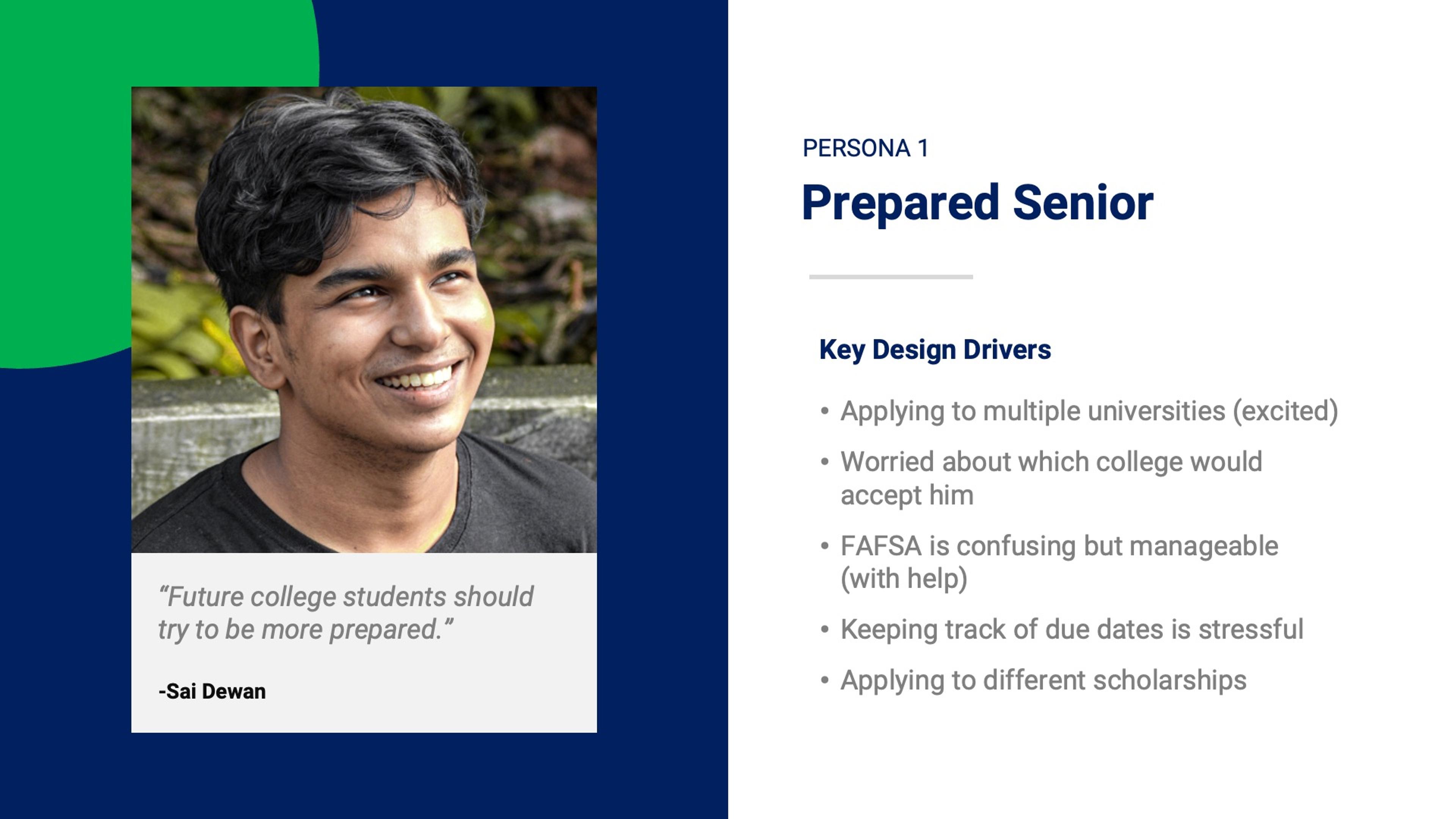
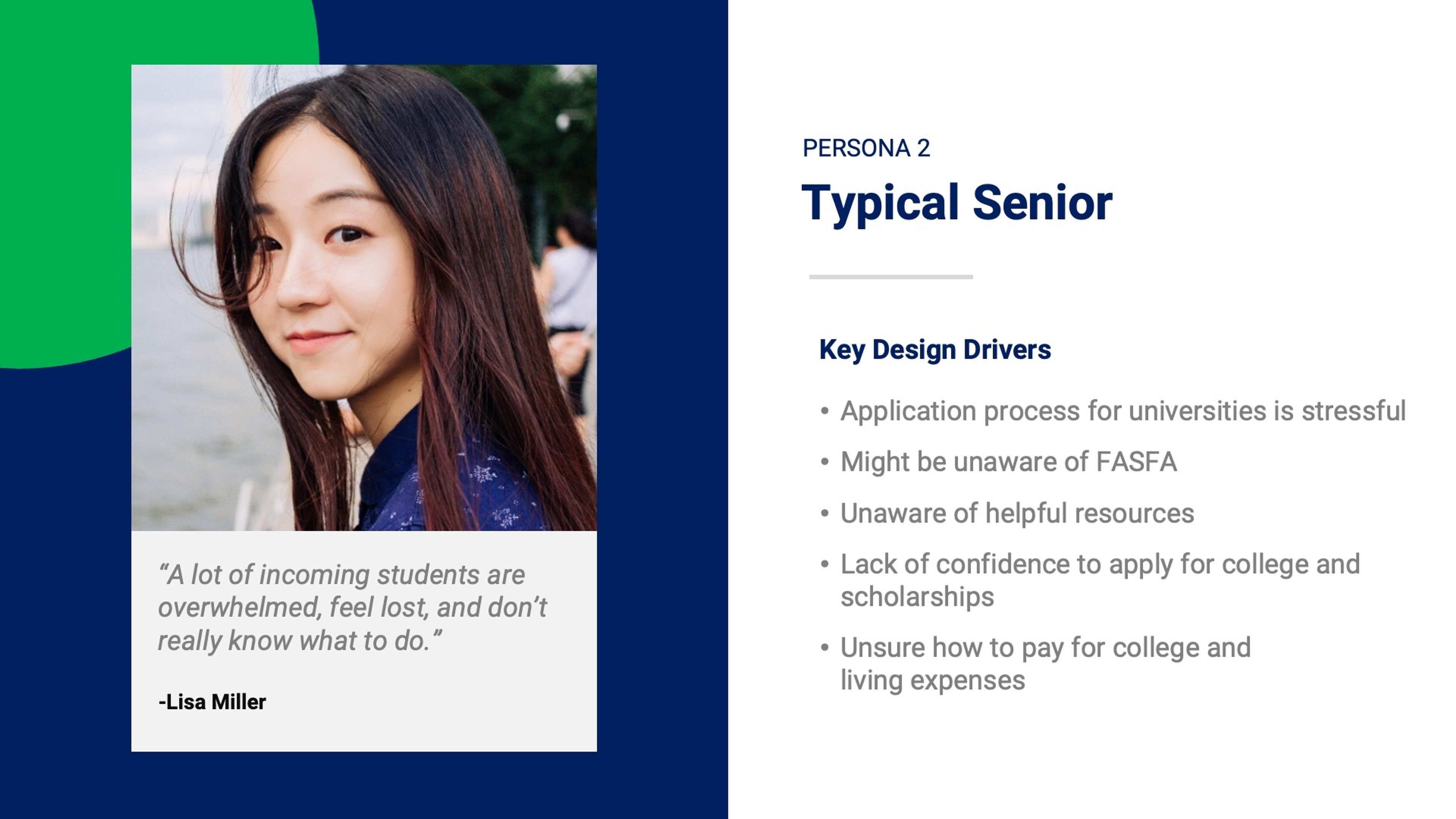
Our user interviews with incoming college students led to the creation of two user personas: Prepared Seniors and Typical Seniors. The prepared senior is a high-school student who has some familiarity with the college application process and needs some way to stay organized. The typical senior, in contrast, is overwhelmed with the entire process and has no idea how to pay for college. In both cases, users lack financial literacy needed to understand how to pay for college. Applying for FAFSA is a particularly challenging aspect of the process for both kinds of users.

User Journey
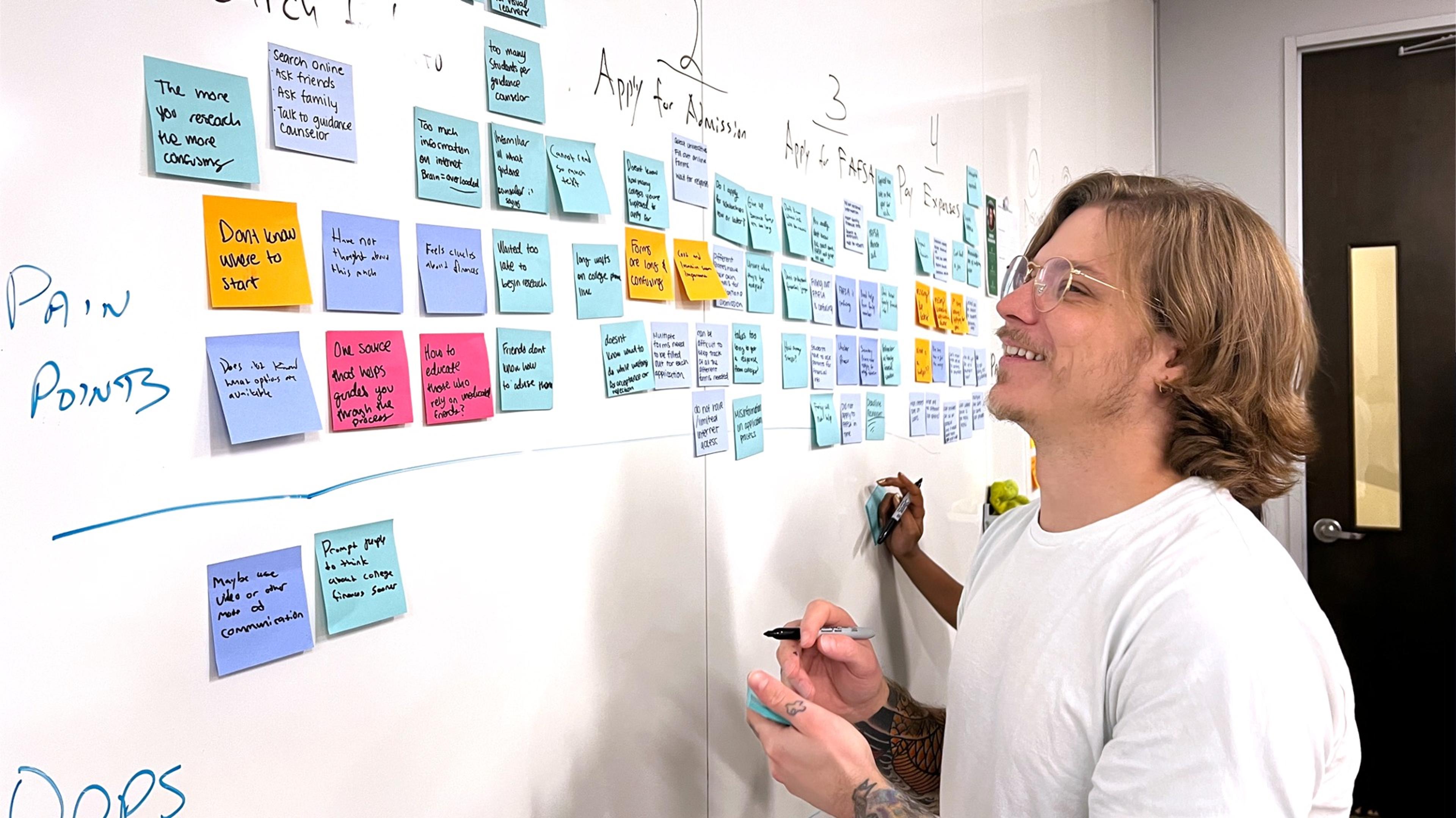
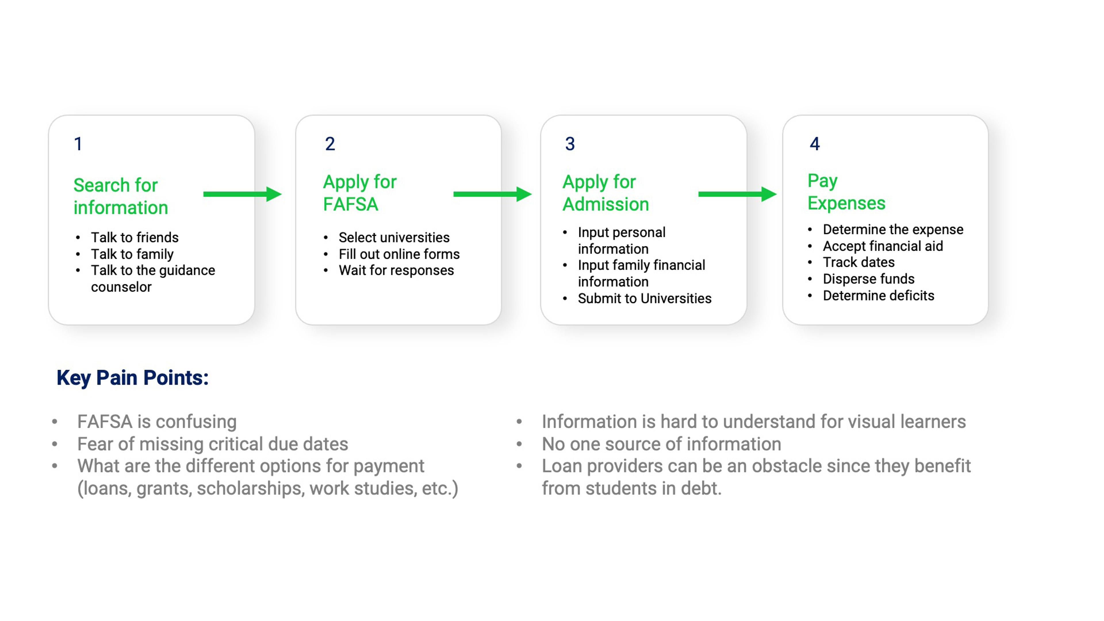
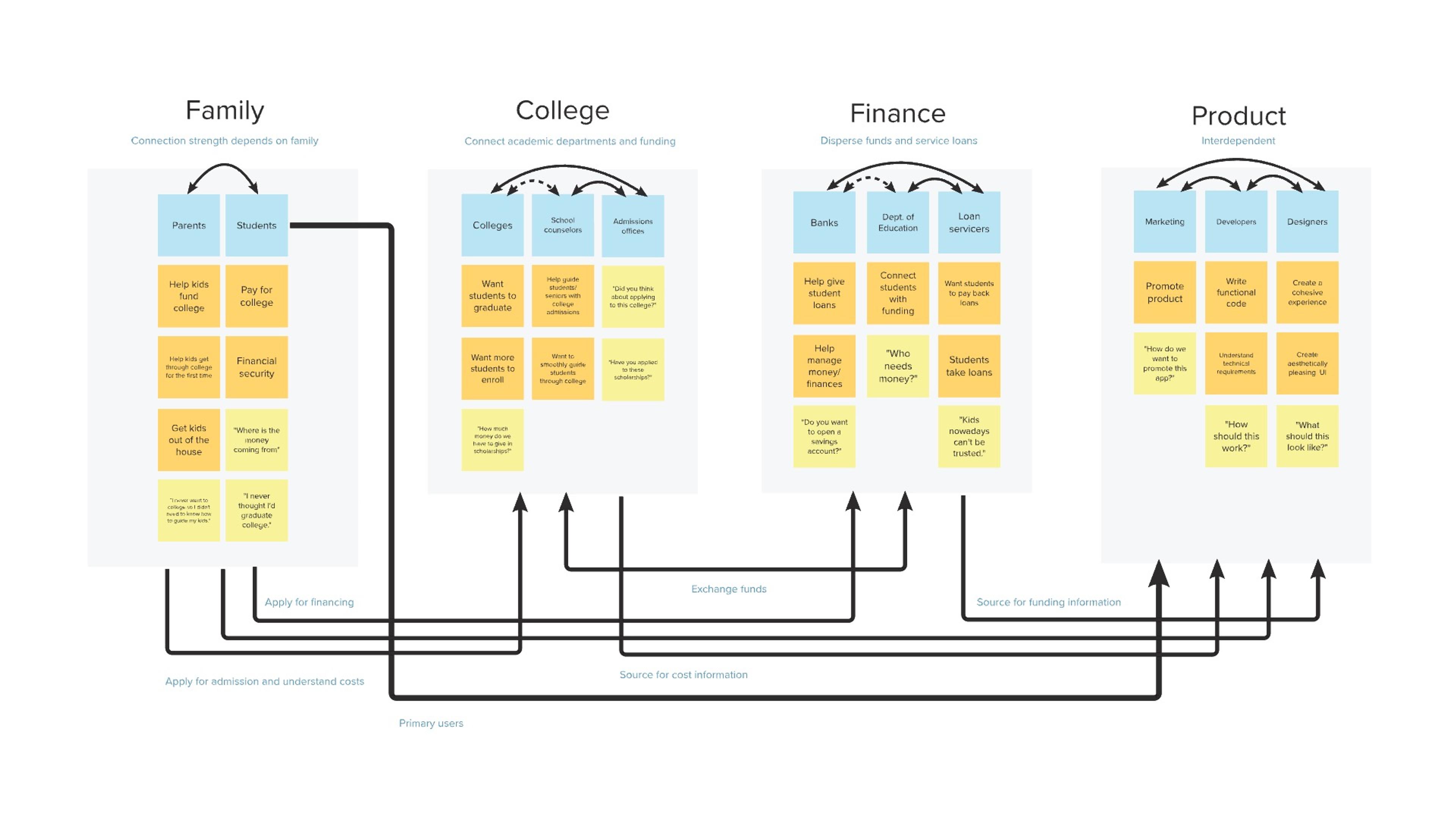
To alleviate our users’ fear of missing payment deadlines and confusion over the financial aid process, we needed to fully understand where pain points occur in the user journey. We created a journey map to help visualize the process and identify opportunities for improvement, as well as a stakeholder map to understand the relationships between different stakeholders.
Epics and User Stories
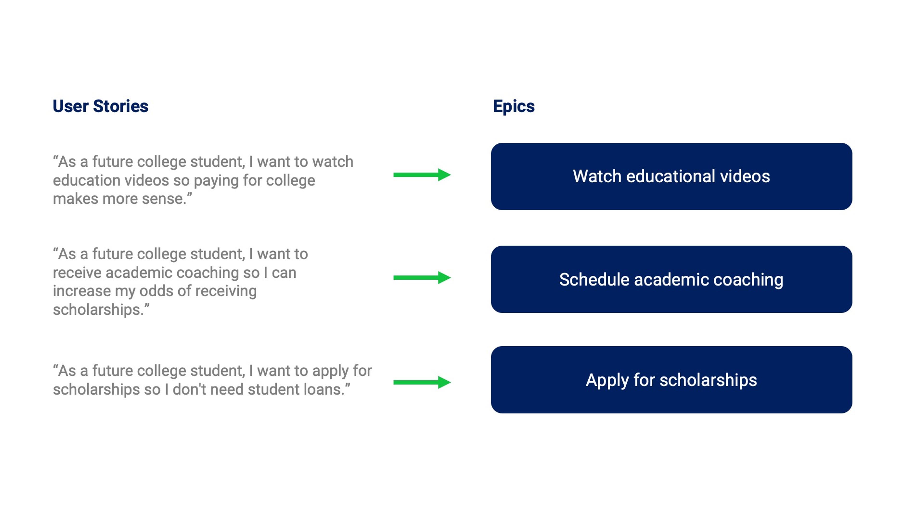
As we moved into our design phase, we created three epics and user stories to describe bodies of work related to specific application functionality.
Storyboard
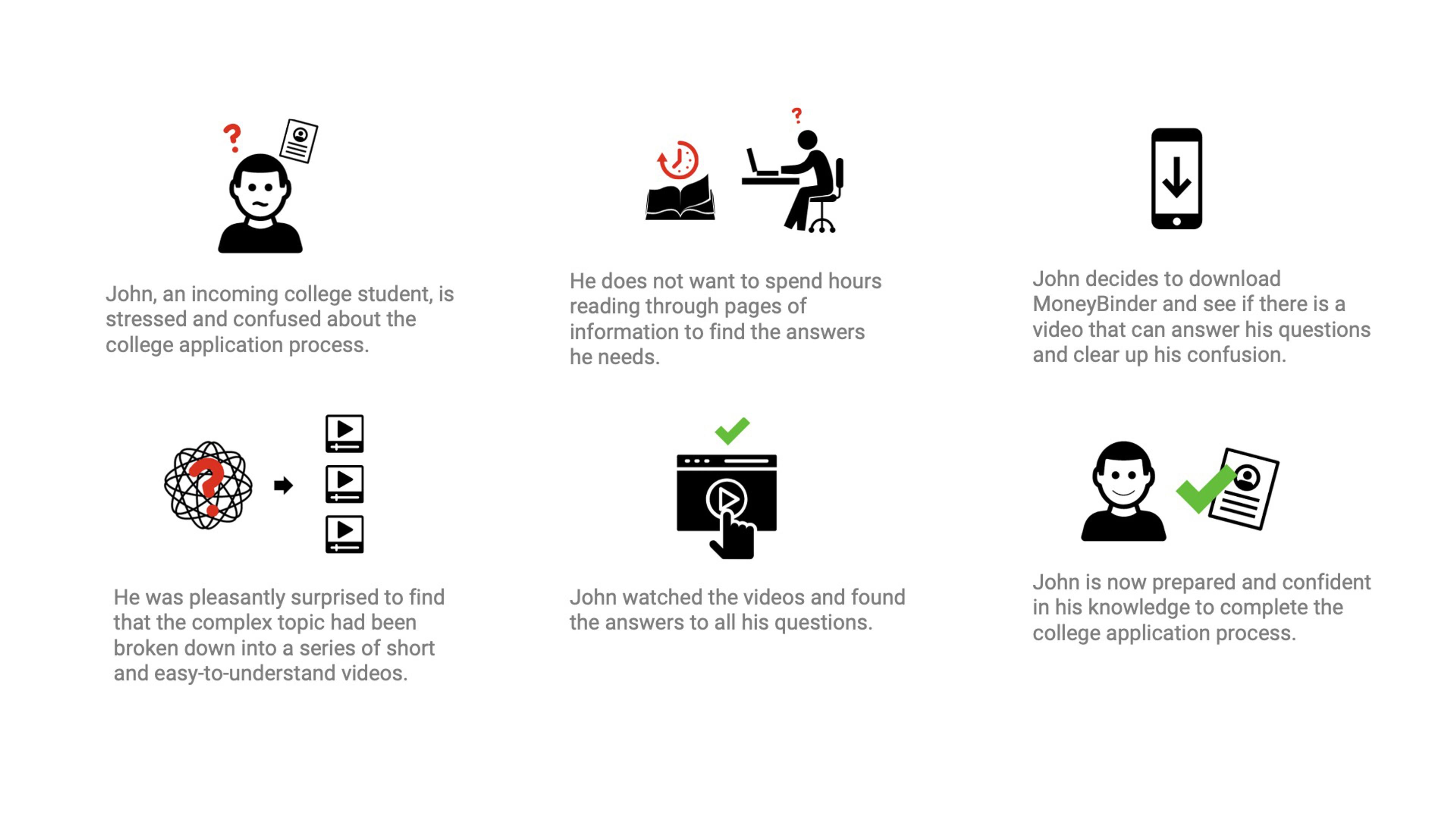
We then storyboarded our user journeys. Since simplification of complex information was a primary pain point for our users, we identified "watching educational videos" as the primary activity they might want to do when they first interact with the app. Ultimately, reducing lengthy financial information into short, easily digestible videos would reduce the time involved and anxiety surrounding our users’ financial education.
Wireframes and Layouts
Epic: Watch educational videos
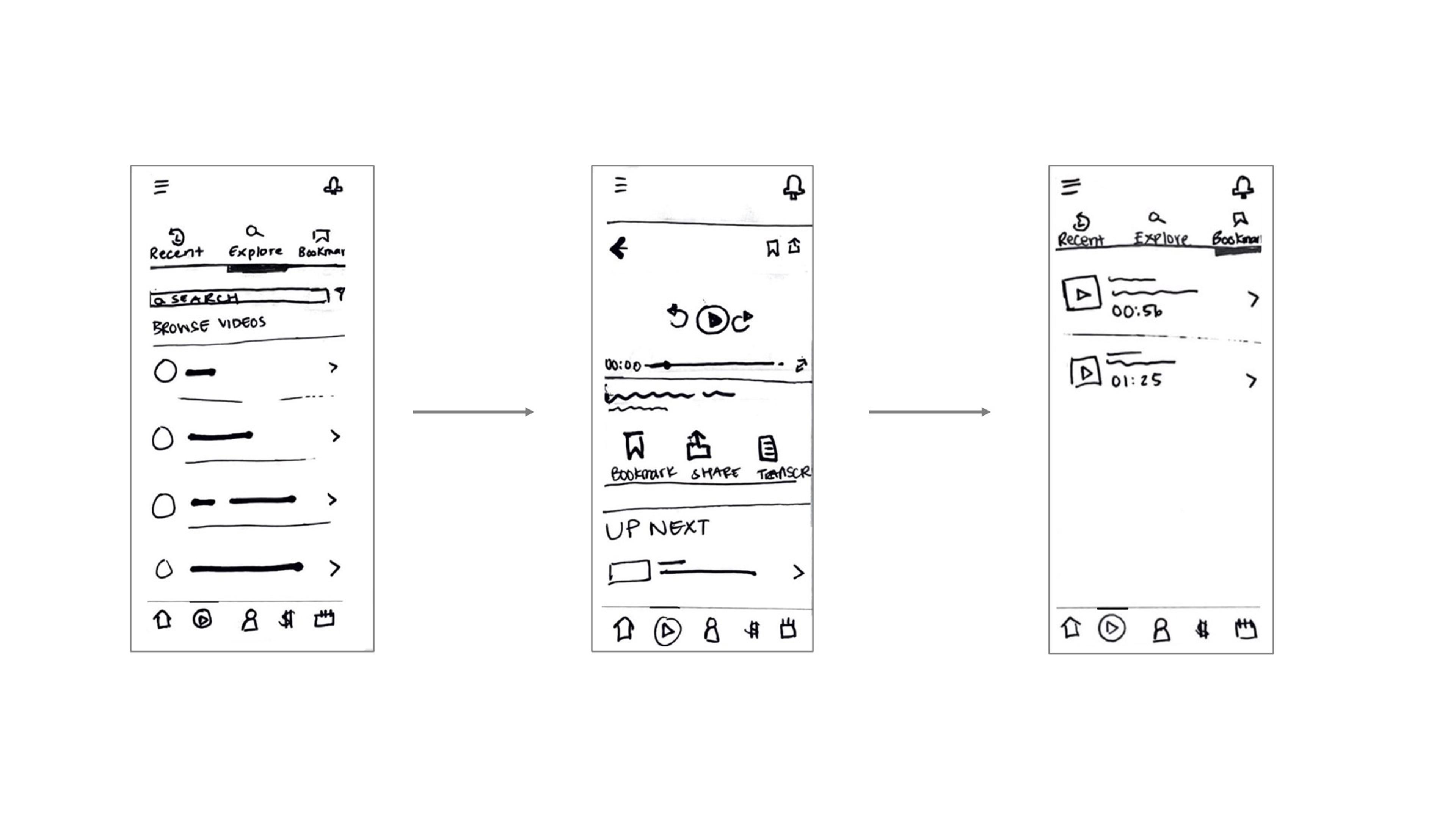
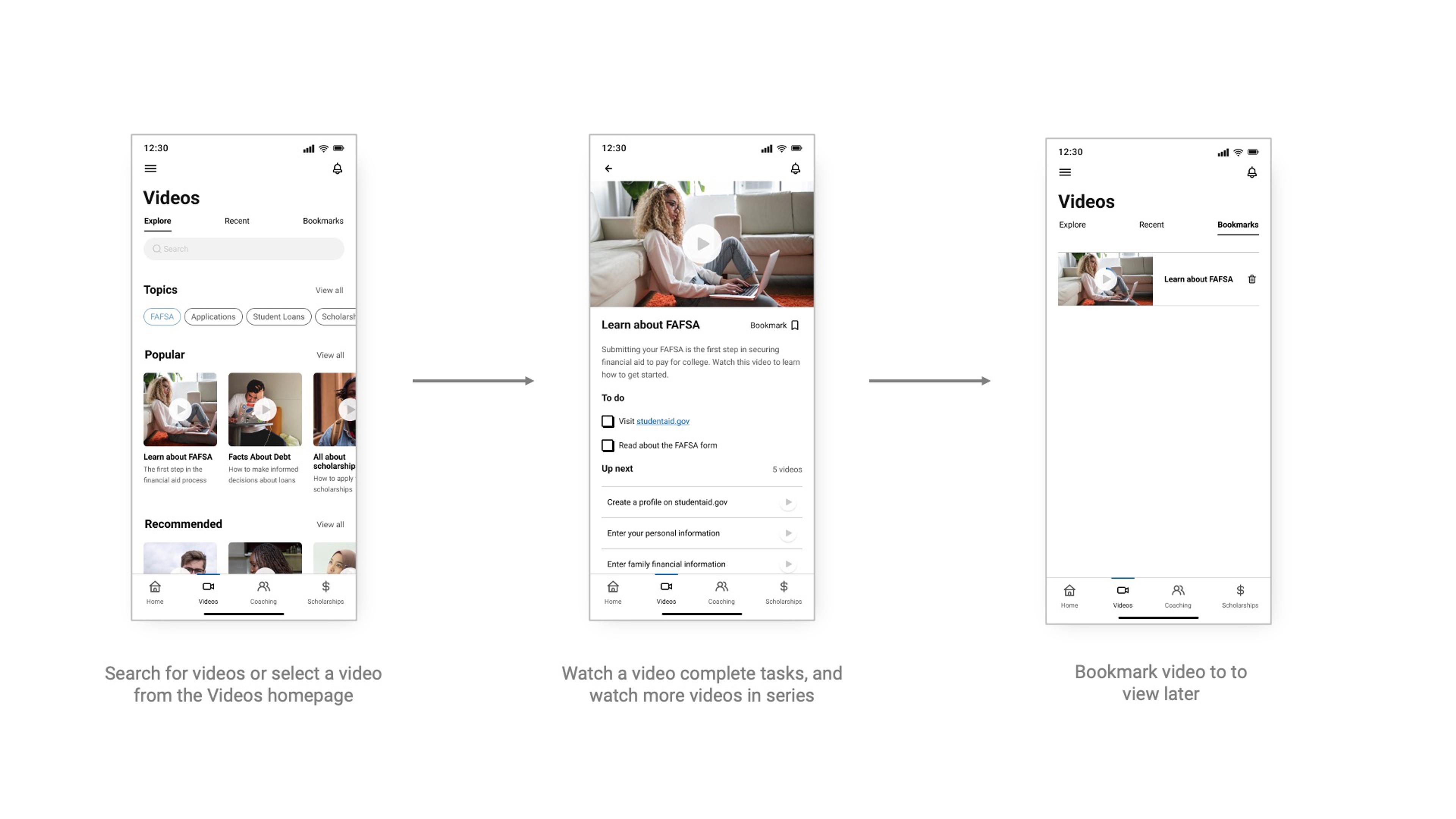
Our users’ primary task is to watch educational videos about paying for college. Users will be able to access these videos in as few as 2 taps from the app's homepage. They will then be able to easily bookmark videos or review their watch history later. We created wireframes and high-fidelity layouts of for this flow, as well as the other flows we wished to test with users.
Epic: Schedule academic coaching
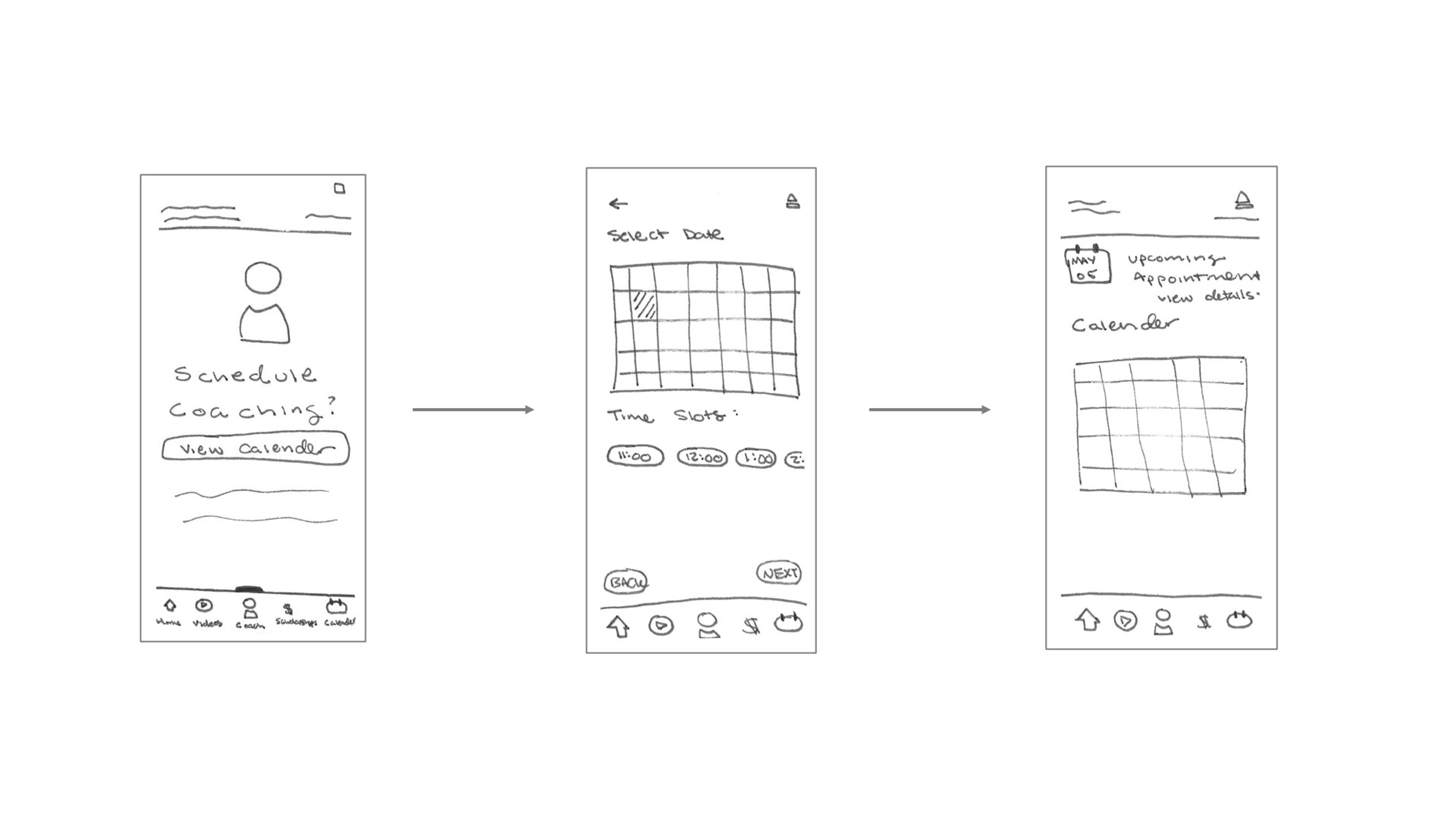
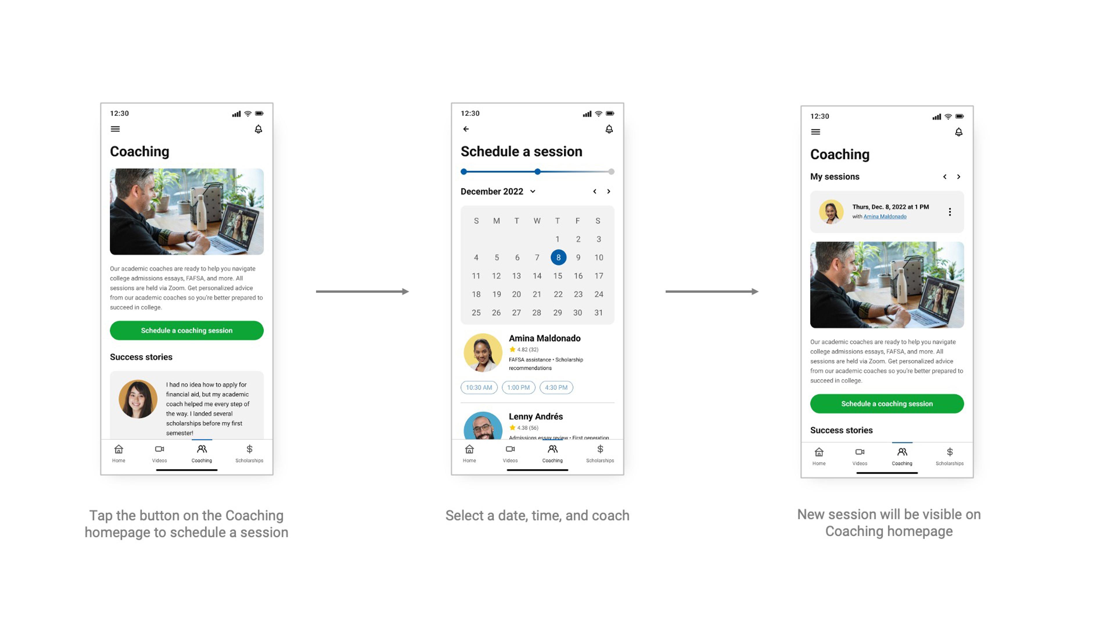
Users will also easily be able to schedule academic coaching from the app. After selecting a plan—either a monthly session or one-time session—they can select a date, time, and coach.
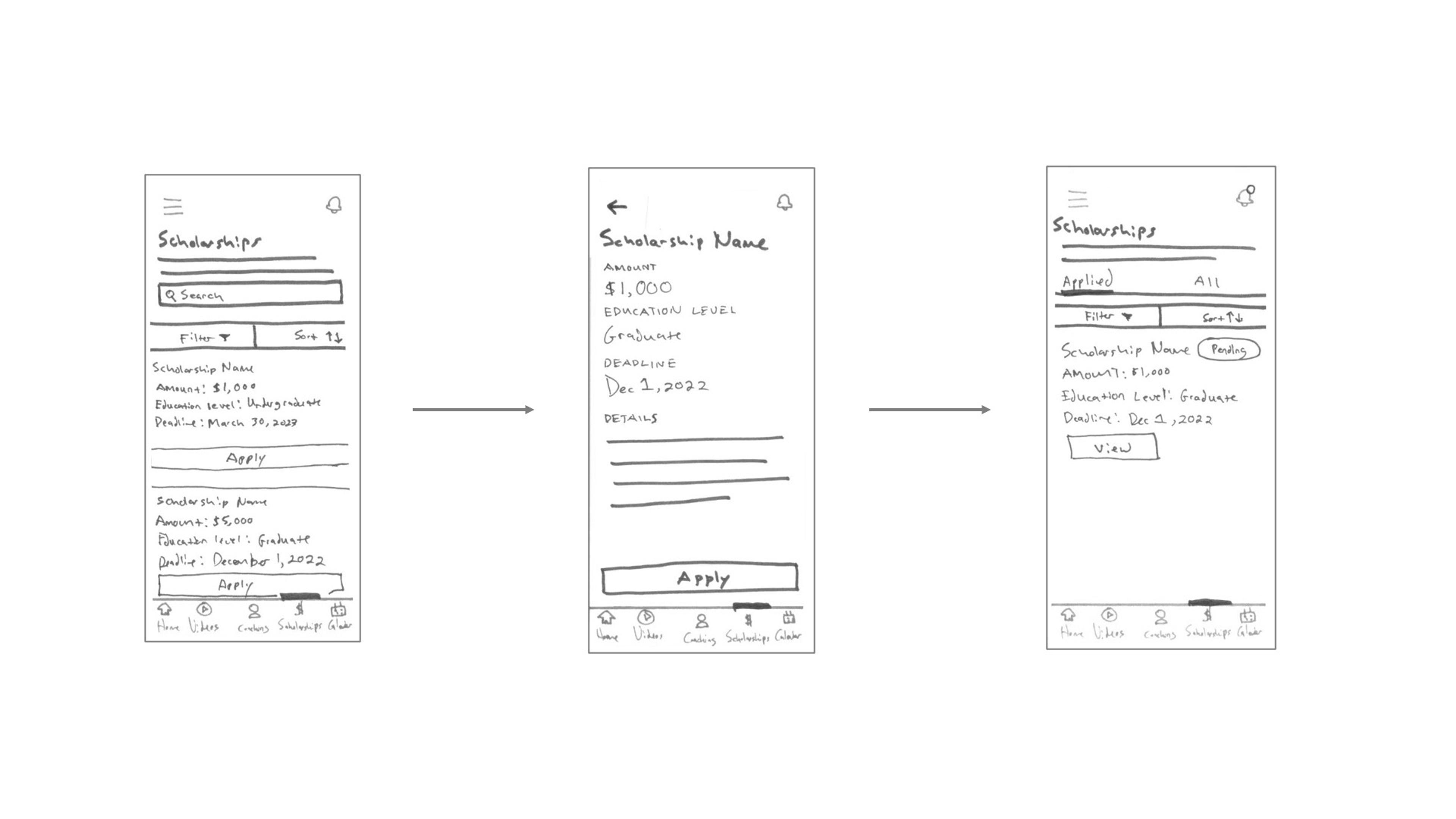
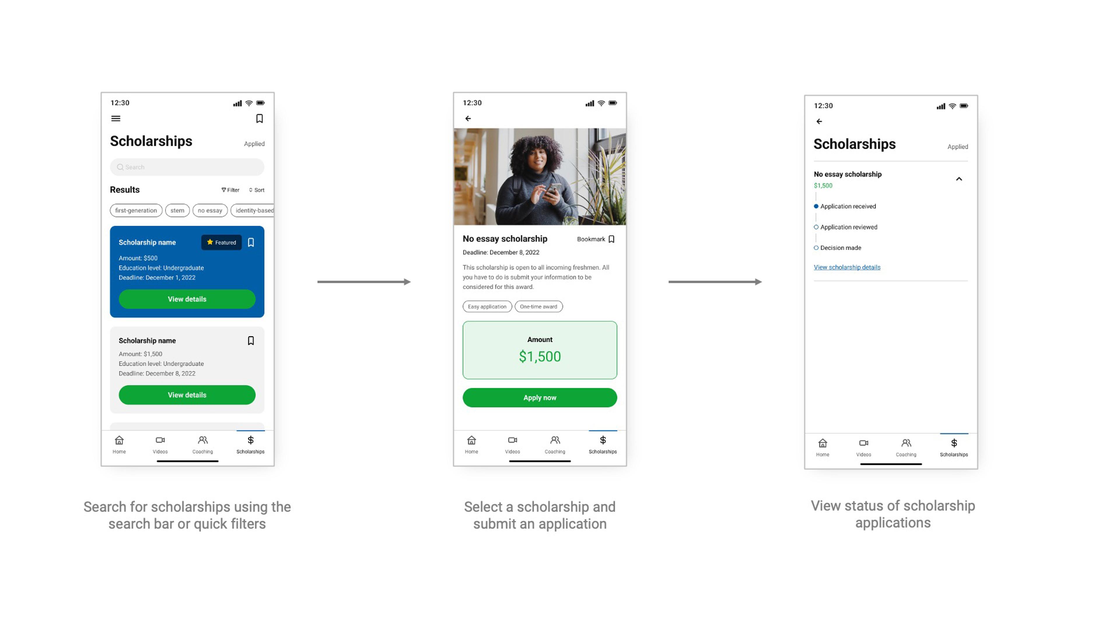
Epic: Apply for Scholarships
Finally, we will integrate a scholarship application portal. This will allow users to easily search for and apply for different kinds of scholarships.
Design system in Figma
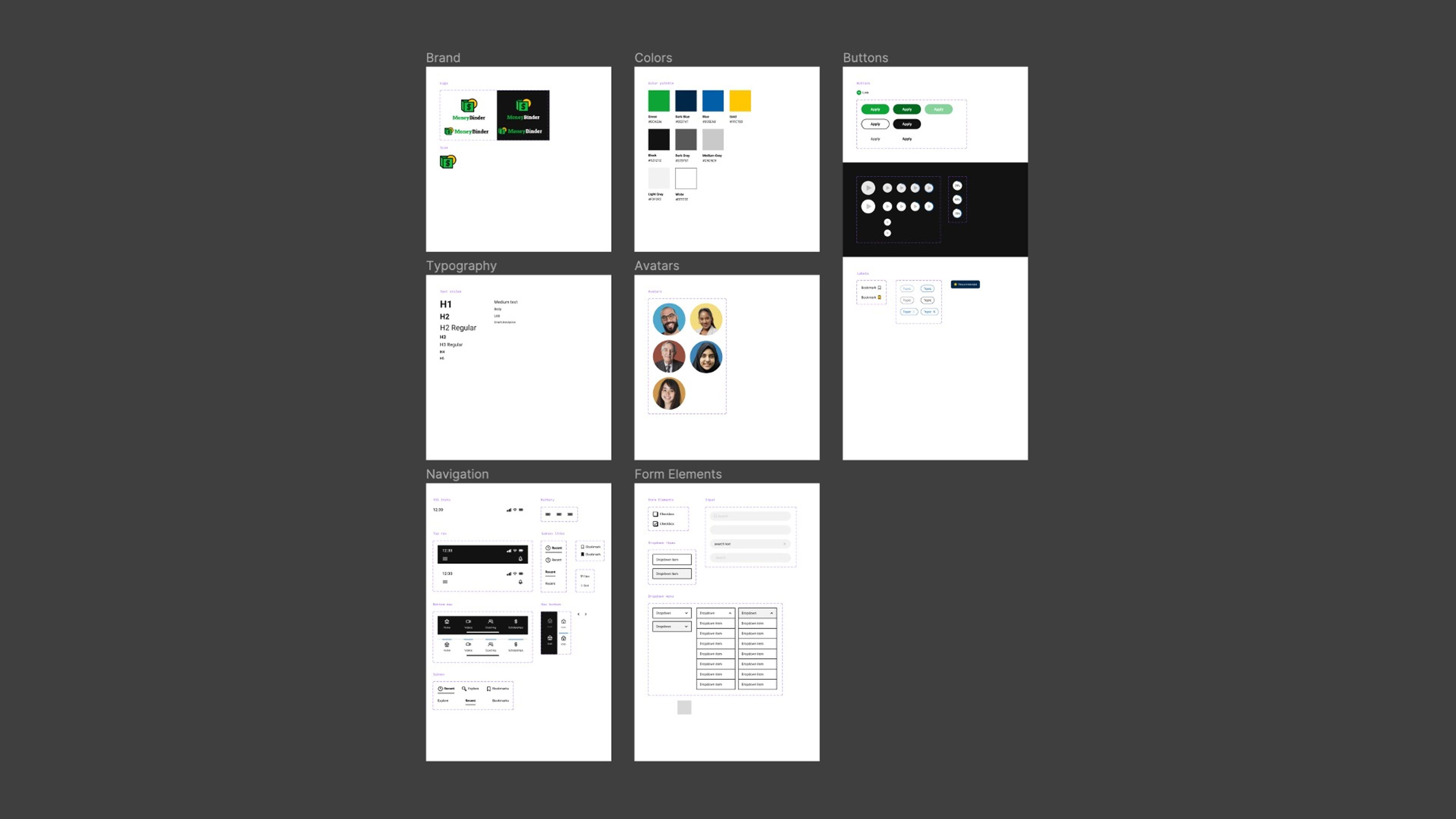
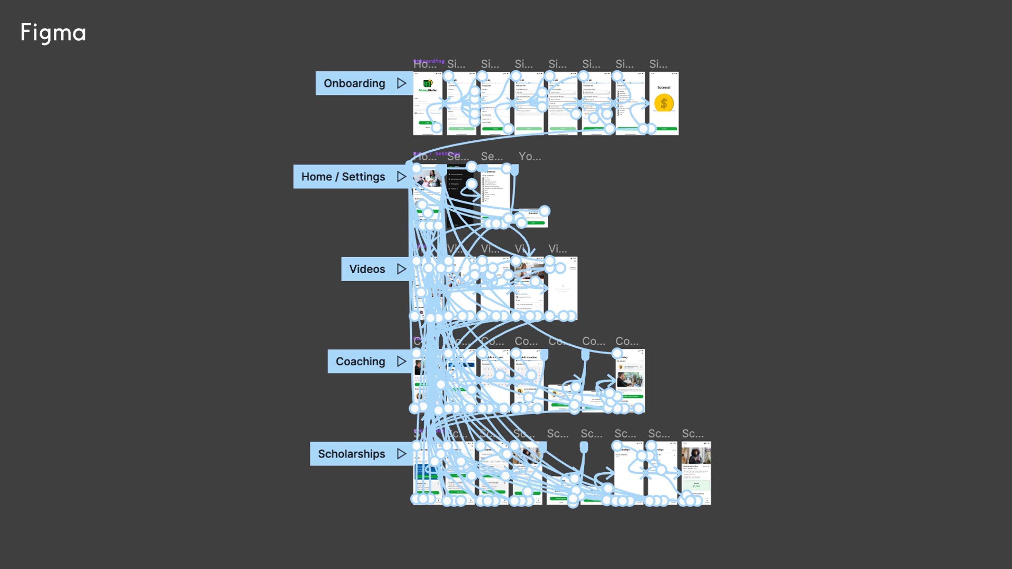
During the design process, we created a design system in Figma with reusable components. This allowed us to maintain visual consistency throughout the experience and quickly update and iterate our prototypes after usability testing.
User Testing
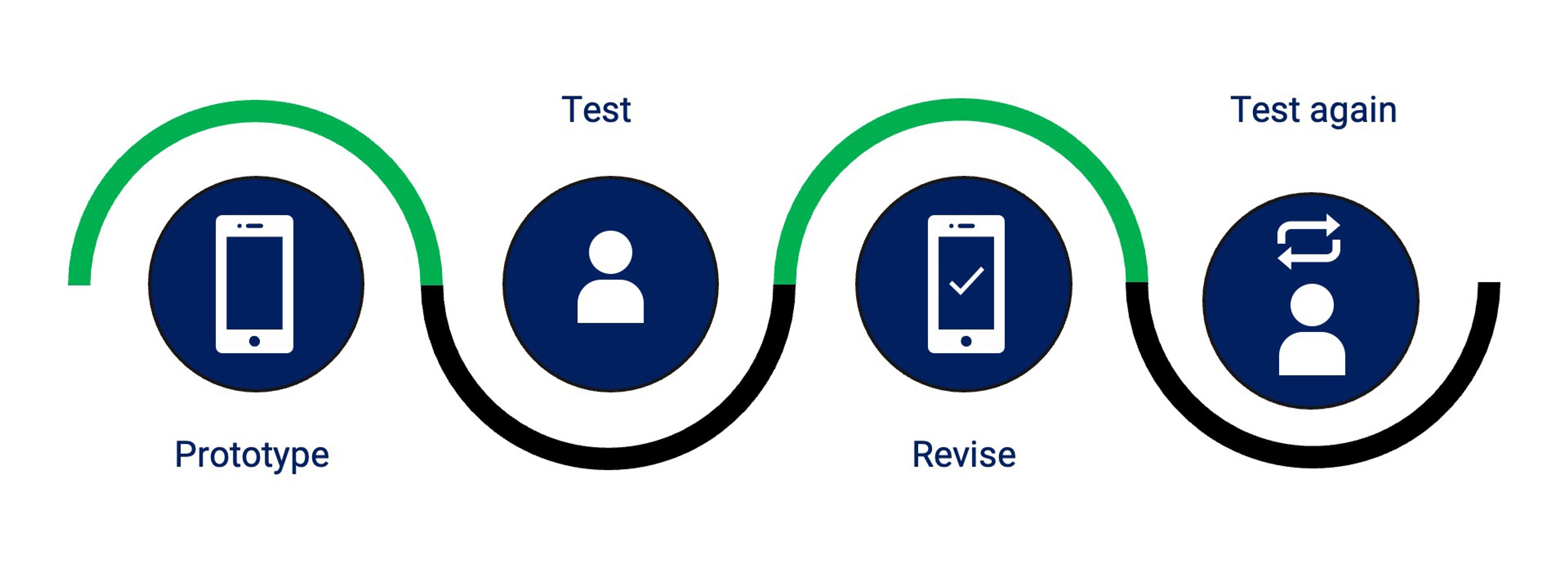
After creating our initial layouts, we tested them with real users to validate our concept and identify areas we could improve. We usability tested by prototyping, observing user interactions with the prototypes, revising our designs based on observations and feedback, and testing again.
Prototyping in Figma
Methods and tasks
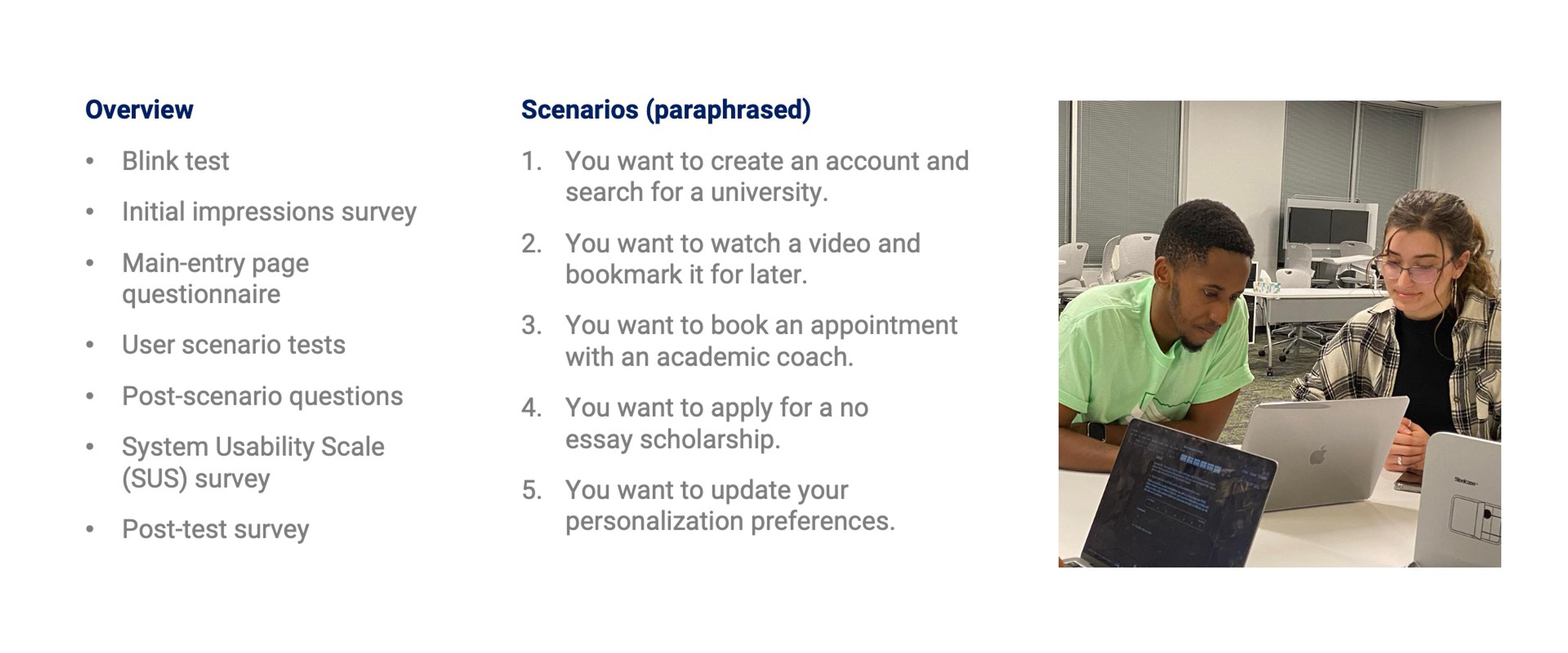
Our usability tests were conducted in 2 rounds of 10 sessions with high school seniors and current college students. They were asked questions and given several tasks to complete while we observed and took notes. We used Rapid Iterative testing and Evaluation to capture their feedback and quickly make improvements.
Results: Round 1
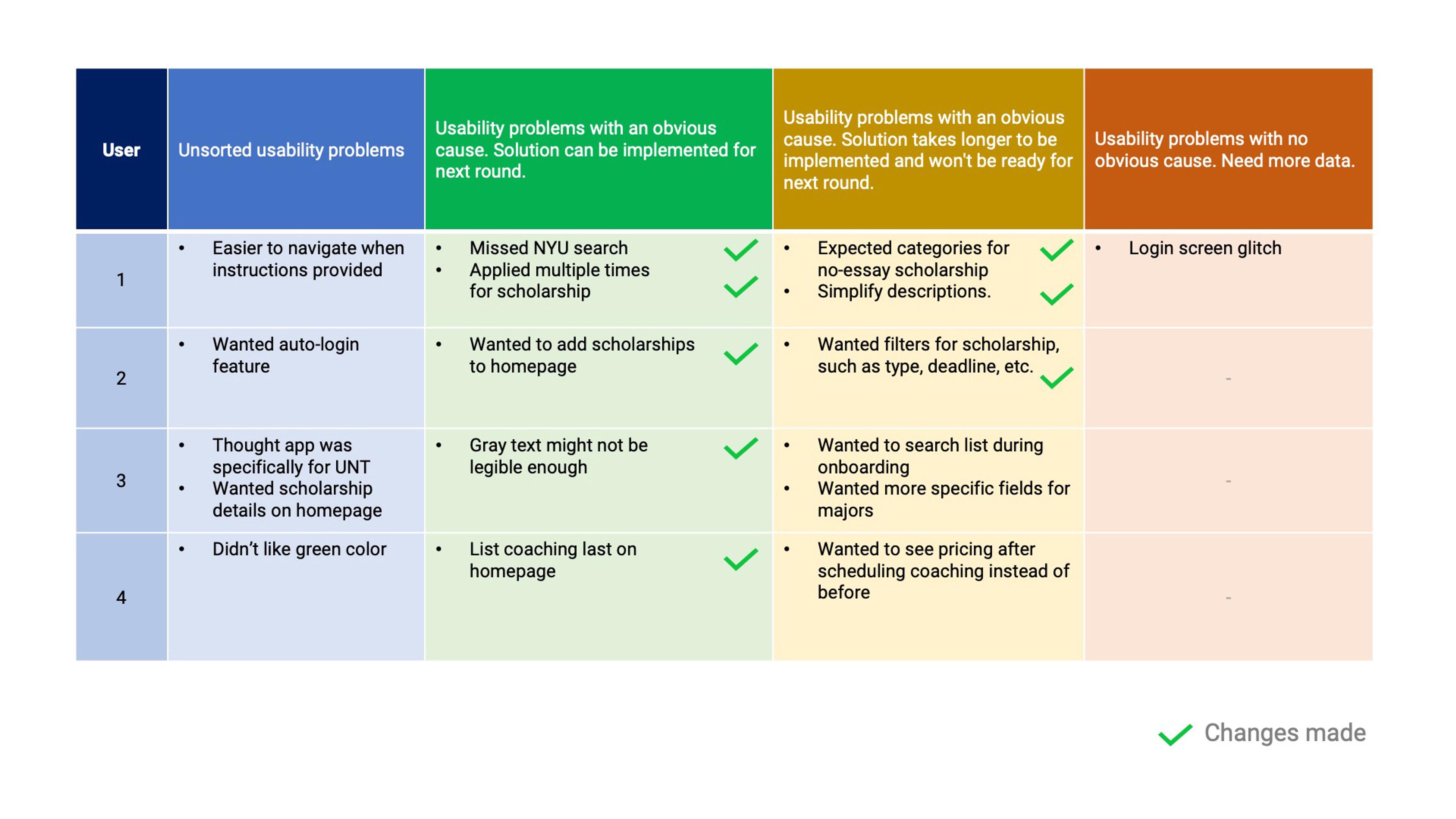
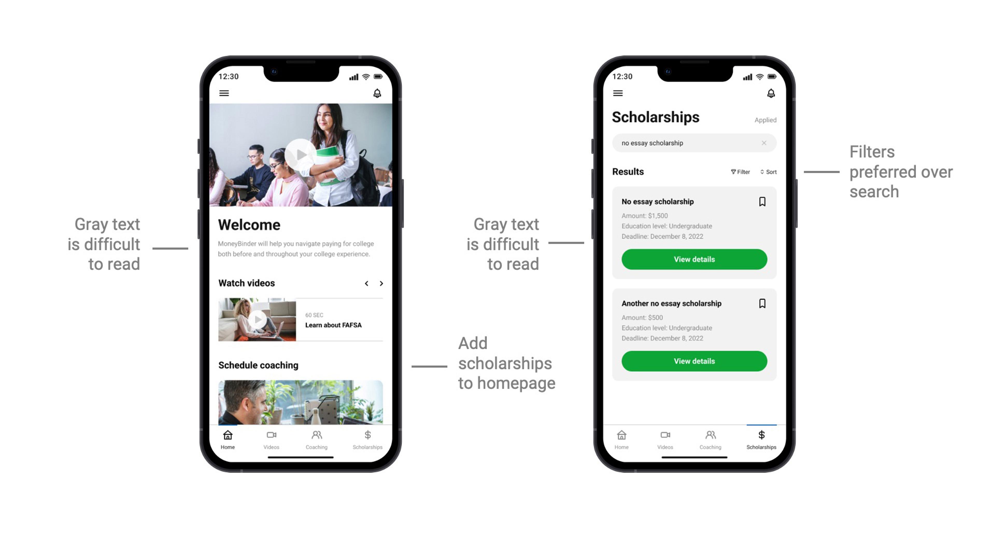
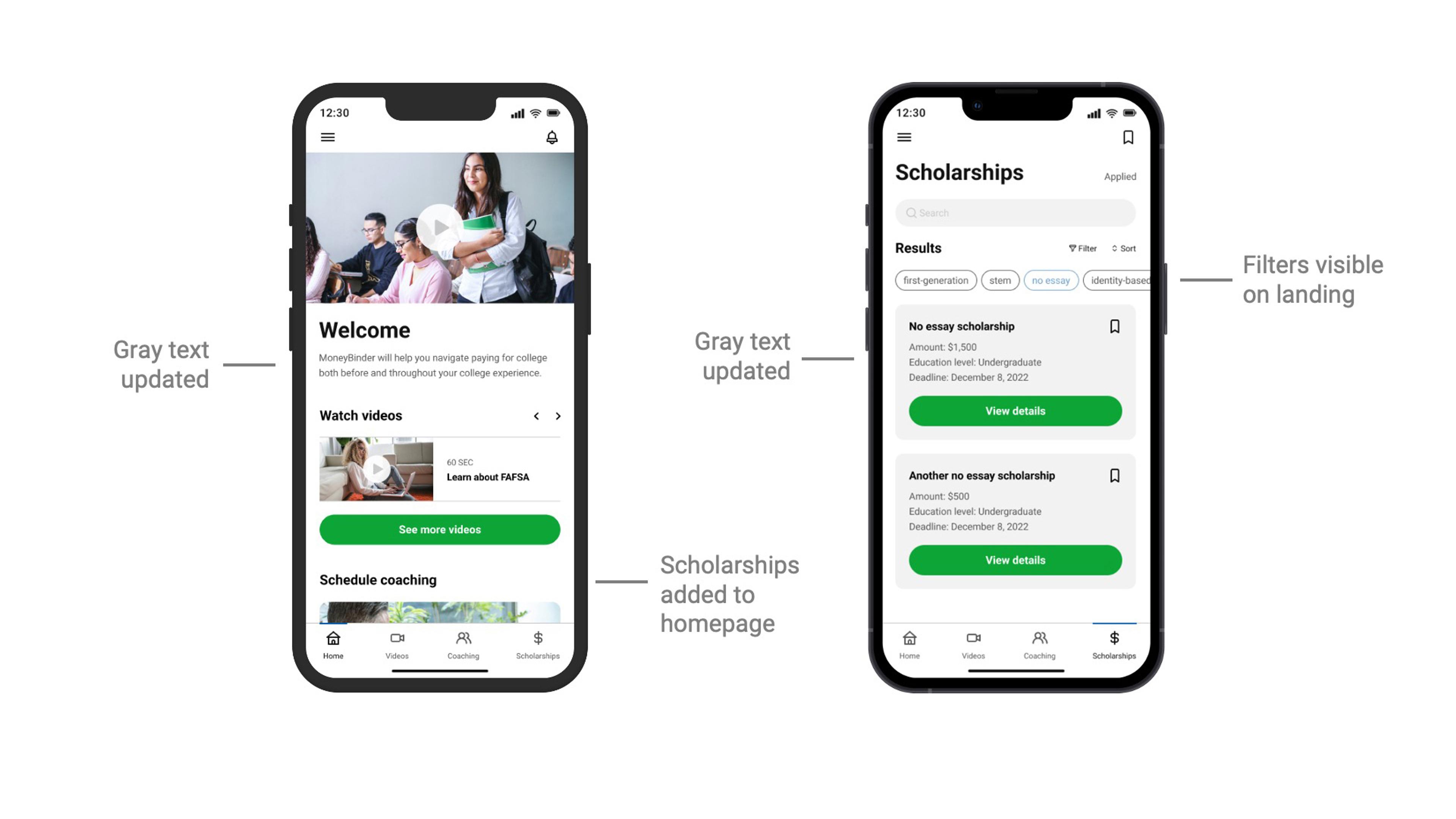
Our Rapid Iterative Testing and Evaluation study began with 4 participants. Our results were categorized on a table and prioritized based on feasibility and impact. One recurring issue was the lack of filtering capability on the scholarships page. Though this feature would exist on a functional implementation of our app, it did not exist during prototyping, which was frustrating for our users. We added quick filters before the final test, which were used to search for scholarships instead of the search bar. We changed the layouts based on this feedback and conducted a second round of usability testing.
Results: Round 2
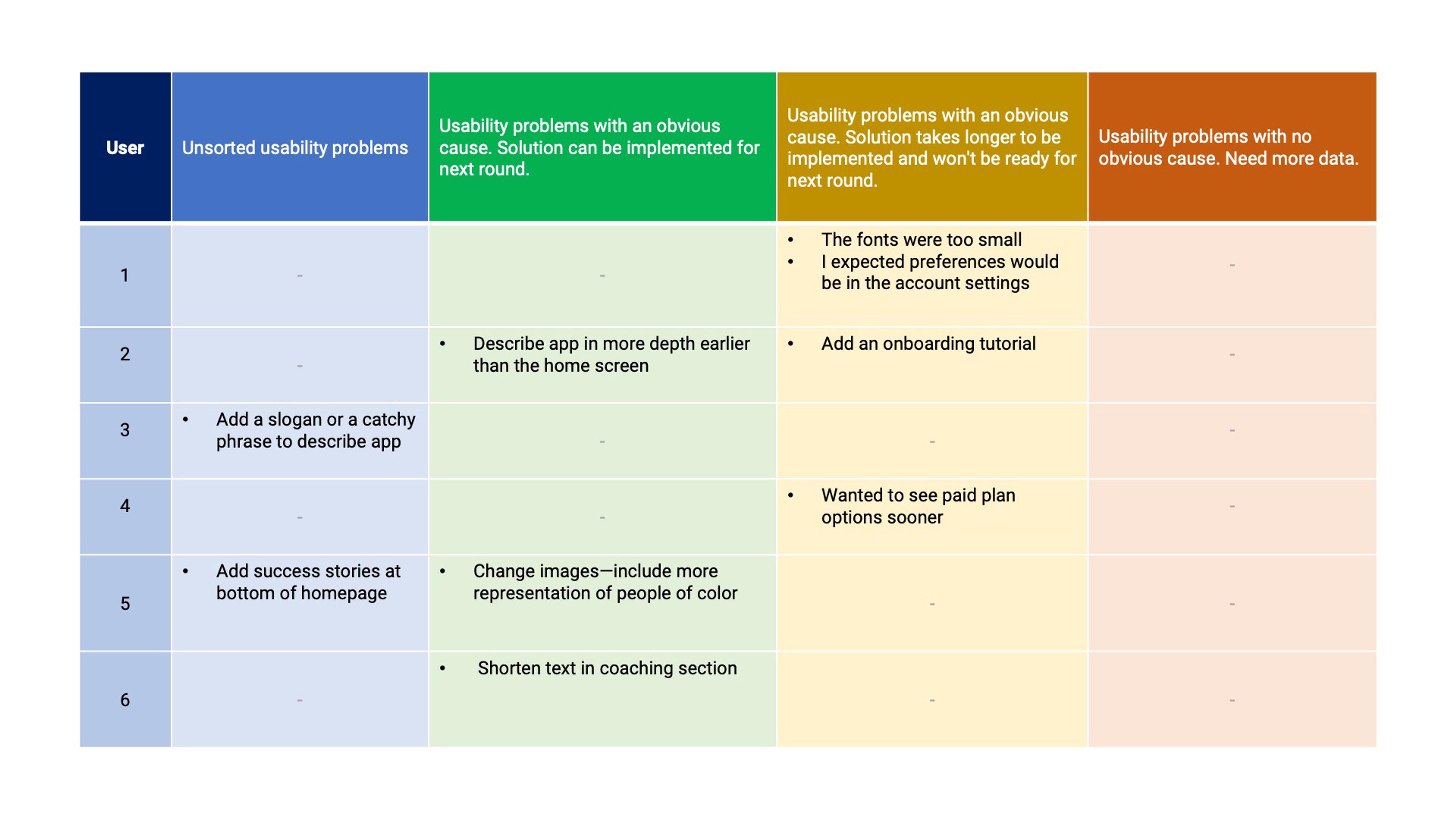
We then validated our changes second round with 6 more participants. There were far fewer usability issues on the second round and users mostly provided feedback regarding branding, pricing, and more complex feature requests than we could deliver for this project.
System Usability Scale (SUS)
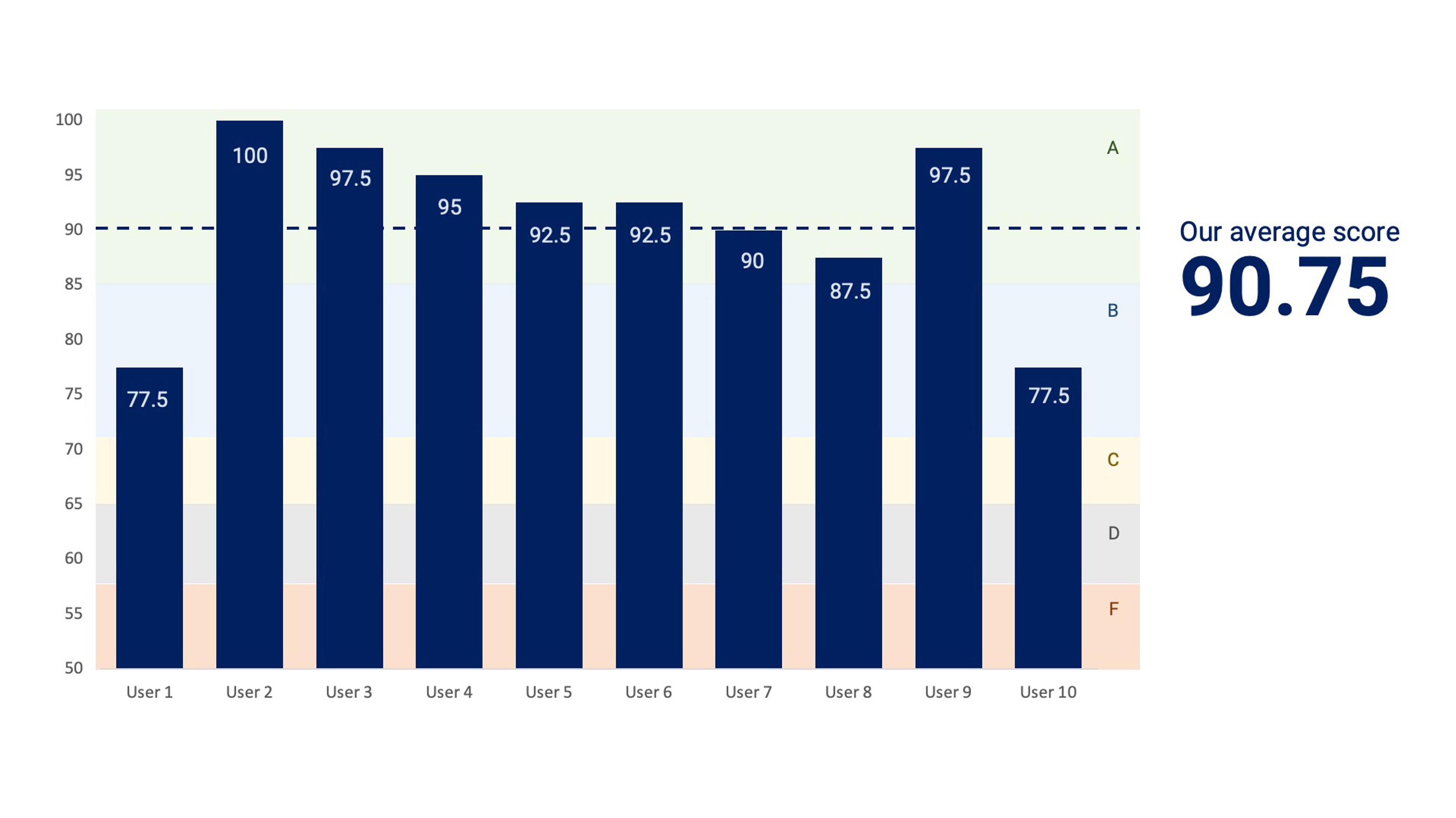
The most dramatic improvement in usability occurred after the first test, with our initial SUS score in the 70's and nearly all of our final scores were above 90. Our average SUS score after testing was 90.75.
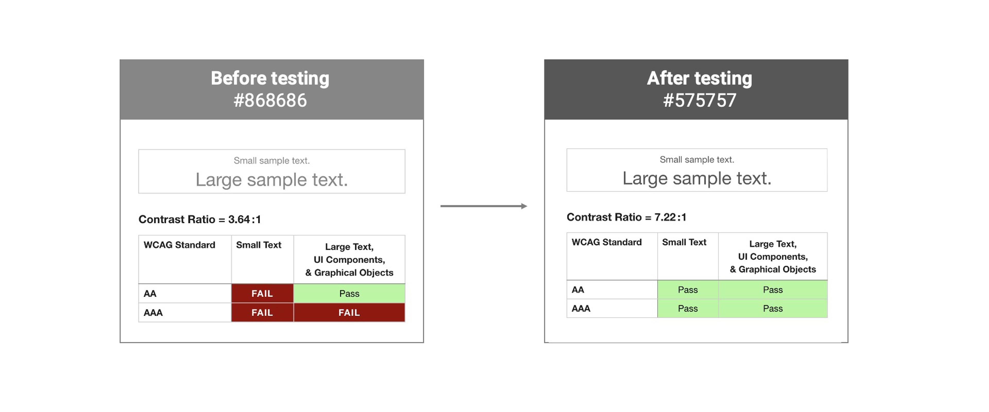
Accessibility
Revisions
Though our app didn't require substantial edits after the first round of tests, these two screens received the most updates. Here's how they looked before and after testing.
Next Steps
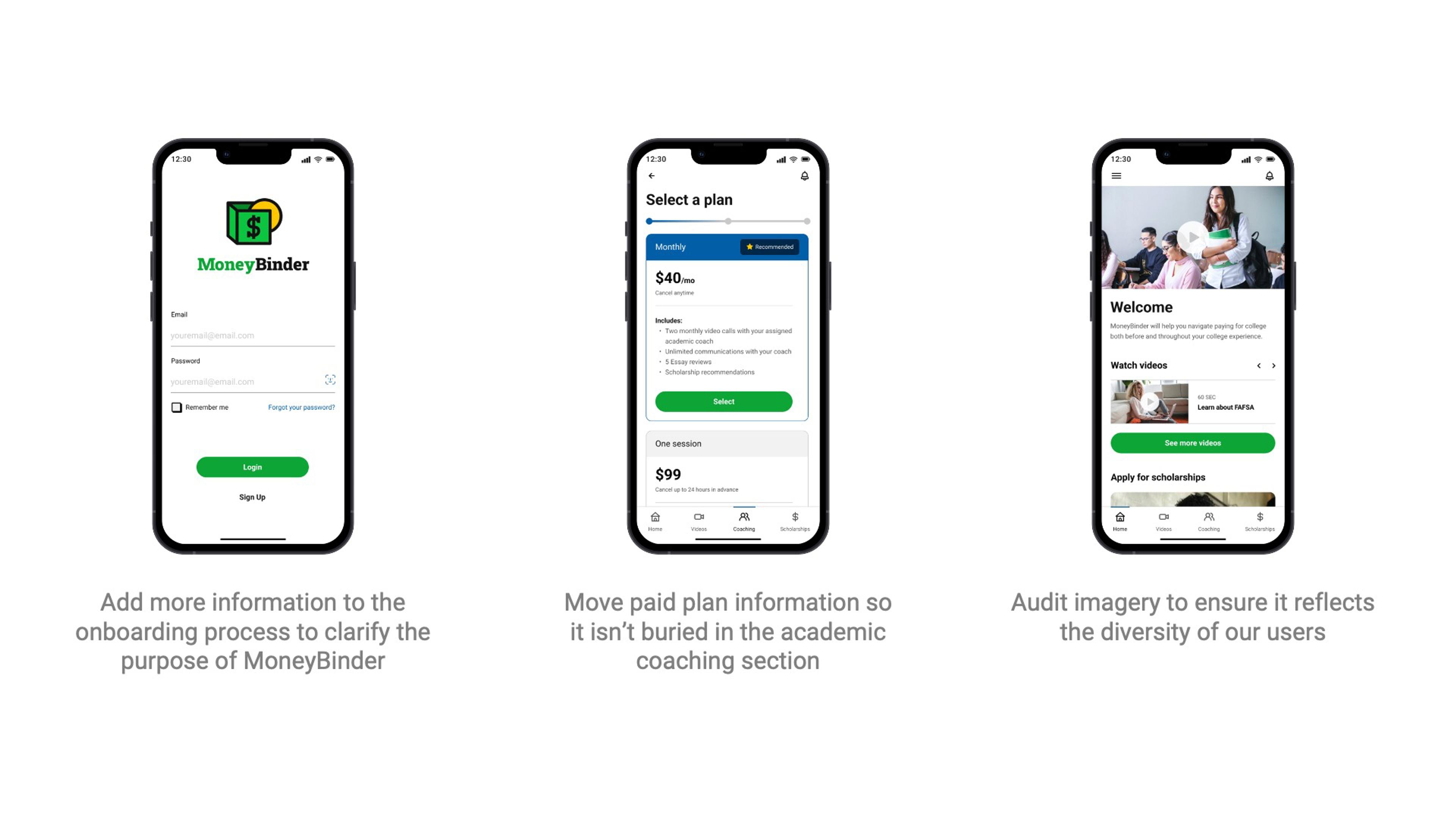
Our final round of user testing revealed a few content and UI updates we should make as our immediate next steps. For example, our users wanted more information about the purpose of the app sooner in the onboarding flow. They also wanted to know about any paid features earlier in the process, rather than as the second step of the academic coaching flow. Most importantly, we were encouraged to closely examine our use of photography to ensure we were inclusive of a wide variety of people.
Future Upgrades
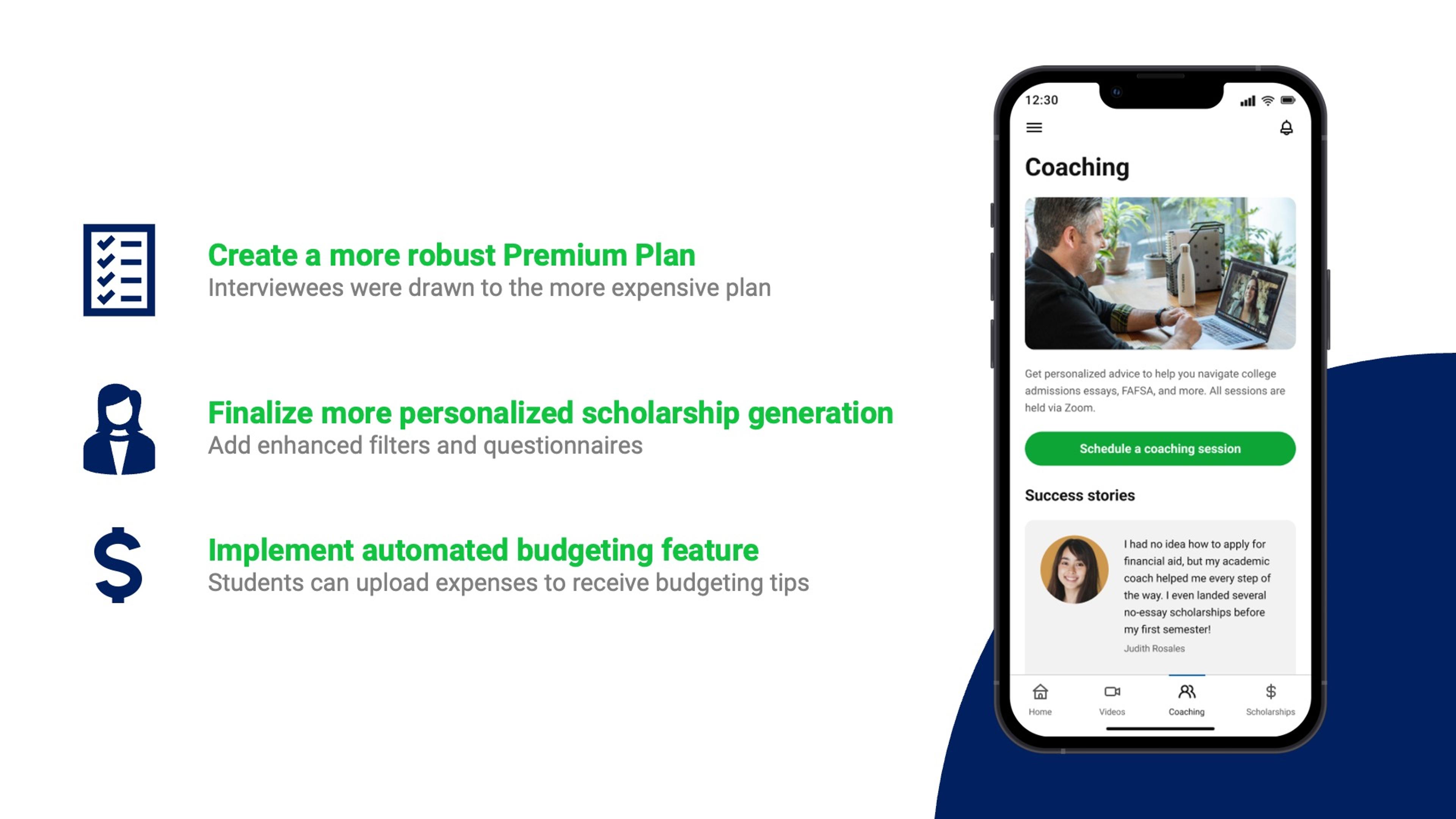
Finally, we focused our concept on differentiating features, but one of our early concepts centered around budgeting for college finances. We would hope to integrate budgeting tools in a future implementation so MoneyBinder becomes a one-stop shop for all things related to college finances.
Conclusion
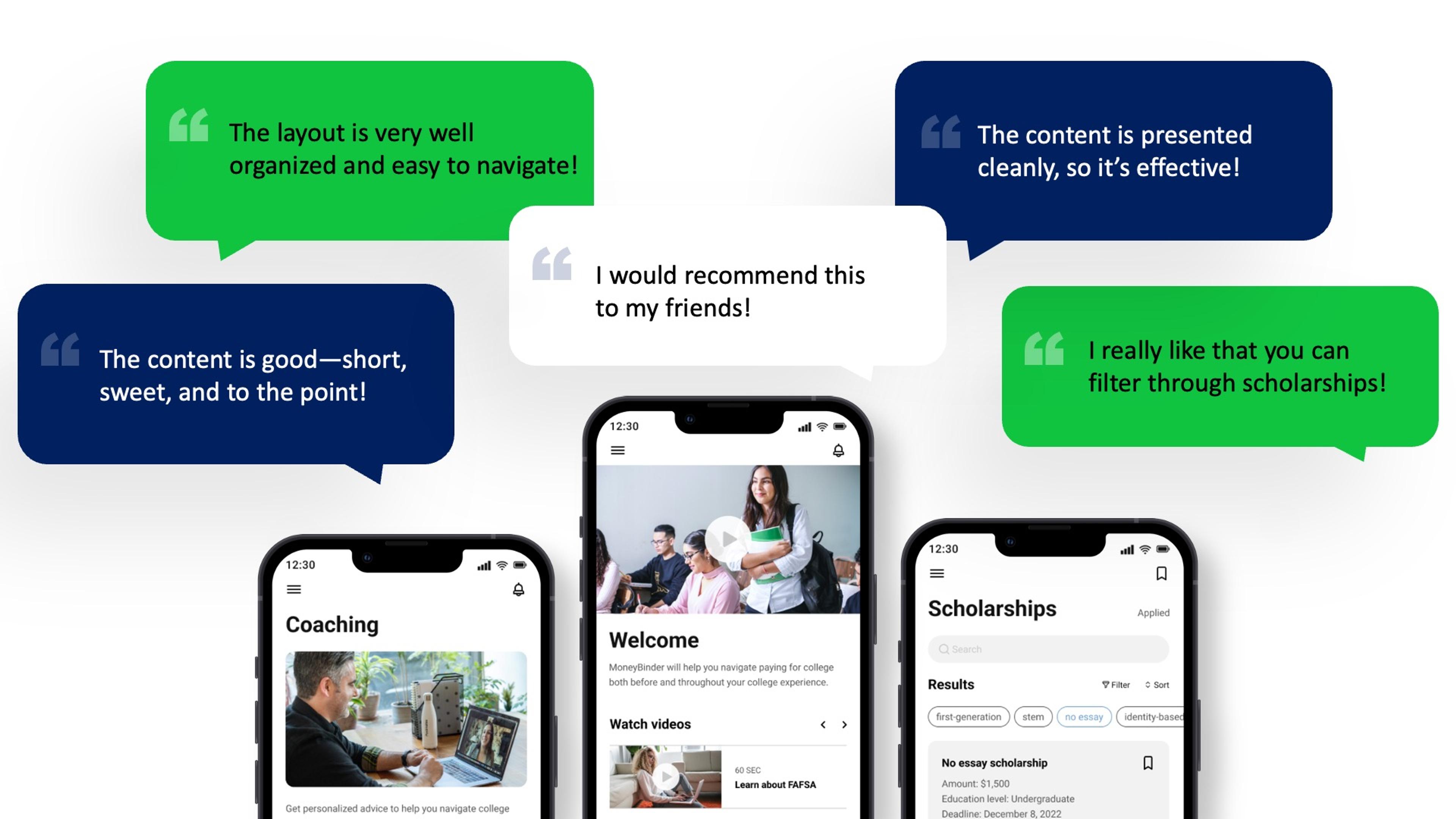
Our MoneyBinder project validated our hypothesis that there’s a need and a want for this kind of product. So much so that at the end of the interviews, our participants asked us if our concept was going to become a real thing so they can use it. This is how we knew our concept was something that could help our users pay for college and avoid debt.
Team
