Member Lead Capture

Summary
These pages were designed to help inform potential new foundation members about the benefits of membership. Prospective members would have access to detailed information regarding each level of membership and the ability to easily contact the foundation if interested.
Problem
The process of becoming a paying member did not match the value provided by the foundation or the cost associated with membership.
Role
- Layout designs in Figma
- QA with developers
- Contact form development in React
Links
Introduction
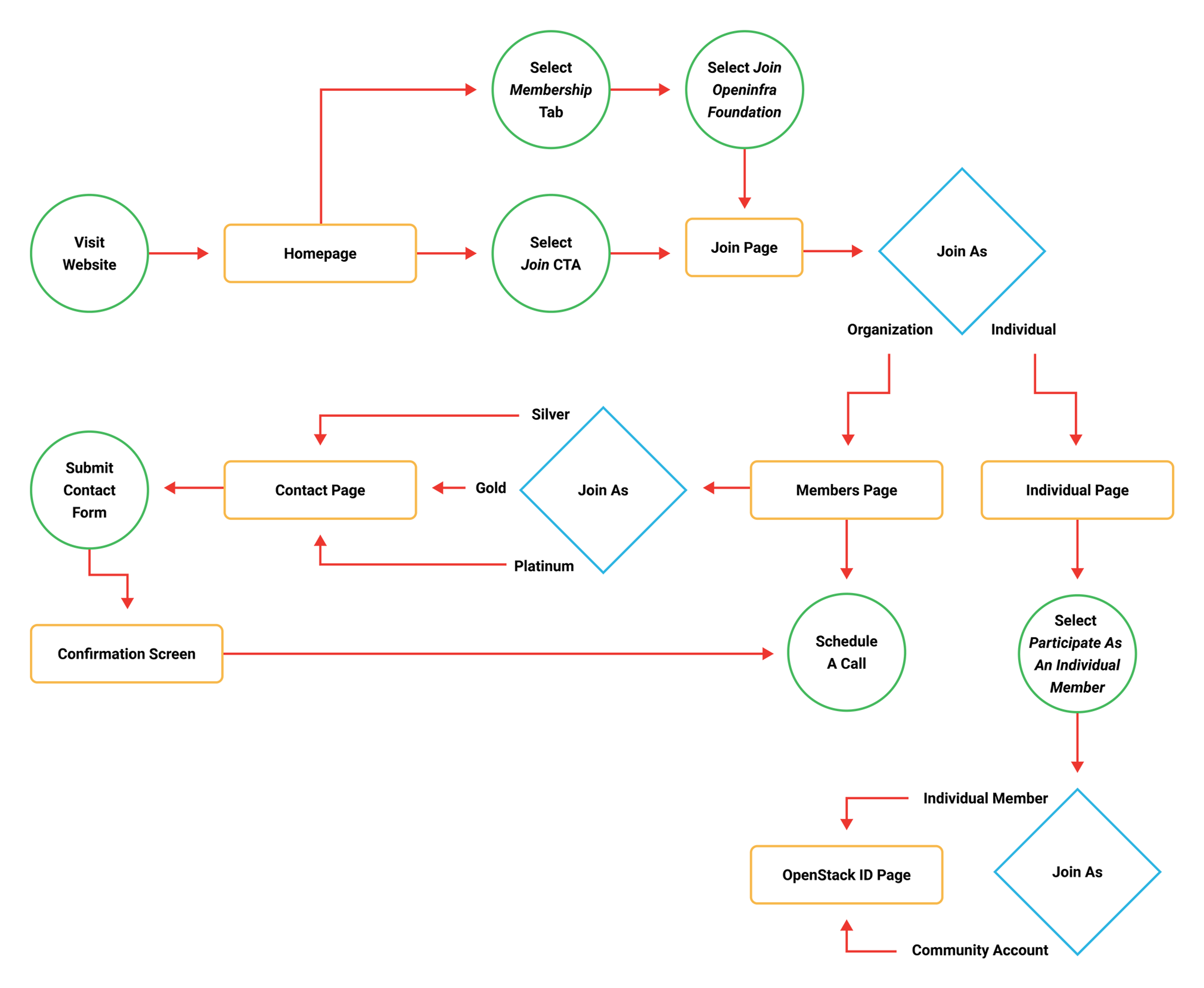
Signing new members is essential to the foundation’s business model. However, there was no easy way for prospective members to find information on the website about membership benefits and contact the foundation regarding their interest. The user flow below illustrates the journey we expected prospective members to follow as they went through the process of visiting the website and contacting the foundation.
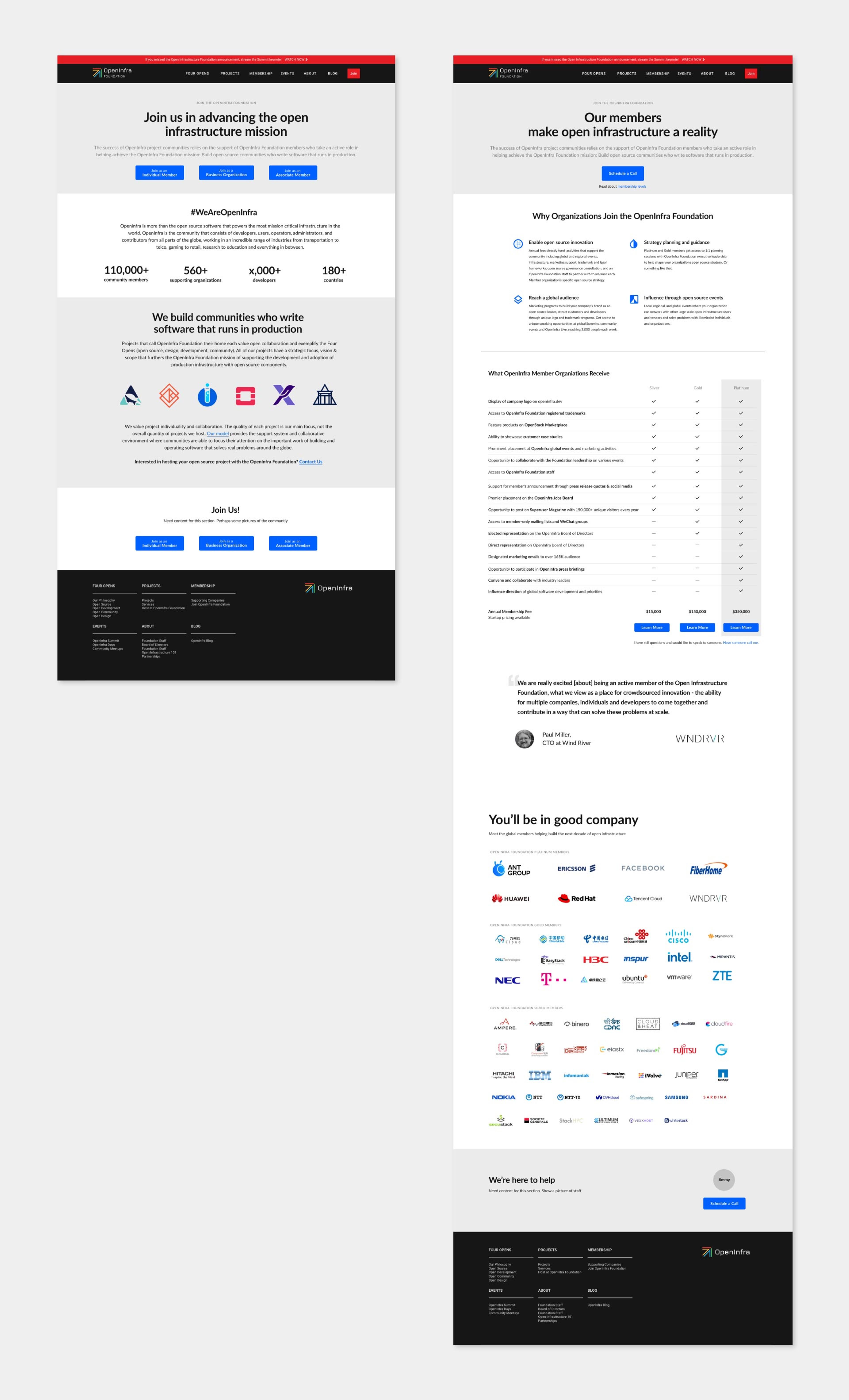
Wireframes from Wes Wilson
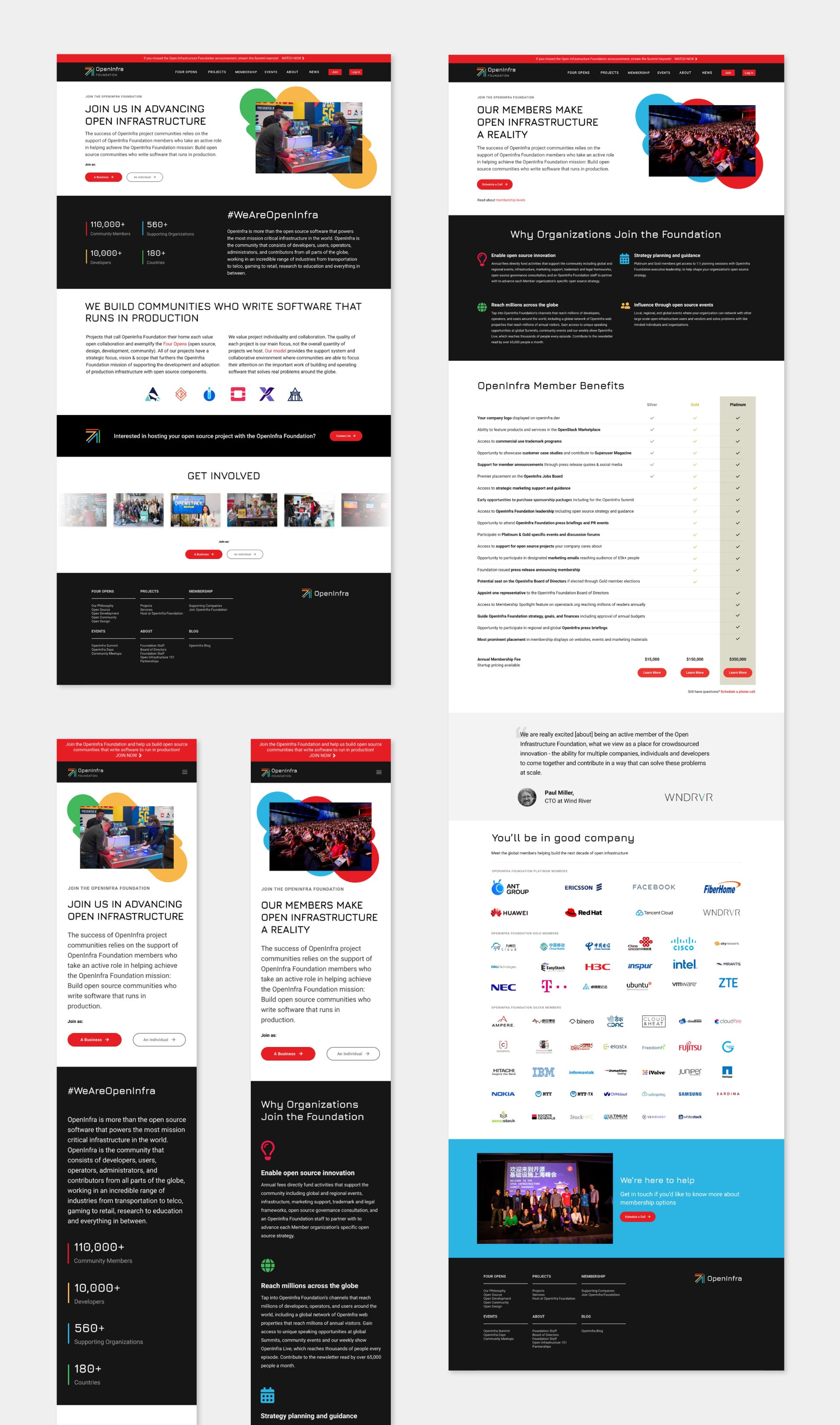
After Wes Wilson created wireframes and assembled content, I styled the layouts and ensured brand consistency. When the team was happy with the visual design, I transferred the layouts to the developers at Tipit to build the production versions of the web pages.
Form Component
Designing the layouts was an important first step in the process, but ultimately we wanted to prospective members to submit a contact form linked to our Salesforce database, which became the source of truth for member information.
Jimmy McArthur generated a contact form linked to Salesforce we could embed on all foundation managed websites. I was tasked with refining the form so that it could be easily restyled to match different software project brands and capture prospective member level information at the end of the member lead capture journey. I first created a functional prototype in React to gain internal buy-in of the idea.
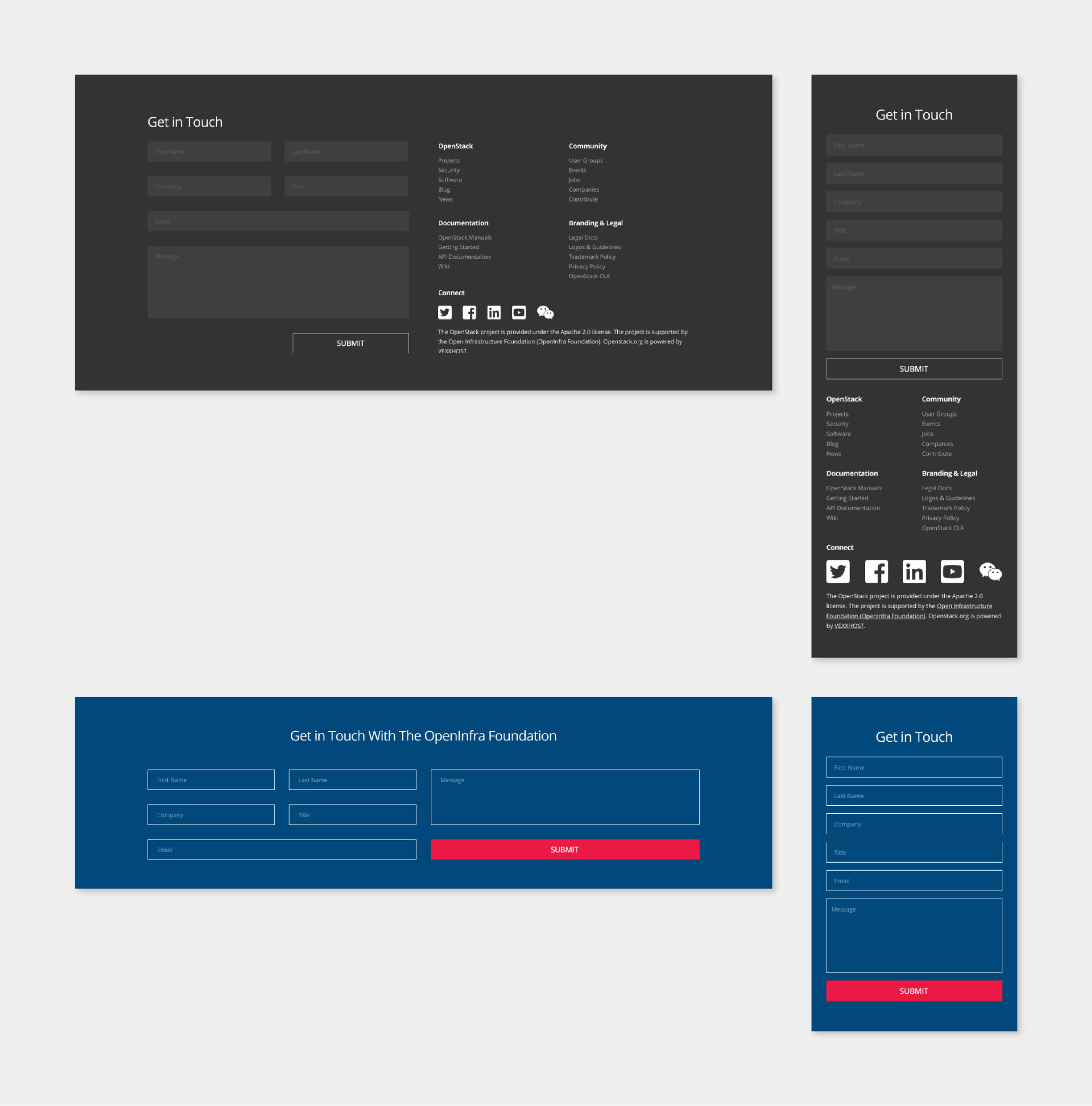
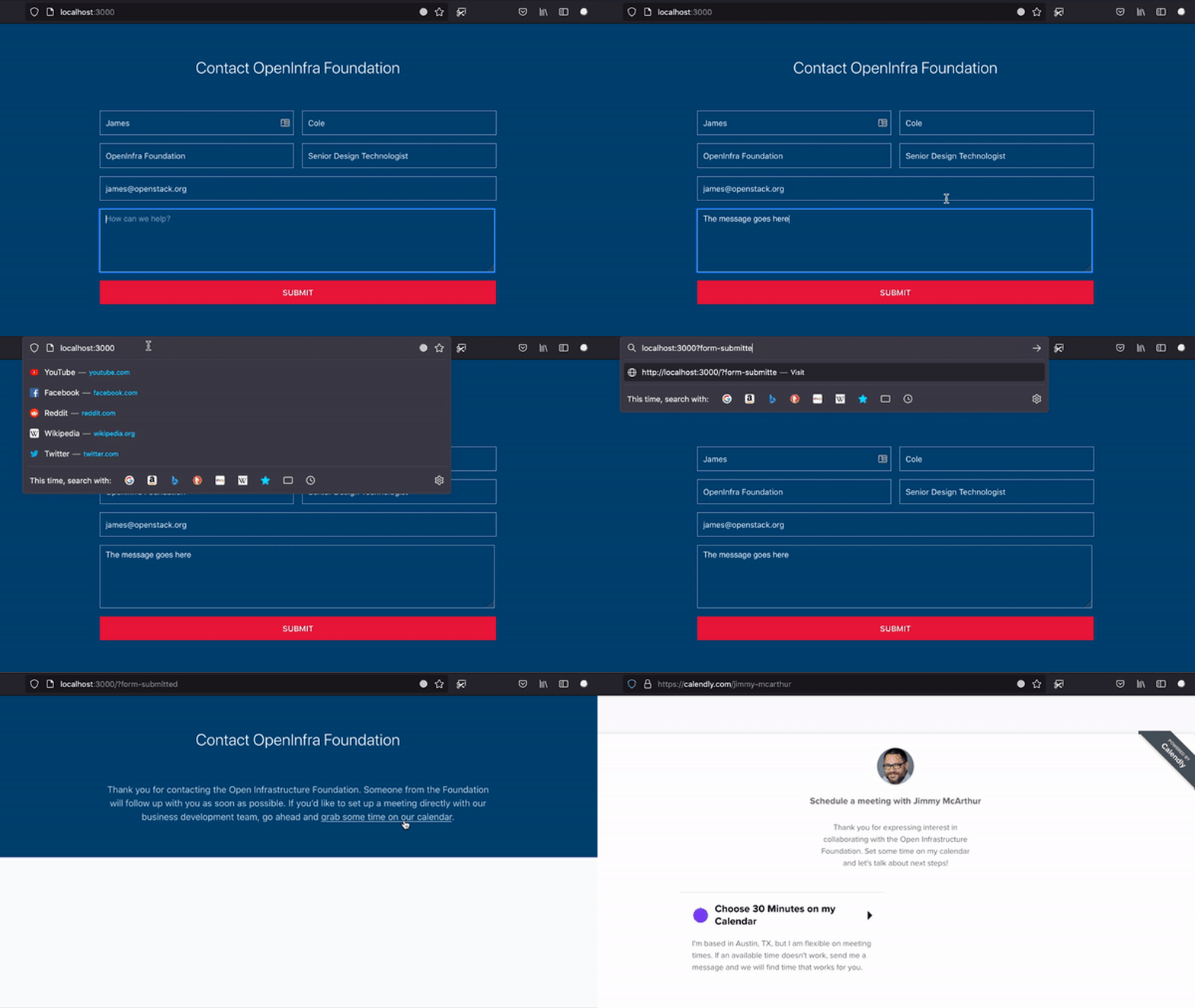
One challenge of this project was that the default form behavior directed users to a blank page on submit, and did not automatically display a confirmation message. To address this omission, I wrote a function to append a query string to the URL and redirect users back to the form on submit. If the document saw the query string in the URL, it hid the form and displayed a confirmation message encouraging users to schedule a meeting.
Once the basic functionality was established, I added the form to the foundation’s website as part of a Contact page. I updated the style variables to match the foundation’s branding and added additional logic to capture member lead information. If a user landed on the form after clicking one of the member level buttons, a query string related to the member level would be passed to the Contact page URL. If the document detected the query string, it added placeholder text to the form related to the member level.
Results
Traffic to openinfra.dev/join increased 47%
Monthly pageviews increased from 2,463 in May 2021 to 3,617 in September 2021 and have remained ~1,000 higher than May 2021 since the new pages launched.
The foundation signed 2 new members, representing $20k
As of January 2022, the foundation converted 2 of 8 valid leads to Silver Members for a total of $20k in membership fees through the join/members pages.
Demo
