OpenInfra Design System

Summary
Staff frequently requested new landing pages and increasing numbers of people were contributing visual design work to the organization. The pages usually needed to be designed and deployed quickly, leaving little room for QA.
Creating a design system would improve the efficiency of the design and development processes, reducing the friction involved when launching new pages.
My role in this project involved auditing the foundation's website, identifying commonly used design patterns, creating components and styles in Figma, and publishing the design system on the foundation's brand guide website.
Problem
OpenInfra Foundation staff needed an efficient, scalable system to quickly design, develop, QA, and deploy consistent web pages so they could effectively communicate the organization’s value to current and potential members.
Role
- Conducted website audit
- Designed initial components in Figma
- Published design system on brand guide website
Process
The process of designing new web content at the OpenInfra Foundation is best categorized as Lean UX, whereby a minimum viable product is launched as quickly as possible with the goal of refining it over time. However, because so much emphasis is placed on shipping early and often (i.e. quickly), sometimes quality checks fall through the cracks after a project is deployed. As a result, substandard visuals and code are sometimes copied in multiple locations to save time, leading to inconsistencies, technical debt, and duplication of efforts when components need to be fixed. This makes the option of quickly launching new pages while conveying a high-quality standard increasingly difficult.
To amplify this problem, more people began contributing design and devlopment across multiple web properties. The added complexity and inconsistency would increase the learning curve for future contributors, forcing reliance on a small group of experienced designers and developers already familiar with the brands.
I began to address these issues by pitching the idea of a design system so commonly used styles and components for the openinfra.dev website could be standardized and documented. After attending the Figma Schema Conference 2021 online and subsequently reading "Expressive Design Systems" by Yesenia Prerez-Cruz I decided to begin by composing a set of design principles to help current and future designers evaluate design work. This would be useful to not only identify potential design system components, but also to determine whether a design aligned with organizational values more broadly.
Design Principles
- Open: Is the design open to feedback from other people?
- Simple: Does the design avoid unnecessary complexity?
- Flexible: Can the design be repurposed to work in different contexts?
- Accessible: Is the design representative of our global audience?
Website Audit
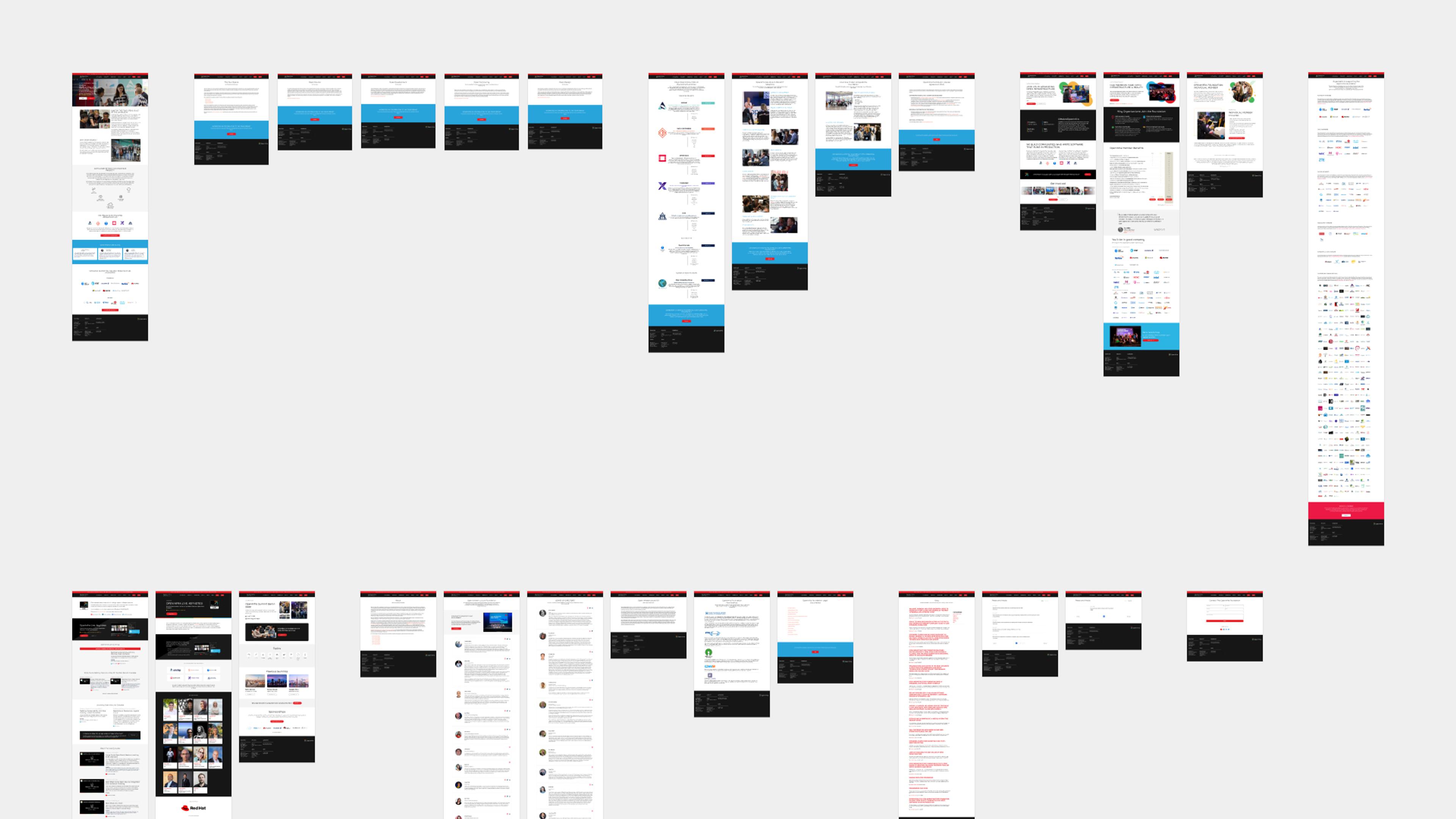
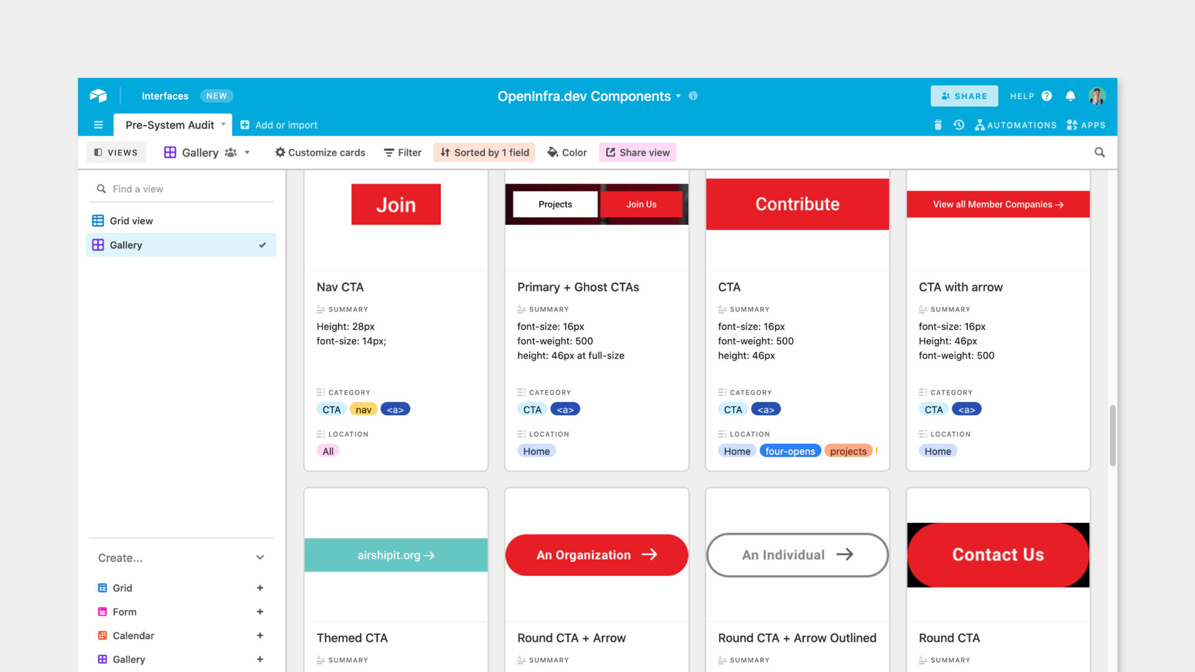
After inspecting every page of the website, I populated an Airtable spreadsheet with screenshots of individual elements to categorize the various styles and components present on the website and identify inconsistencies in implementation.
Styles
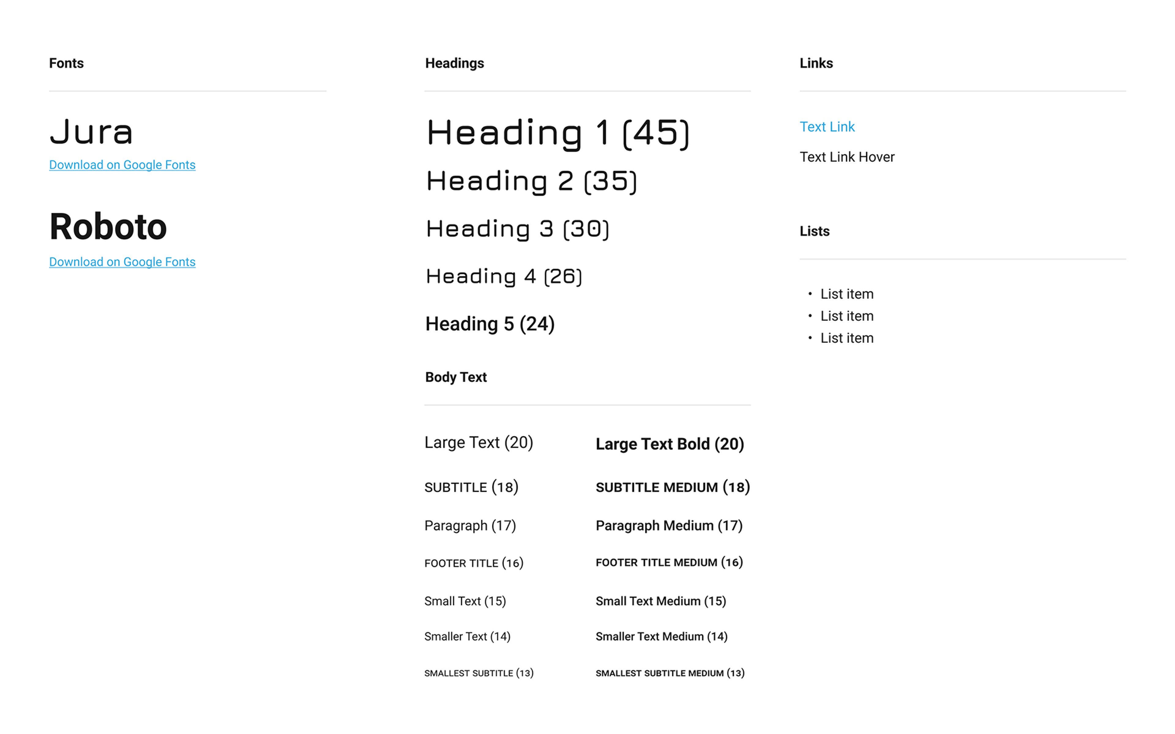
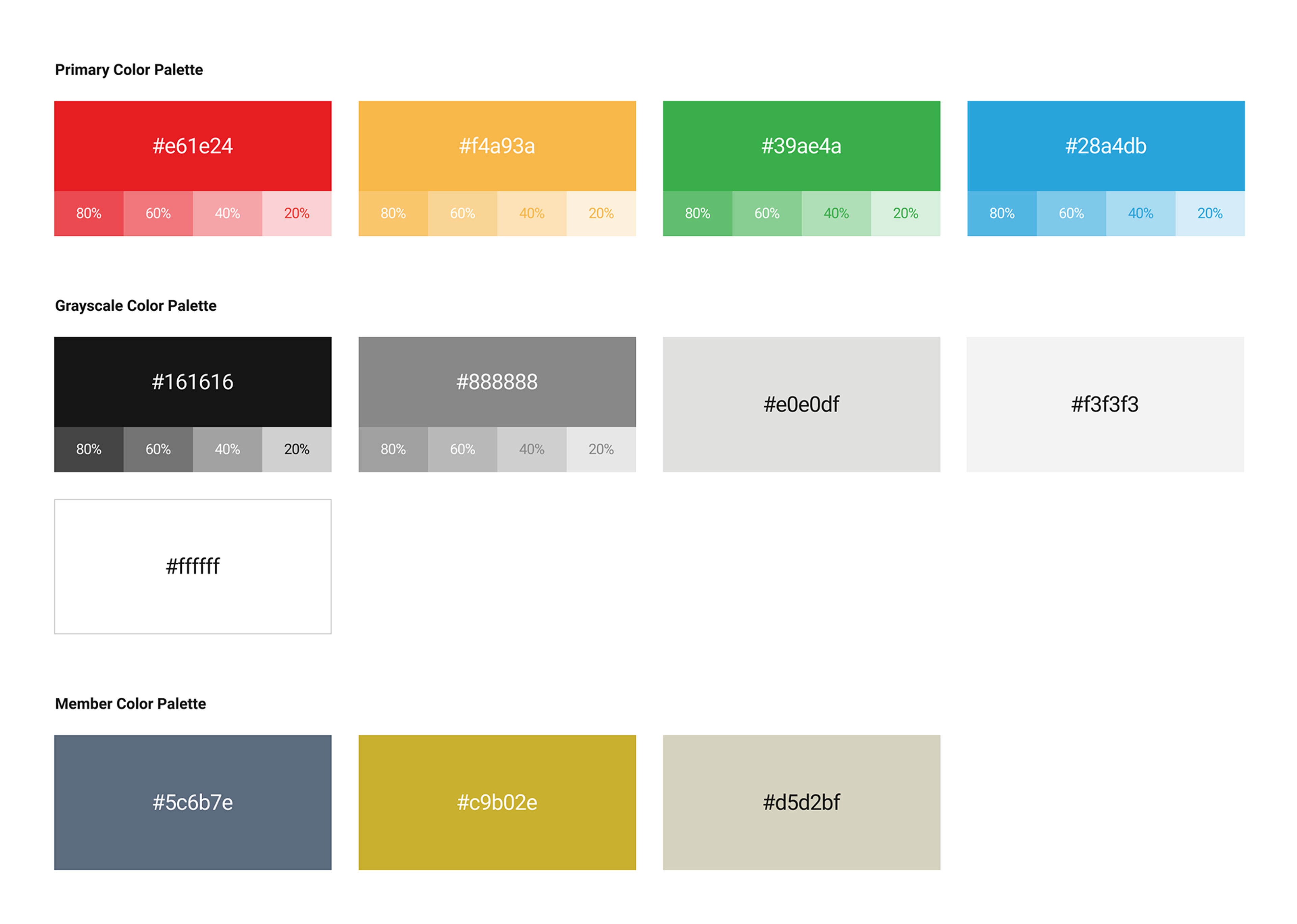
The website audit revealed we were doing a pretty good job of maintaining visual hierarchy across the site but there were many small variations in styling with no apparent justification. The design system seemed like an appropriate tool for both documenting these styles and making them accessible to everyone inside and outside the organization. I started by adding the text styles and brand colors to the design system.
Components
Buttons
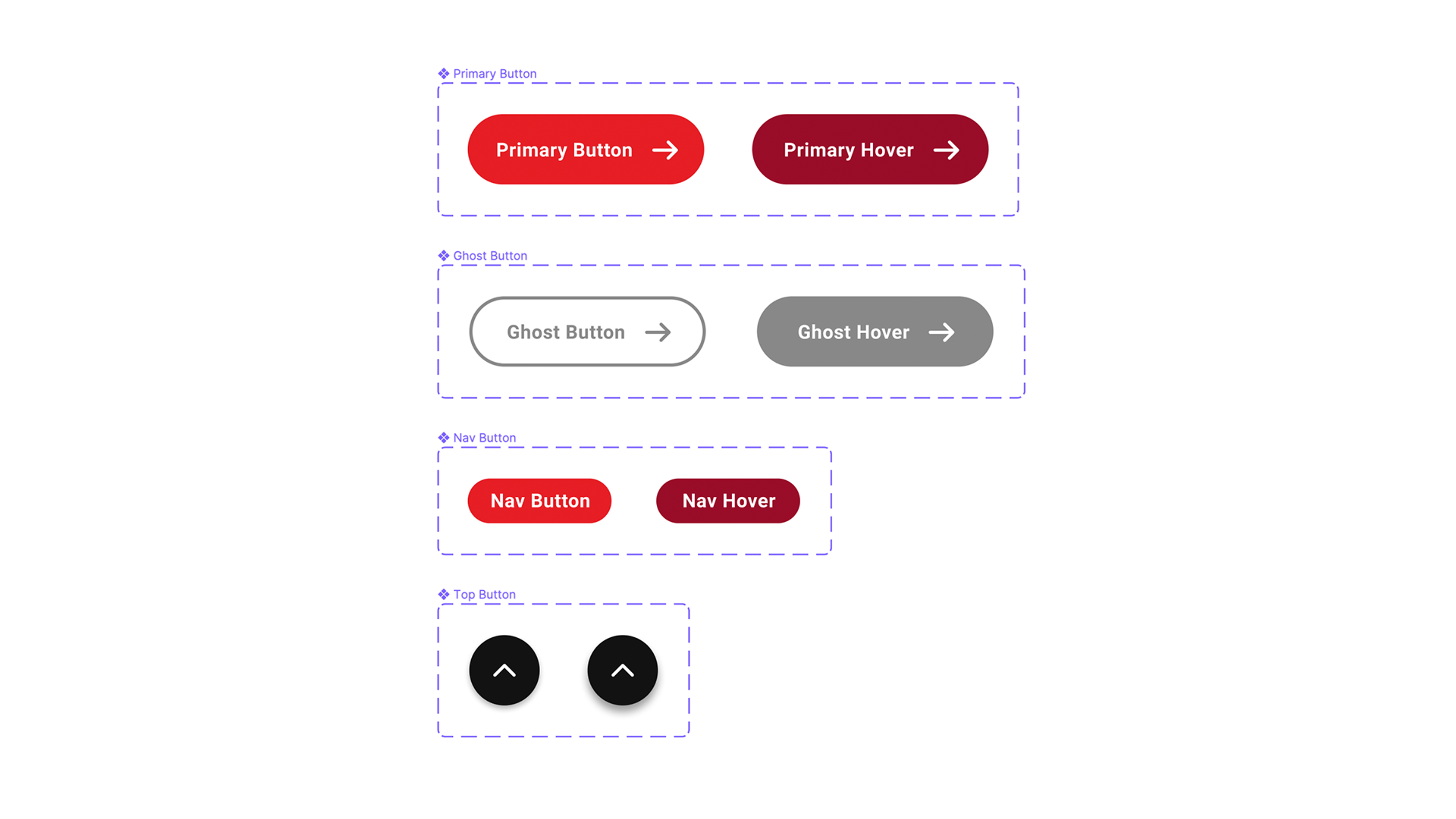
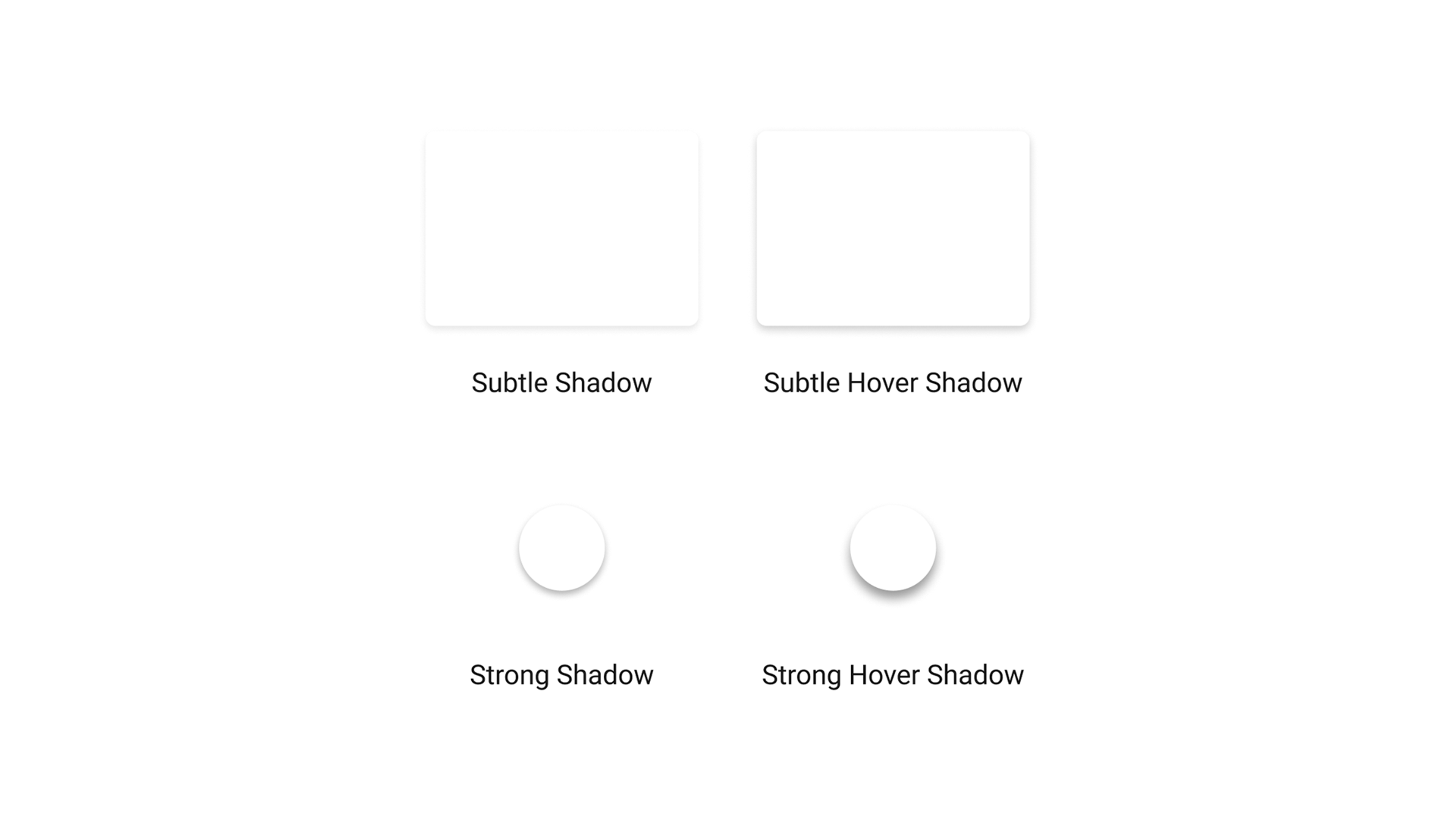
Next, I simplified the type of buttons we would use moving forward to include only pill buttons for calls to action, with variants for color and border. Hover states and shadow effects were also documented in the design system.
UI Icons
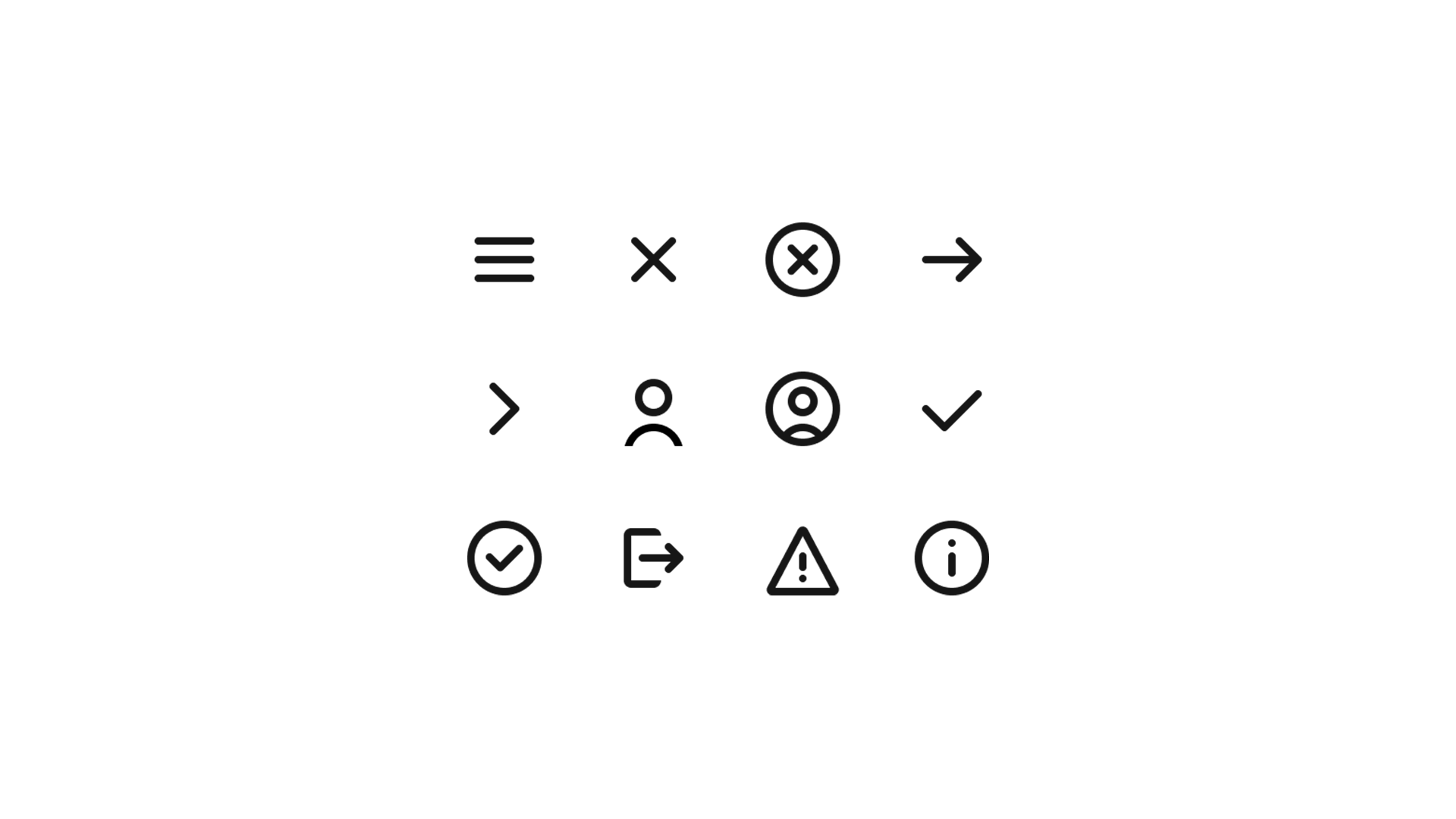
Icons were historically a mix of custom icons and Font Awesome icons, but creating the design system provided an opportunity to build some new UI icons as well. I took the opportunity to redraw previously used icons and begin creating a set of icons to build upon as needed.
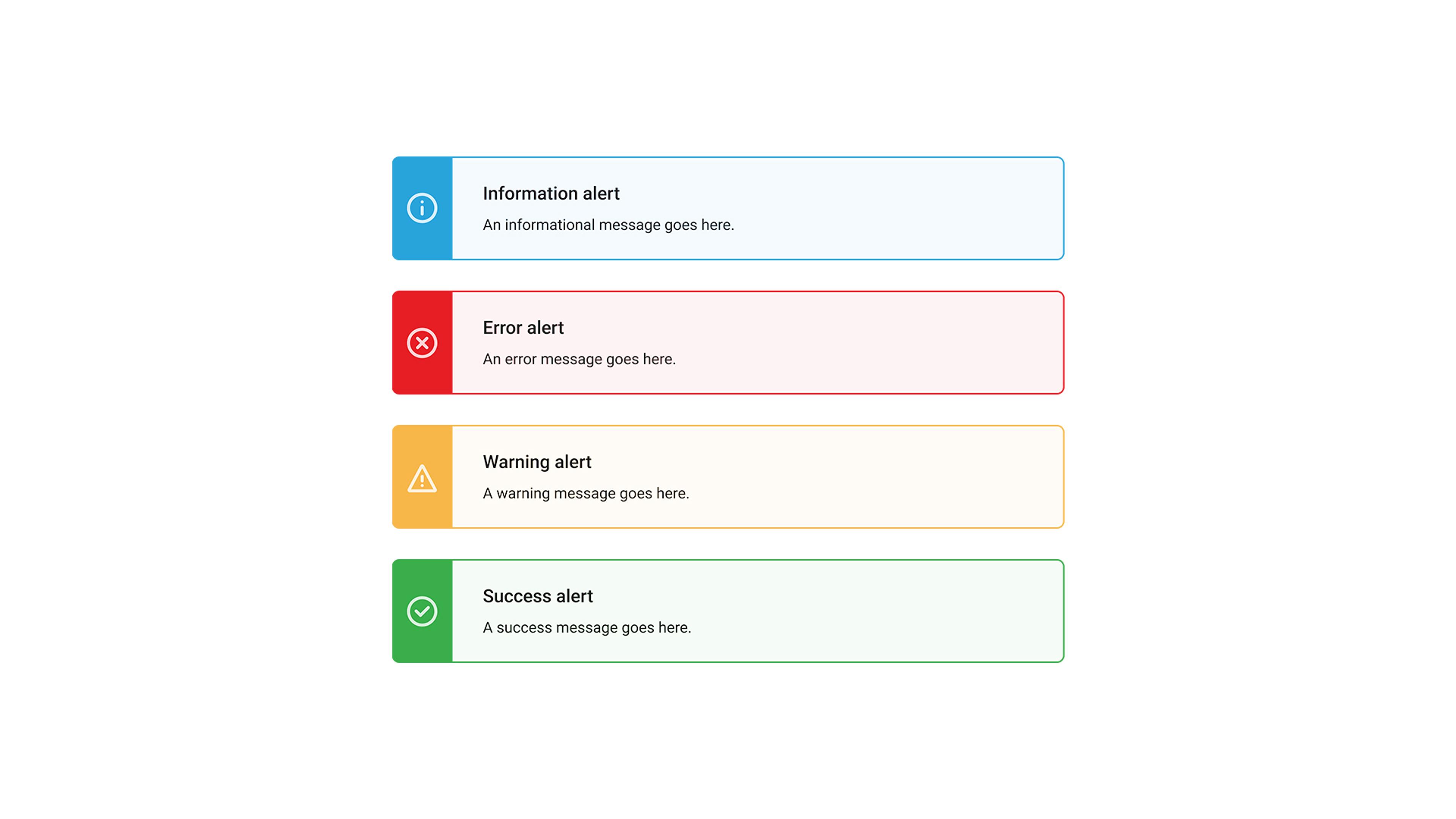
Banners and alerts
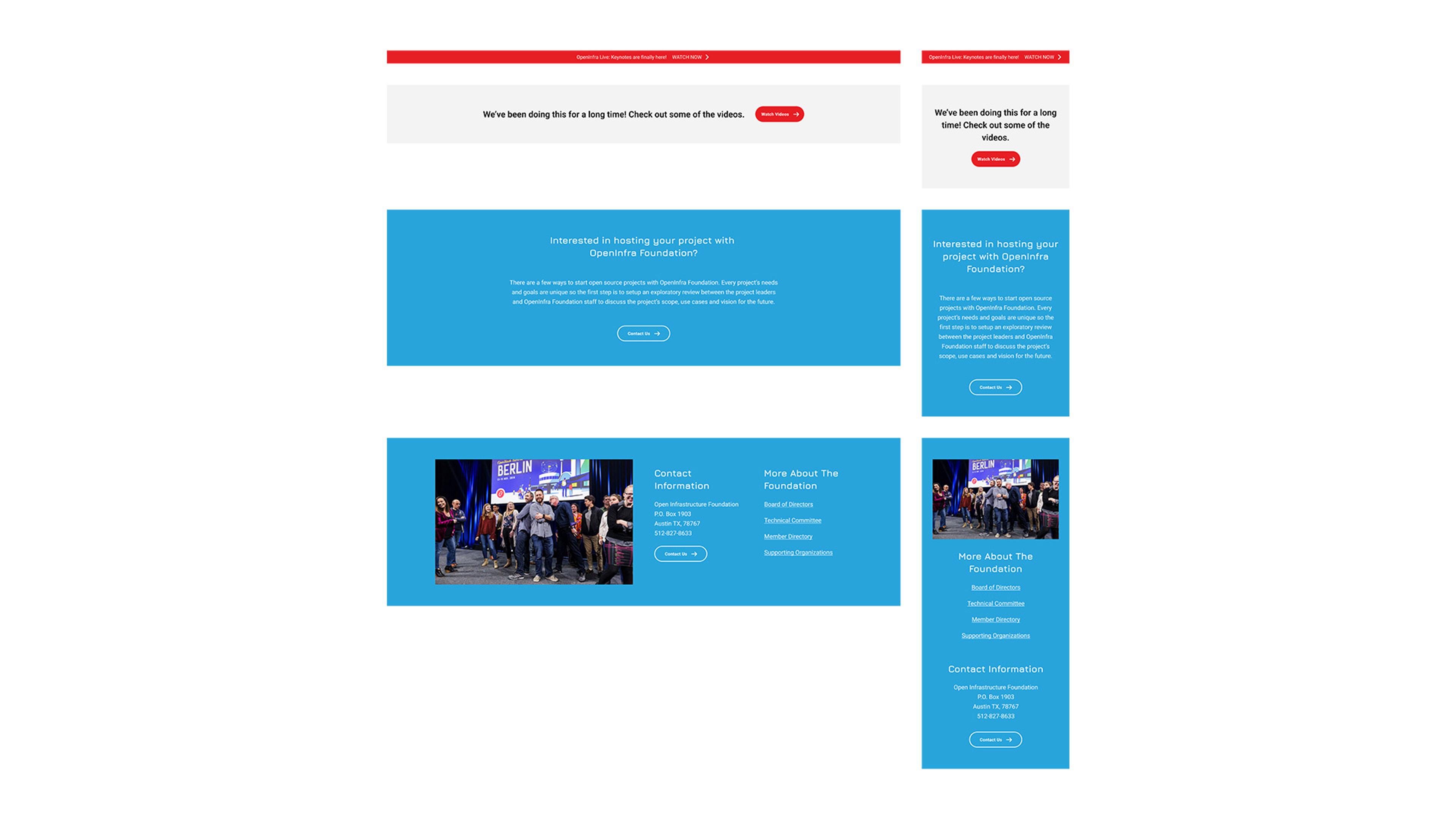
Since many of the styles and smaller components were now codified, it was easy work to begin creating larger components like banners and alert boxes.
Navigation
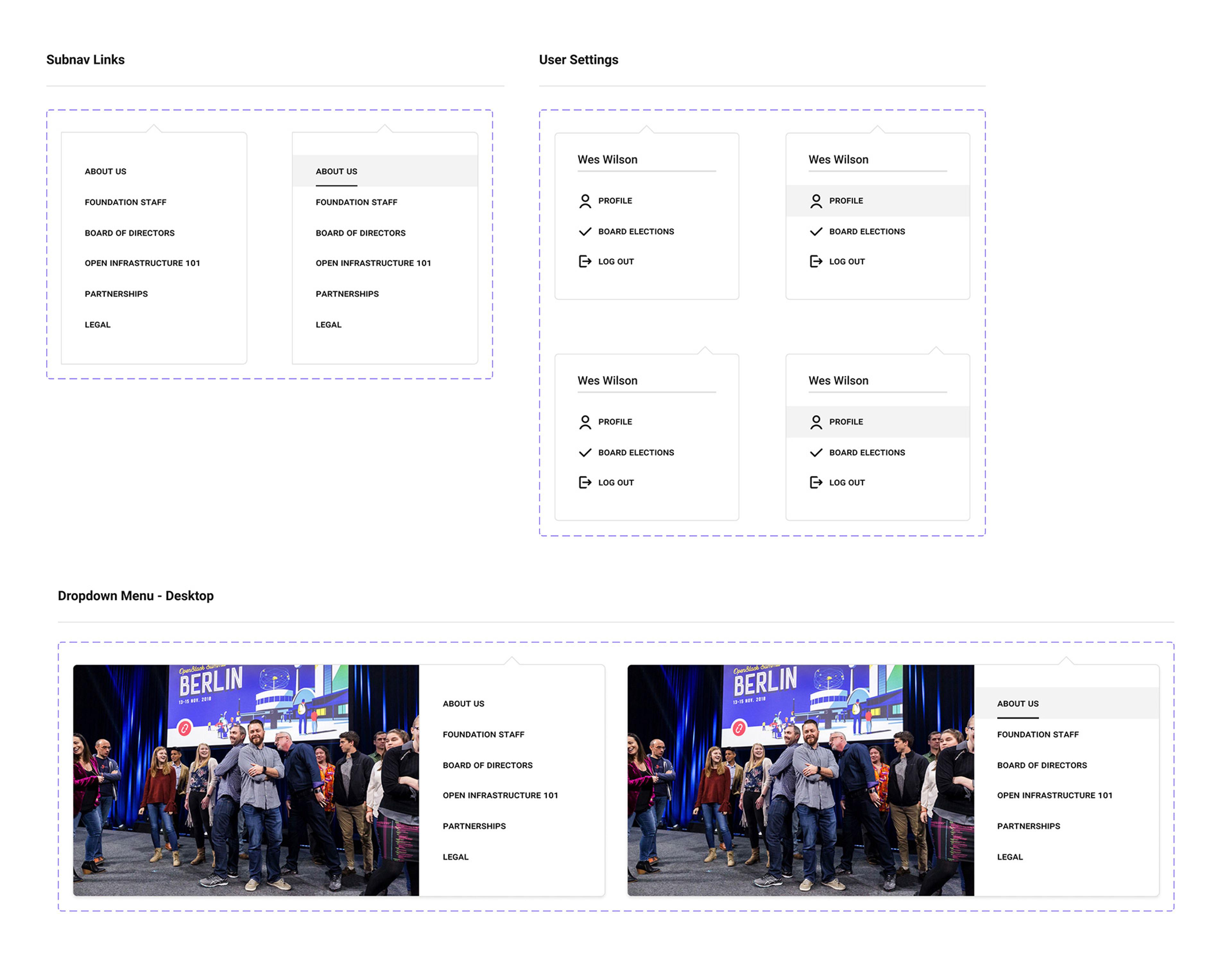
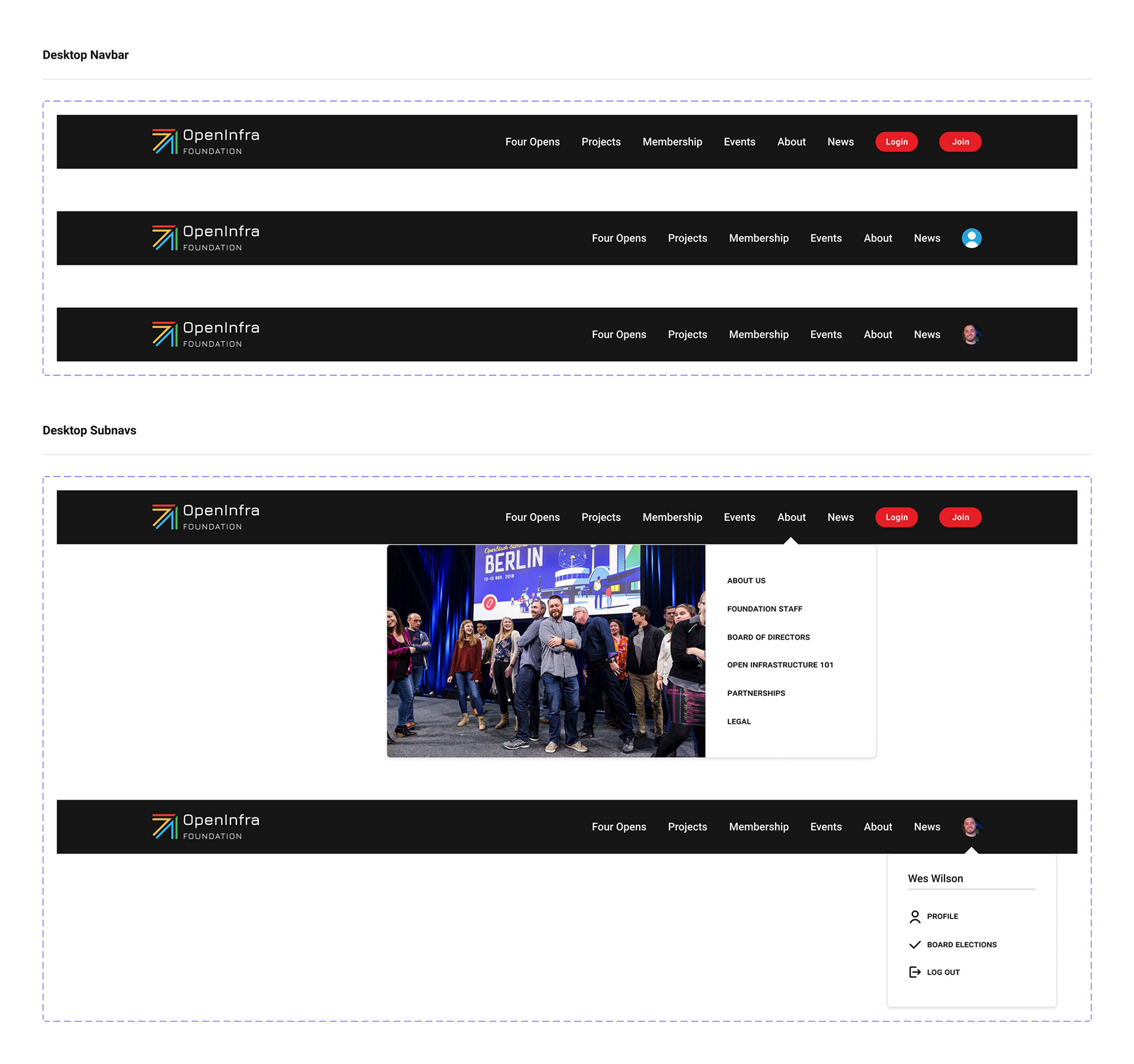
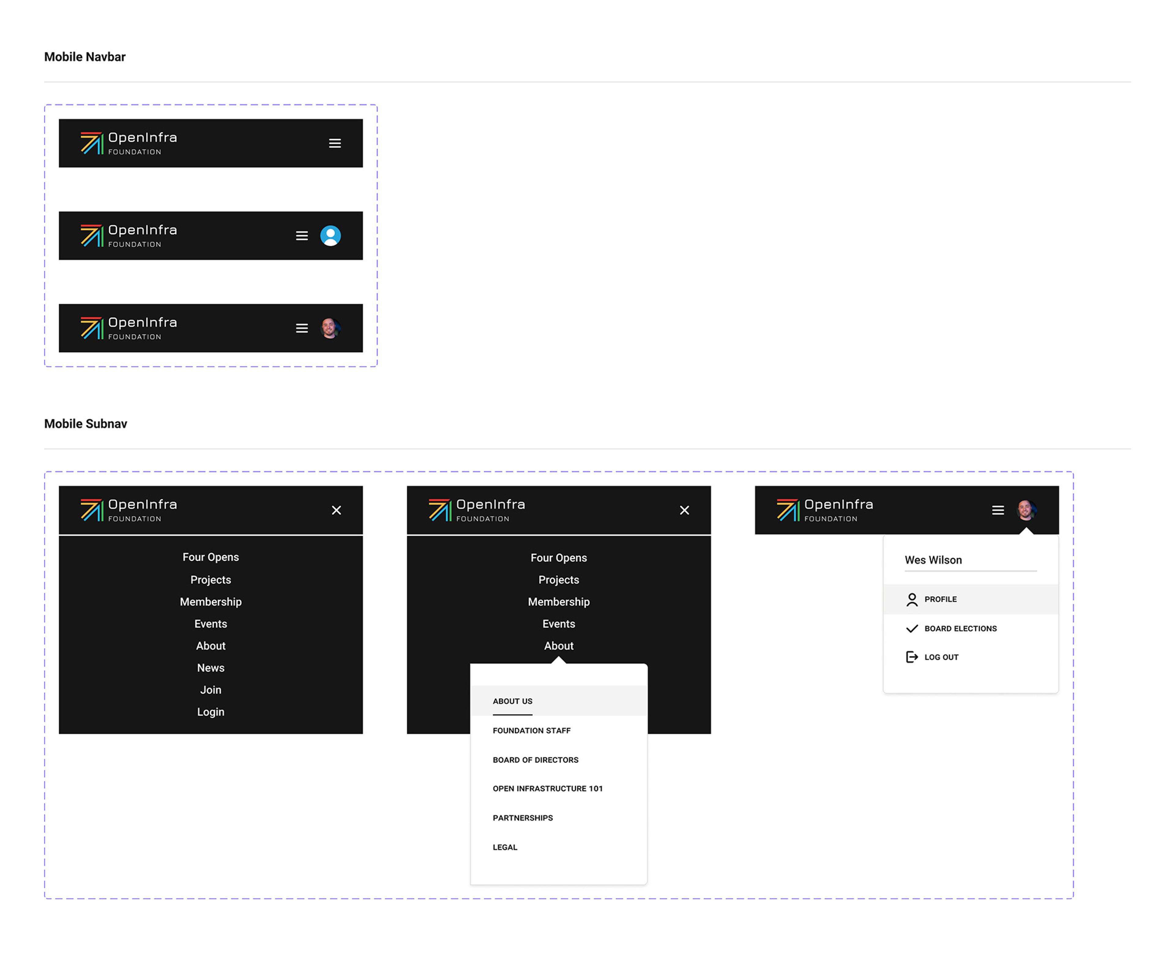
Much of the website design was a holdover from a version created by outside contractors. As such, we did not have native files internally for simple elements like the navbar and had been using screenshots in new landing page designs. I created a navbar component showing various sizes and log-in states as well as some aspirational refinements to use moving forward.
The nav component turned out to be a decent example of an "organism" in the Atomic Design methodology, combining "atoms", such as text, buttons, and icons to form "molecules" like subnav menus that can be merged into a more complex structures like responsive navigation bars.
Guide
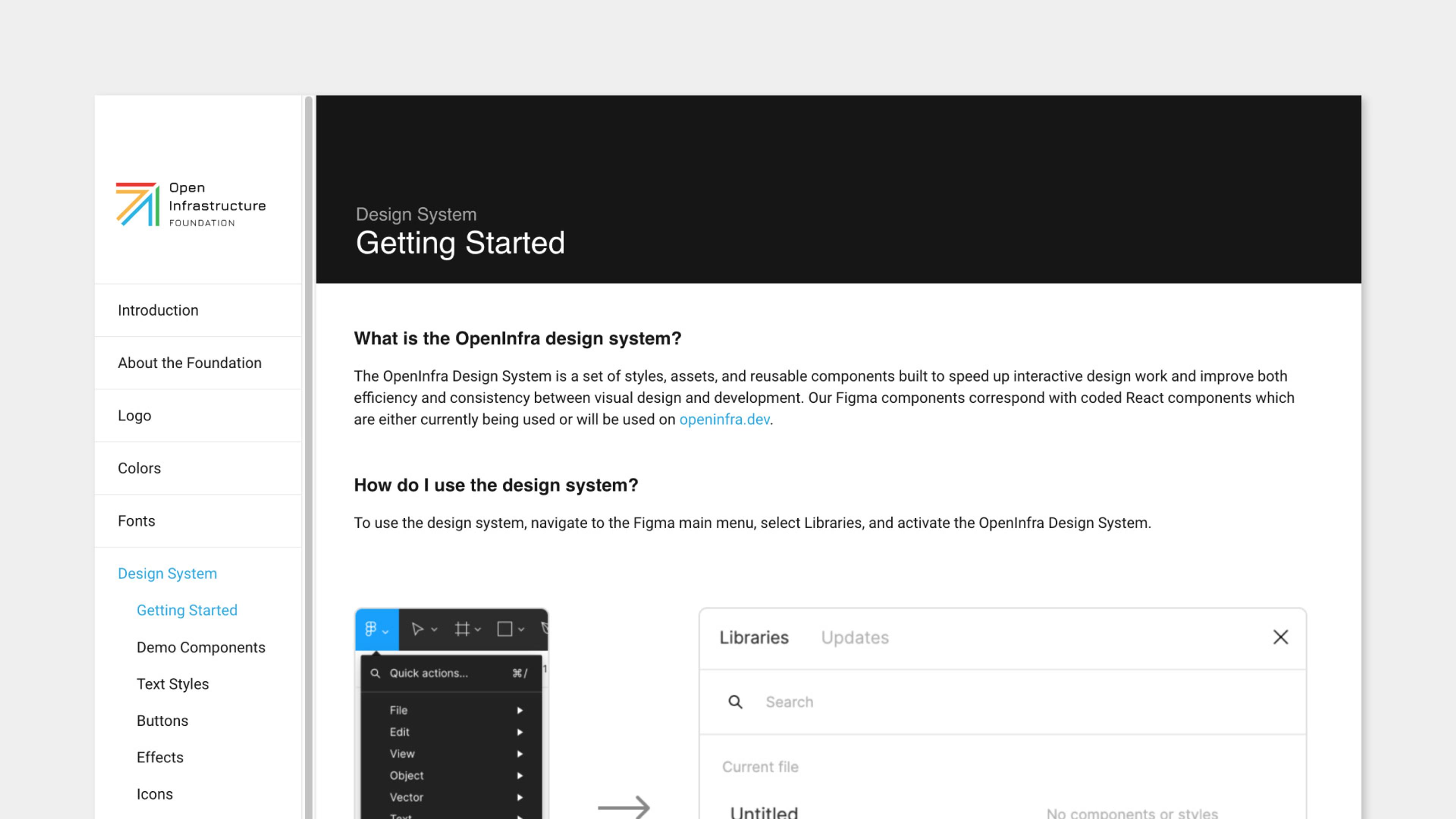
Once I completed the initial set of components for the design system, I composed a simple guide to help other designers get started with the design system. I then published the design system on the organization's brand guide website using embedded Figma frames to display the most current iterations of the components.
Conclusion
A design system is never really complete. It will grow, change, and need continuous maintenence as it matures. In addition to adding new components, future goals could be to test the design system with outside contributors, revise more of the inconsistencies identified in the site audit, and integrate Storybook with the website so coded components can be built in isolation without running the entire website locally.
You can see some demo components below and view a copy of the design system as it existed at the time of writing by visiting this link and using the navigation dropdown menu in the upper left.

