Leatherman Tool Comparison

Summary
I was tasked with creating a feature to compare tools on the Leatherman website. From curated lists of products, users would be able to select several items and then see their features in a list.
The feature was designed to educate users on the differences between products and help them select the right product for their use case.
Problem
Visitors to the Leatherman website needed a way to identify the differences in features between products that were visually similar.
Role
- Layouts for product comparison pages
- Prototyping the interactions
Introduction
Leatherman has developed a large catalog of products inspired by their original multitool. Each product houses a variety of tools, mostly nested in the grips of a large pair of pliers. Different iterations of the product were designed around various use cases, such as tools for camping, emergency response, or household tasks. However, since the base form-factor tended to be fairly consistent, it was sometimes difficult for customers to easily identify the differences between products. To solve that problem on the Leatherman website, the first step was for users to select a collection of tools to compare.
Tool Selection
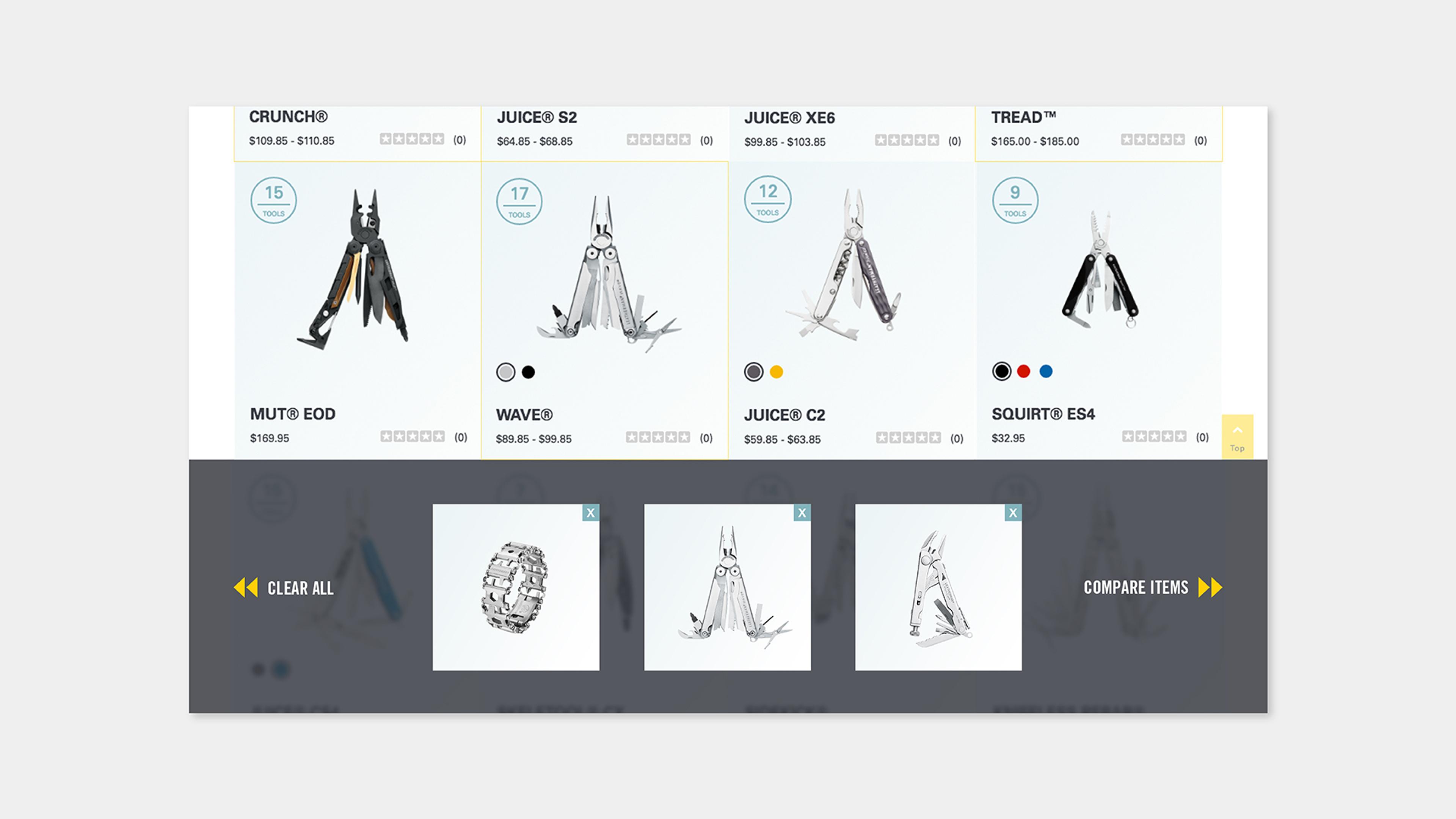
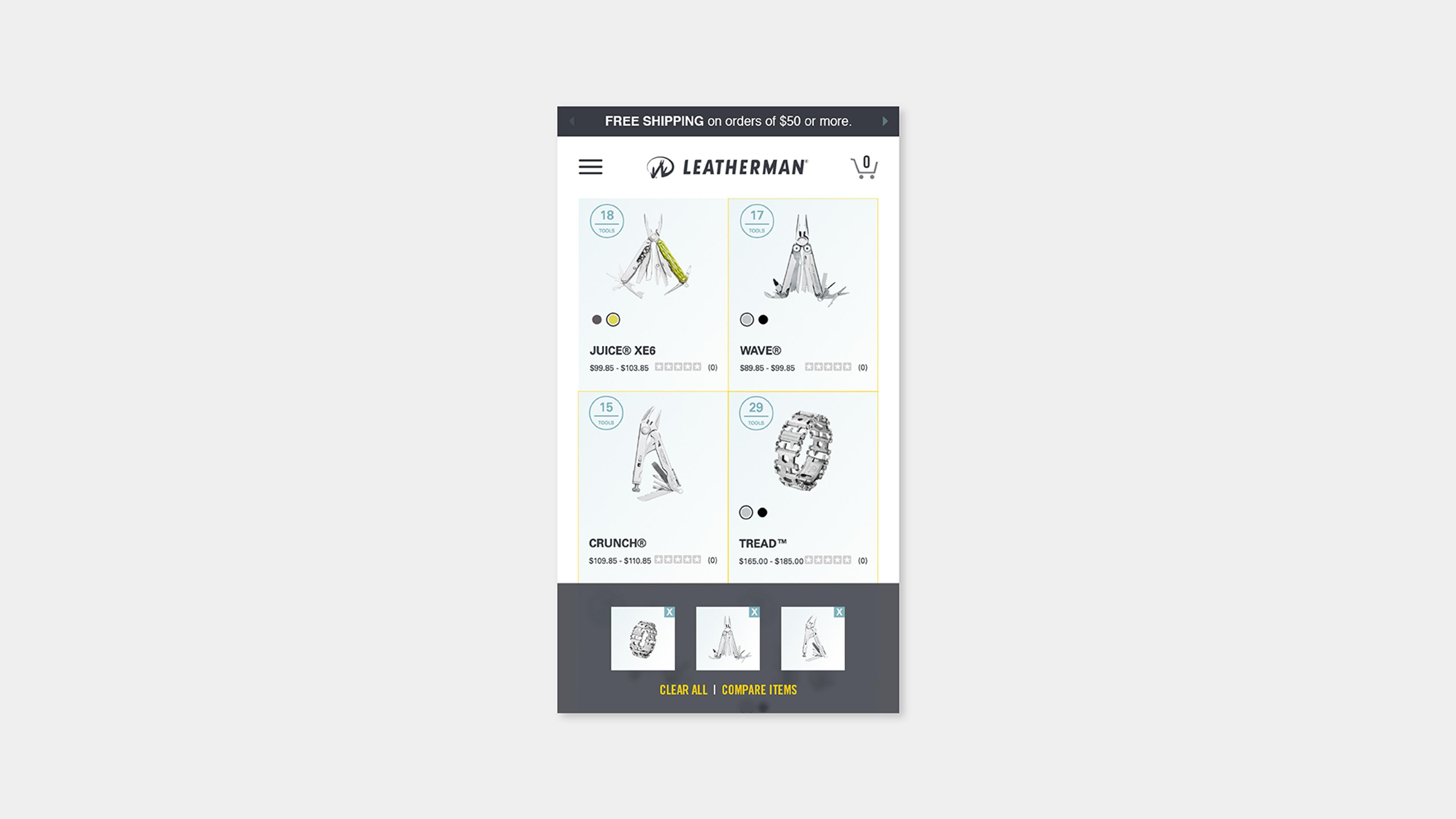
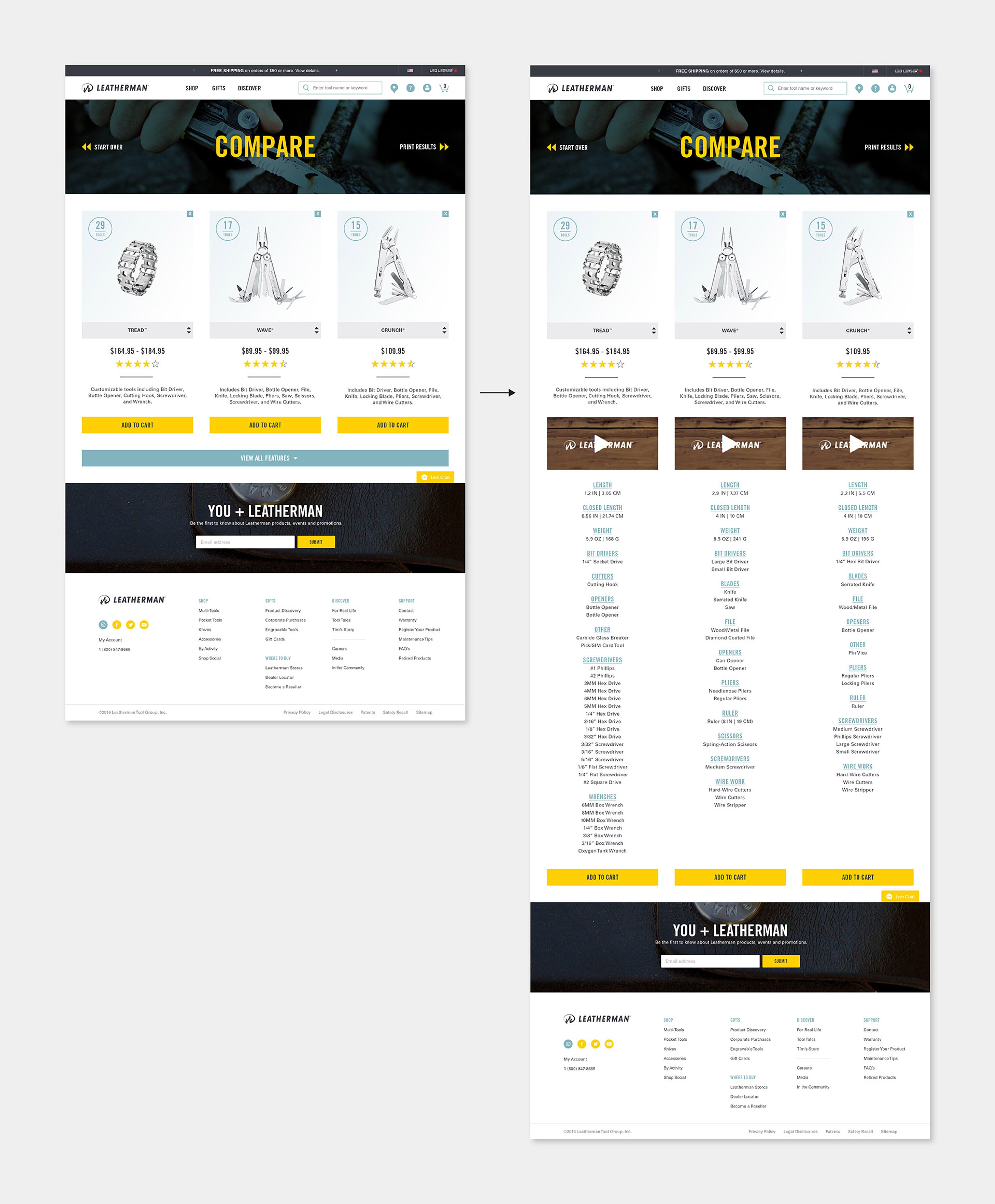
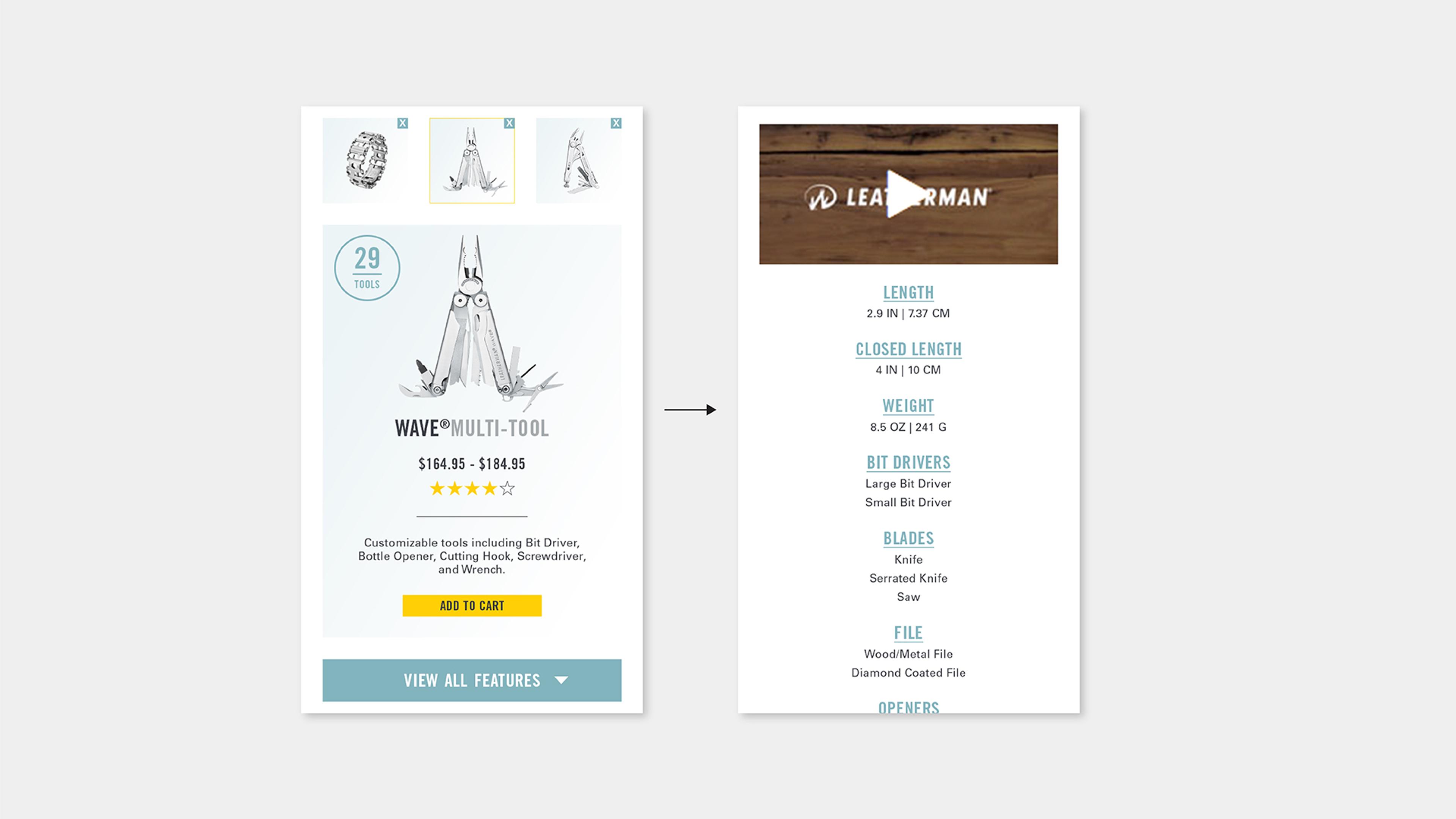
Selecting tools activated a modal at the bottom of the screen which would display a thumbnail image of the selected tools, buttons to clear the tools from the list, and a button to move the user to the comparison page. From the comparison page, users could click a button to expand the list of features for each product, remove products from the comparison, add products to their cart, or go back to the search results.


Tool Comparison
The production version of the feature used a checkbox to select items to compare rather than clicking on the image thumbnail. This solved an issue of the user being required to activate something to tell the browser they wanted to compare tools or the browser taking them directly to the product detail page after clicking the image. The production version also immediately displayed all features, rather than requiring the user to click an additional button to see all features.


